Testing your prototype with assistive technology users
Last Updated: March 3, 2026
Do you have a prototype ready to test and want to include assistive technology users early on in the process? If so, you can generally adapt the prototype you use to test with non-assistive technology users to include those who use assistive technology.
According to Sam Proulx’s presentation from the Civic Design Conference by Rosenfeld, here are some things to consider as you prepare for research with assistive technology users. First, consider testing with screen magnification users, as it requires the least amount of adaption to your prototype. Then, adapt your prototype to accommodate users with physical challenges. Finally, you can reuse some of what you’ve built to create a prototype that you’ll be able to test with users of screen readers.
Screen magnification

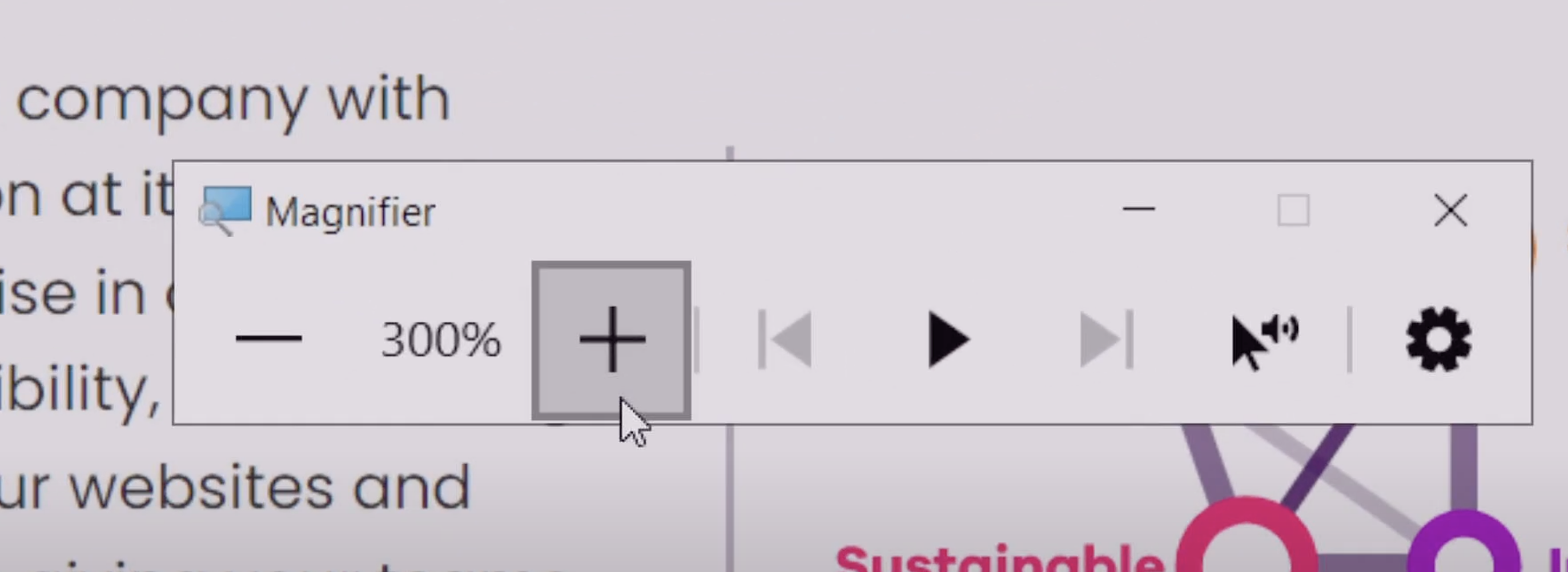
The windows magnifier tool allows users to zoom in up to 500 percent
Screen magnification software allows the user to increase and decrease the magnification of text and images to varying degrees. People with low vision primarily use it.
➡️ Watch a demo on screen magnification by TetraLogical
Popular screen magnification tools
Some popular screen magnification tools are:
ZoomText
ZoomText Fusion
This is ZoomText, but with a screen reader built-in
Magnifier (Windows)
Zoom (Apple)
What to expect
Some things to expect when testing with users who use screen magnification tools are:
They can easily see and interpret graphical prototypes and wireframes.
Prototypes probably already contain the information they need
Screen magnification software generally works with Figma prototypes. Figma has an accessibility mode that users can activate.
Most similar to users who do not use assistive technology
What to look out for
Some things to look out for in your prototype when testing with users who use screen magnification tools are:
Color contrast
Are your prototypes still interpretable if a user uses different color contrast modes?
Would a user with low vision or using your prototype in broad daylight still be able to read your content with magnification?
Effect of magnification on content
Does any content like images become blurry?
How would your content look with large text that reflows the page on a small screen (like an iPhone 5se)?
White space
Are there any essential elements that are distant from other elements that might be missed? For example, finding a button on the far right side of the page may be more challenging if nothing connects it back to the left side.
How to adapt your prototype
Little adaptation is required if they’re using traditional zoom magnification tools.
If the user uses magnification that increases the font size on the whole page (e.g., using
CMD+on a Chrome browser), most design software prototypes will not reflow unless they are coded prototypes.
Alternative navigation

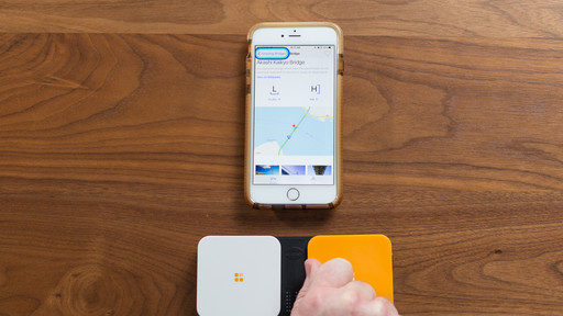
A traditional switch device can be used to navigate a mobile phone.
Those who have physical disabilities, including differences in muscular control, pain that has an impact on movement, missing limbs, and others, may use a wide variety of alternative navigation tools to help them access websites and apps.
Popular alternative navigation tools
Some popular alternative navigation tools that people with physical disabilities use are:
Switch systems
Dragon NaturallySpeaking
Voice Control (Apple)
One-handed keyboards
Head mouse
Sip and puff device
What to expect
Some things to expect when testing with users who have physical challenges are:
They can easily see and understand prototypes
Prototypes will contain much of the information they need
Prototyping software may work with the assistive software they use
Some adaptation may be required to involve them in prototype research
What to look out for
Some things to look out for in your prototype when testing with users who have physical challenges are:
Hover states
Control labels
Spacing
Minimizing the number of required clicks
Size of click targets
How to adapt your prototype
When creating a prototype to test with users with physical challenges, make sure that your prototype can indicate the following:
Where hover is required
Size of click targets
Labels of controls
You may need to operate the clickable prototype on their behalf.
Please pay attention to voice commands they expect to work.
Ensure clickable elements are correctly labeled.
Screen readers

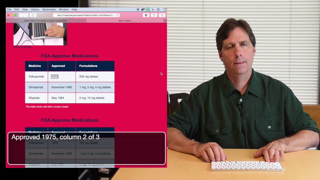
A screen reader helps users aurally navigate a page.
Screen readers are software programs that allow access to content for those with difficulty reading printed text or interpreting icons—primarily used by the blind or those with dyslexia or low vision.
Popular screen reader tools
NVDA (Non-Visual Desktop Access)
JAWS (Jobs Access With Speech)
VoiceOver (Apple)
TalkBack (Android)
What to expect
Some things to expect when testing with users who use screen readers are:
They cannot see or understand graphical prototypes
Prototypes do not contain the information they need
Prototyping software does not work with screen-reading software
Significant adaptation is required to involve them in prototype research
What to look out for
Some things to look out for in your prototype when testing with users who use screen readers are:
Semantic layout
Heading levels
Control labels
Keyboard accessibility
Focus states
Landmarks
Alt-text
How to adapt your prototype
Building your prototype in code is best for testing with screen readers at this point in the design process. You can use tools like Codespace or CodePen, not Figma, to create a mock-up. Or, you can test your product in Production or Staging. Reach out to the #accessibility-help channel in Slack if you need help.
Your screen reader prototype must indicate the following:
Placement of headings and landmarks
The semantic layout of items like lists and tables
Labels of buttons, links, and other controls
Alt-text on images
Conduct your own accessibility tests
You can also start to conduct your own accessibility testing as your team prepares for a staging review. This document will walk you through how to conduct foundational accessibility testing, which is required, as well as advanced accessibility testing, which is recommended. Track your findings with the accessibility testing artifact. This is required and must be submitted before each staging review.
Rosenfeld Media. (2021, December 9). Prototype Reviews, People With Disabilities, and You. Civic Design 2021. Prototype Reviews, People With Disabilities, and You.
Get help with assistive technology research
The Accessibility Digital Experience (ADE) team can audit the accessibility of your product, test critical user flows, review your research plan and conversation guide, provide AT users and research feedback for your pilots, and serve as technical support during your research sessions. Submit an ADE intake ticket to start working with ADE.
Help and feedback
Get help from the Platform Support Team in Slack.
Submit a feature idea to the Platform.
