

Last updated:
Overview
This document helps teams prepare for the process of accessibility testing for a Staging Review. It outlines testing requirements, how to use the supporting materials, and how accessibility requirements are evaluated.
Required actions
Teams must complete the Accessibility testing: Staging Review artifact. This checklist walks teams through the required accessibility testing for Staging Reviews.
Testing deadline
Teams must submit the completed Accessibility testing: Staging Review artifact 4 days before their scheduled Staging Review. Failure to complete required testing by this deadline may result in launch-blocking issues or a cancellation of the Staging Review.
Before you begin
-
Product readiness: Complete the Accessibility testing: Staging Review artifact only when your product is stable and ready for Staging Review. The artifact should reflect testing performed on a near-final version of your product, not on work-in-progress features.
-
Use of VADS: VADS components and patterns improve accessible outcomes, but they do not guarantee an accessible product. Teams must still validate accessibility through testing.
-
Need help? The Accessibility Digital Experience (ADE) team is available to assist with testing. Reach out in the #accessibility-help slack channel and tag @accessibility-de
Key Resources
This guide references two primary documents:
-
Accessibility testing: Staging Review artifact - The GitHub issue template you'll complete to document your testing
-
Accessibility testing manual - Detailed step-by-step instructions for performing each test including examples and tools needed
Both documents are essential for completing your accessibility Staging Review.
Preparing for Staging Review
1. Start with the Accessibility testing: Staging Review artifact
-
Create an Accessibility testing: Staging Review artifact for your scheduled Staging Review.
-
Review each checklist item to understand the requirement, the pass/fail criteria, and the linked guidance.
-
Each checklist item provides a link to more information on how to test, use of tools, examples of passes and failures, and other information to help guide testing
-
Note: If a test case does not apply to your experience (e.g., your page contains no video content), mark that test as “Pass” in your artifact.
-
-
Complete the checklist in your Staging Review ticket to demonstrate coverage.
-
Note: Accessibility testing requirements are broken into three tiers:
-
Required tests must be completed by all teams.
-
Recommended tests are intended for teams with one or more of the following resources:
-
Previous accessibility testing experience
-
Access to an accessibility specialist for guidance
-
Additional capacity beyond required testing
-
Accessibility Digital Experience (ADE) support
-
-
Advanced tests are performed by the Governance accessibility specialist during your review. Product teams are not expected to complete advanced testing.
-
2. Reference the Accessibility Testing Manual
-
The manual provides step‑by‑step instructions for each checklist item.
-
Review the manual, familiarizing yourself with the format and install any tools necessary as part of your testing
-
Follow the manual to ensure tests are performed consistently and correctly, reducing ambiguity and ensuring repeatable results.
3. Document Your Work
-
For any issues identified during your accessibility testing, please log/report them.
-
Log the issue using “Create sub-issue” button at the end of the artifact ticket.

-
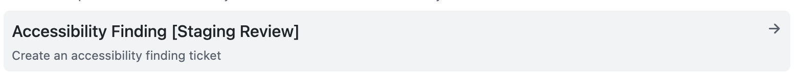
Select the “Accessibility Finding [Staging Review]” issue template
-
Fill in as much information as you are able
-
Add the
a11y-testinglabel -
Select the Collaboration Cycle milestone found in your collab cycle ticket

-
-
Notify
jasondaywhen the artifact is completed
What to expect during Staging Review
During the Accessibility Staging Review period leading up to the Staging Review meeting, the Governance accessibility specialist will:
-
Confirm that the Accessibility testing: Staging Review artifact has been completed.
-
Verify that required tests are documented (as either pass or fail)
-
If any checklist items are marked as fail in the artifact, verify that issues have been logged
-
Review the logged accessibility issues and ensure that they are valid and labelled correctly, and provide additional detail as needed
-
Provide feedback on the artifact and any issues logged
-
Answer any questions raised by your team during the artifact completion process
-
Complete advanced testing, and conduct additional tests as appropriate for your product.
-
Note: You will receive individual issue tickets documenting accessibility barriers or violations of the VA.gov experience standards. You may also receive general advice related to your accessibility testing as documented in your testing artifact.
During the Staging Review meeting:
-
Any accessibility barriers detected as part of the Staging Review will be reported via GitHub issues and will be discussed at the Staging Review meeting. Issues are labeled according to the defect severity rubric, and any issues that must be addressed prior to launch will be labeled
launch-blocking.
We recommend you work with an accessibility specialist to validate and resolve feedback received at your Staging Review. If you do not have an accessibility specialist available to work with your team, please consider:
-
Posting a question in the #accessibility-help channel.
-
Attending office hours for either accessibility or for the Collaboration Cycle.
-
Outcome
By following this process:
-
Teams demonstrate progressive conformance with WCAG 2.2 requirements and http://VA.gov experience standards.
-
Product teams build skills and align to a unified testing standard, resulting in a reduction of defects and more mature accessibility practices
-
Reviewers and stakeholders have clear visibility into both coverage and issues identified, ensuring accessibility is integrated into the software development lifecycle.
Help and feedback
-
Get help from the Platform Support Team in Slack.
-
Submit a feature idea to the Platform.