

Last updated
Overview
This manual provides practical, end‑to‑end instructions for conducting accessibility testing and completing the Accessibility testing: Staging review artifact. It details all required, recommended, and advanced tests, and includes step‑by‑step procedures, tool guidance, and testing expectations to ensure consistent, thorough, and repeatable results.
Each section includes:
-
Clear checklist/test case
-
References to relevant accessibility standards such as WCAG
-
Detailed instructions on how to test and validate conformance
-
Guidance on using supporting tools and resources
This resource is designed to help teams systematically identify and resolve accessibility issues, ensuring digital experiences are usable and inclusive for all users.
Methodology
-
Each test case/checklist item is a single, testable unit
-
Required tests are primarily visual inspections or involve simple actions/tools
-
Recommended tests may require deeper inspection using browser DevTools or more complex judgments
-
Each “How to Test” section provides step‑by‑step instructions to ensure consistency in testing
Applicability of Test Cases
When completing the Accessibility Testing: Staging Review artifact, some test cases may not apply to your product or user flow. If a test case is not relevant, for example if your experience contains no videos, mark the corresponding test cases as N/A.
Testing tools
Manual / Visual Inspection
-
Keyboard
-
Colour Contrast Analyzer (Desktop app)
-
Bookmarklets
-
VA11y - provides checks for accessible names, image text alternatives, heading structure, semantic page structure, text-spacing, and grayscale
-
Advanced testing
-
PEAT - Photosensitive Epilepsy Analysis Tool
-
Target size bookmarklet
Automated testing
-
Axe Devtools (Chrome extension)
-
Axe-core (NPM)
Automated testing
Automated-001 - Axe DevTools has been run on every page (Required)
-
Checklist: Every page in the user flow, including page variations, interactive states of content, etc., is tested with Axe Devtools
-
Standard: Automated
-
Tier: Required
-
Category: Automated
-
Experience Standard: N/A
-
Severity: N/A
How to Test:
-
Tools Needed: Axe Devtools browser extension
-
Steps:
-
Open AXE DevTools in Chrome/Edge Developer Tools
-
F12 (Windows/Linux) or Cmd+Opt+I (Mac)
-
Open AXE DevTools from the top toolbar (may be under
>>)
-
-
Configure AXE DevTools
-
Open the kebab menu (three dots)
-
Go to Settings
-
Under Rules and Issues, enable Best Practices
-
Select WCAG 2.2 AA
-
-
Test each page in your flow
-
Run AXE on every page, including:
-
Page variations
-
Modals
-
Dropdowns
-
Dynamic states
-
-
-
Resources:
Automated-002 - Axe-core has been integrated in end to end testing (Required)
-
Checklist: End to end testing with Cypress or other libraries includes AXE scanning
-
Standard: Automated
-
Tier: Required
-
Category: Automated
-
Experience Standard: N/A
-
Severity: N/A
How to Test:
-
Tools Needed: Cypress + Axe-core plugin
-
Steps:
-
Review E2E test scripts for
cy.injectAxe()andcy.checkA11y()calls. -
Run the test suite and confirm accessibility assertions are executed.
-
Validate that all page states are covered.
-
Resources:
WEB-111 – Non-text content
WEB-111-001 - Meaningful descriptions are provided for informative images (Required)
This check ensures that all informative images include meaningful text alternatives that convey the same purpose or information as the image itself. These alternatives allow users who rely on assistive technologies to understand visual content without seeing it. The goal is to make non-text content perceivable and equivalent for all users.
-
Checklist: All informative images have a text alternative that is meaningful and serves the equivalent purpose
-
Standard: WCAG 1.1.1 Non-text Content
-
Tier: Required
-
Category: Images
-
Experience Standard: Comprehension: User can perceive all meaningful elements.
-
Severity: High or Critical
How to Test:
-
Tools Needed: Chrome DevTools, VA11y bookmarklet
-
Steps:
-
VA11y bookmarklet
-
Activate the VA11y bookmarklet
-
Open VA11y and select the Images tab
-
Hover over images in the page and read the bookmarklet panel for information
-
Verify that the text alternative conveys the image’s purpose
-
OR, for decorative images, check for
alt="",role="presentation", oraria-hidden="true"
-
-
-
Chrome DevTools
-
Identify images in the page, and inspect them using DevTools
-
Look for
alt,aria-label, oraria-labelledbyattributes and confirm that the text alternative conveys the image’s purpose-
For SVGs, there may be an
aria-label,title=""attribute, or<title>element
-
-
For decorative images, check for
alt="",role="presentation", oraria-hidden="true"
-
-
Confirm that the text alternative conveys the image’s purpose.
-
-
Tip: Ask “If the image were removed, would the text alternative still convey the same meaning?”
Examples:
-
Pass
-

alt="VA logo and Seal, U.S. Department of Veterans Affairs"
-
-
Fail
-
Image doesn’t have a text alternative nor is it identified as decorative
-
<img src="image.png" />
-
-
Image alt text is not descriptive
-
<img src=”image.png” alt=”image” />
-
-
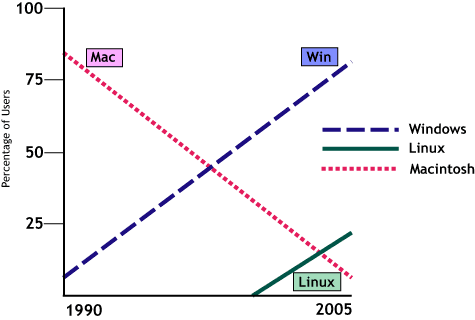
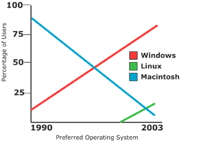
WEB-111-002 - Brief and detailed descriptions are provided for complex images (Recommended)
This check ensures that complex images, such as charts, graphs, maps, and infographics, include both a concise alt text and a detailed description that conveys all meaningful visual information. The brief description helps users quickly identify the image’s purpose, while the longer description provides full access to the data or relationships depicted. This supports users who rely on screen readers or cannot visually interpret complex visuals.
-
Checklist: Complex images (graphs, maps, charts) have both alt text and longer descriptions
-
Standard: WCAG 1.1.1 Non-text Content
-
Tier: Recommended
-
Category: Images
-
Experience Standard: Comprehension: User can perceive all meaningful elements.
-
Severity: High or Critical
How to Test:
-
Tools Needed: Chrome DevTools, VA11y bookmarklet, Manual review
-
Steps:
-
Scan the page for:
-
Charts, graphs, maps, infographics
-
Diagrams or illustrations that convey relationships or data
-
-
VA11y bookmarklet
-
Activate the VA11y bookmarklet
-
Open VA11y and select the Images tab
-
Hover over each image
-
Verify that the text alternative conveys the image’s purpose
-
Inspect the images for the existence of the
altattribute and look for extended descriptions, such as a<figcaption>,longdesc, or surrounding text -
Confirm that the long description accurately conveys all relevant visual information.
-
-
Chrome DevTools
-
Inspect the image element:
-
Confirm presence of a short
altattribute that briefly identifies the image. -
Look for
aria-describedby,<figcaption>, linked long description (e.g.,<a href="#desc1">Full description</a>), or immediately adjacent text
-
-
Verify that the long description is:
-
Programmatically associated with the image
-
Located nearby or easily discoverable
-
-
-
Examples:
-
Pass
-
Additional description is descriptive and adds more context to a complex image
-
<img src="chart.png" alt="Monthly enrollment chart" aria-describedby="chart-desc">
<div id="chart-desc">This bar chart shows VA health care enrollment trends from January to June, with a steady increase from 12,000 to 18,500 enrollees.</div>
-
-
-
Fail
-
<img src="chart.png" alt="Monthly enrollment chart">
<!-- No long description provided -->
-
WEB-111-003 - Decorative images are hidden from screen readers (Recommended)
This check ensures that purely decorative images, those that do not convey meaningful content, are hidden from screen readers using appropriate markup. This prevents unnecessary clutter in the accessibility tree and allows users to focus on relevant content. The goal is to streamline the experience for assistive technology users by excluding non-essential visuals.
-
Checklist: Decorative images are hidden from screen readers
-
Standard: WCAG 1.1.1 Non-text Content
-
Tier: Recommended
-
Category: Images
-
Experience Standard: Comprehension: User can perceive all meaningful elements.
-
Severity: Medium or High
How to Test:
-
Tools Needed: Chrome DevTools, VA11y bookmarklet
-
Steps:
-
VA11y bookmarklet
-
Activate the bookmarklet
-
Open VA11y and select the Images tab
-
Review:
-
Images for “decorative” information
-
Decorative images for a text alternative
-
-
Confirm that only meaningful images are exposed to assistive technologies.
-
-
Chrome DevTools
-
Identify images in the page, and inspect them using DevTools
-
Verify that the image is decorative, meaning that it doesn’t provide any additional context, and ensure that the image either has
alt="", role="presentation", or aria-hidden="true"
-
-
Examples:
-
Pass:
-
A dividing border image does not provide any information or meaning
-
<img src="border.png" alt="">
-
-
Fail:
-
<img src="border.png" alt="Decorative border">
-
WEB-111-004 - Background images are not used for informative content (Recommended)
This check ensures that meaningful visual content is not delivered solely through CSS background images, which are typically inaccessible to screen readers and other assistive technologies. Informative images must be implemented using semantic HTML elements like <img> with appropriate text alternatives. The goal is to ensure that all users can perceive and understand visual information, regardless of how it’s rendered.
-
Checklist: CSS background images must not be used to convey meaningful information unless that same information is also provided in an accessible form elsewhere.
-
Standard: WCAG 1.1.1 Non-text Content
-
Tier: Recommended
-
Category: Images
-
Experience Standard: Comprehension: User can perceive all meaningful elements.
-
Severity: High or Critical
How to Test:
-
Tools Needed: Chrome DevTools, VA11y bookmarklet
-
Steps:
-
VA11y bookmarklet
-
Activate the VA11y bookmarklet
-
Open VA11y and select the Images tab
-
Review:
-
Hover over images and identify text alternative
-
If the image is non-decorative and isn’t identified as an image by VA11y:
-
Inspect the image using Chrome DevTools
-
Identify if the element is an
<img>,<svg>, or<figure>or some other HTML element
-
-
-
-
Examples:
-
Pass
-
No meaningful images are included via CSS
-
If an image is included via CSS, the image is decorative
-
WEB-121 - Text transcripts are provided for audio and video-only content (Recommended)
This check ensures that audio-only and video-only content includes a full text transcript that conveys all meaningful information. Transcripts allow users who are deaf, hard of hearing, blind, or unable to access media players to understand the content. The goal is to provide an equivalent experience through readable, accessible text.
-
Checklist: Transcript provides same information as original media
-
Standard: WCAG 1.2.1 Audio-only and Video-only (Prerecorded)
-
Tier: Recommended
-
Category: Audio & video
-
Experience Standard: Comprehension: User can perceive all meaningful elements.
-
Severity: Critical
How to Test:
-
Tools Needed: Manual review
-
Steps:
-
Locate audio-only or video-only content.
-
Ensure the transcript is accessible via HTML (surrounding text) or linked text.
-
Read the transcript and confirm that it includes:
-
All spoken dialogue
-
Relevant sound effects or cues (e.g., “[applause]”, “[music fades]”)
-
Descriptions of visual context (for video-only)
-
-
Ensure the transcript is readable, complete, and matches the media content.
-
Examples:
-
Pass:
-
A video without audio narration (video‑only) includes a descriptive transcript that explains the visual information.
-
A product demo video with no voiceover has a transcript describing each step shown on screen.
-
-
A training video with spoken dialogue provides a transcript that accurately captures the speech and identifies speakers.
-
“Instructor: Welcome to the course. Student: Thank you.”
-
-
-
Fail
-
No text transcript is provided for audio‑only or video‑only content.
-
Transcript is incomplete or inaccurate (e.g., missing dialogue, omitting key sound effects, or misrepresenting visuals).
-
Exceptions:
-
A video can be considered "purely decorative" if it conveys no important information, such as a background video used for aesthetic purposes. In such cases, a transcript or audio description may not be required, and can be treated like a decorative image by using techniques like
aria-hidden="true"to hide it from assistive technologies.
WEB-122 - Captions are provided for all prerecorded videos (Required)
This check ensures that all prerecorded video content includes captions that are synchronized with the audio. Captions must convey spoken dialogue, sound effects, and other relevant audio cues to make video content accessible to users who are deaf or hard of hearing. The goal is to provide an equivalent experience without relying on sound.
-
Checklist: Prerecorded videos include synchronized captions for dialogue, sound effects, and relevant audio
-
Standard: WCAG 1.2.2 Captions (Prerecorded)
-
Tier: Required
-
Category: Audio & video
-
Experience Standard: Comprehension: User can perceive all meaningful elements.
-
Severity: Critical
How to Test:
-
Tools Needed: Manual review
-
Steps:
-
Enable captions using the video player controls.
-
Watch the video and confirm:
-
Captions appear in sync with spoken content.
-
All dialogue, sound effects, and relevant audio cues are included.
-
Captions are readable and persist long enough to be understood.
-
-
Examples:
-
Pass
-
"[Patriotic music playing] Narrator: Today, millions of Veterans use My HealtheVet portal…"
-
-
Fail
-
No captions available, no caption functionality in the video player, or captions only show partial dialogue.
-
WEB-123 - Transcripts or audio descriptions are included for videos with audio (Required)
This check ensures that prerecorded videos with audio include either a full transcript or an audio description that conveys all meaningful visual information. This is essential for users who are blind or have low vision and cannot perceive visual content. The goal is to provide an equivalent experience by describing actions, expressions, and visual context that are not conveyed through sound alone.
-
Checklist: Non-live video includes a full descriptive transcript or an audio description
-
Standard: WCAG 1.2.3 Audio Description or Media Alternative (Prerecorded)
-
Tier: Required
-
Category: Audio & video
-
Experience Standard: Comprehension: User can perceive all meaningful elements.
-
Severity: High
How to Test:
-
Tools Needed: Manual review
-
Steps:
-
Review each video for accompanying transcript or audio description.
-
Confirm that visual information not conveyed through audio is included in the transcript or description.
-
Ensure the transcript is accessible and easy to locate. The transcript may be provided via a button in the video player, or via text on the page, or by other means.
-
Examples:
-
Pass:
-
"[Scene: VA clinic waiting room] Nurse walks in and calls Mr. Thompson. He stands and follows her."
-
-
Fail:
-
Transcript only includes spoken words, omitting key visual actions or cues.
-
WEB-124 - Real-time captions are provided for live videos (Recommended)
This check ensures that live video content includes real-time captions that accurately reflect spoken dialogue and important audio cues as they occur. Real-time captions are essential for users who are deaf or hard of hearing to participate in live events, meetings, or broadcasts. The goal is to provide equal access to time-sensitive content as it happens.
-
Checklist: Live video content includes synchronized captions generated in real-time
-
Standard: WCAG 1.2.4 Captions (Live)
-
Tier: Recommended
-
Category: Audio & video
-
Experience Standard: Comprehension: User can perceive all meaningful elements.
-
Severity: Critical
How to Test:
-
Tools Needed: Manual review
-
Steps:
-
Join the live video as a viewer.
-
Confirm that captions:
-
Are visible or can be enabled via player controls
-
Appear in sync with spoken content
-
Include relevant non-speech audio cues (e.g., “[applause]”, “[laughter]”)
-
-
WEB‑125 - Audio descriptions are provided for videos with important visual information (Advanced)
Audio descriptions supply narration that conveys important visual details not already provided in the audio track. They ensure that users who cannot see the video still understand critical visual information such as actions, scene changes, or on‑screen text. The goal is to ensure that all meaningful visual information is available to users who rely on audio alone.
-
Checklist: Multimedia content includes audio descriptions that accurately inform the user of important visual information not conveyed through audio.
-
Standard: WCAG 1.2.5 - Audio Description (Prerecorded)
-
Tier: Advanced
-
Category: Audio & video
-
Experience Standard: Comprehension: User can perceive all meaningful elements.
-
Severity: High
How to Test:
-
Tools needed: Manual inspection, Browser DevTools, media player controls
-
Steps:
-
Locate all prerecorded video content.
-
Identify whether the video contains important visual information not conveyed in the audio (e.g., on‑screen text, visual cues, actions critical to understanding).
-
Check for the presence of an audio description track or a descriptive transcript that covers the missing visual information.
-
Play the video with audio description enabled (if available) and confirm that the narration conveys the essential visual details.
-
If no audio description track exists, verify that a descriptive transcript is provided as an alternative.
-
Examples
-
Pass:
-
A training video shows a chart on screen while the narrator says, “As you can see, the chart shows a 20% increase in enrollments.” The audio description track adds: “The chart is a bar graph with four bars, the last bar labeled ‘2025’ is taller than the others.”
-
A video includes an audio description track that narrates, “The speaker walks across the stage and points to the slide titled ‘Next Steps.’”
-
-
Fail:
-
A video displays critical instructions as text on screen, but the audio track does not mention them and no audio description is provided.
-
A promotional video shows a sequence of important visual actions (e.g., a veteran using a new online tool) but provides no narration or transcript describing those actions.
-
WEB-131 – Info & Relationships
WEB-131-001 - Headings match the content hierarchy and use proper HTML tags (Required)
This check ensures that headings are marked up using proper HTML tags (<h1> through <h6>) and follow a logical content hierarchy. Proper heading structure helps users, especially those using assistive technologies understand the organization of the page and navigate efficiently. The goal is to make content structure programmatically determinable and visually coherent.
-
Checklist: Headings accurately reflect content hierarchy and are semantically marked
-
Standard: WCAG 1.3.1 Info and Relationships
-
Tier: Required
-
Category: Structure & semantics
-
Experience Standard: Usability: User can identify an element and its state.
-
Severity: High or Critical
How to Test:
-
Tools Needed: Show Headings bookmarklet
-
Steps:
-
Launch Show Headings bookmarklet
-
Review:
-
The heading level assigned to each element.
-
That all expected headings are represented in the list
-
Any text that appears to be a heading, is a heading
-
-
Examples:
-
Pass
-
<h1>VA Health Benefits</h1>
<h2>Eligibility</h2>
<h3>Service Requirements</h3>
-
-
Fail
-
<div class="heading">VA Health Benefits</div>
-
WEB-131-002 - Headings follow a logical order without skipping levels (Required)
This check ensures that headings are structured in a logical sequence without skipping levels (e.g., jumping from <h2> to <h4>). A consistent heading hierarchy helps users, especially those using screen readers, understand the organization of content and navigate efficiently. The goal is to maintain semantic clarity and predictable structure.
-
Checklist: Heading levels follow a logical, sequential hierarchy with no skipped heading levels
-
Standard: Best practice
-
Tier: Required
-
Category: Structure & semantics
-
Experience Standard: Usability: User can identify an element and its state.
-
Severity: High
How to Test:
-
Tools Needed: Chrome DevTools, Show Headings bookmarklet
-
Steps:
-
Show Headings bookmarklet
-
Activate bookmarklet
-
Review:
-
The heading level assigned to each element.
-
Whether any levels are skipped or misused.
-
Whether headings are exposed correctly to assistive technologies.
-
-
Confirm that the heading structure reflects the visual and logical organization of the page.
-
-
Chrome DevTools
-
Open DevTools (
Ctrl+Shift+Ior right-click → Inspect). -
Locate all heading elements (
<h1>through<h6>). -
Review the sequence of headings:
-
Confirm that headings progress logically (e.g.,
<h1>→<h2>→<h3>). -
Avoid skipping levels (e.g.,
<h2>followed directly by<h4>). -
Ensure headings are not used purely for styling.
-
-
-
Examples:
-
Pass
-
<h1>VA Health Benefits</h1>
<h2>Eligibility</h2>
<h3>Service Requirements</h3>
-
-
Fail
-
<h1>VA Health Benefits</h1>
<h4>Eligibility</h4> <!-- Skips h2 and h3 -->
-
Exceptions:
-
There are exceptions where a heading level may be skipped, for the sake of consistency in a component or similar - e.g. a modal dialog always starting with an H2
WEB-131-003 - There is one H1 per page/screen (Required)
This check ensures that each page or screen includes exactly one <h1> heading that clearly identifies the main topic or purpose. A single <h1> helps screen reader users orient themselves and understand the structure of the content. The goal is to establish a consistent and predictable heading hierarchy.
-
Checklist: A single H1 exists for every page or screen
-
Standard: Best practice
-
Tier: Required
-
Category: Structure & semantics
-
Experience Standard: Usability: User can identify an element and its state.
-
Severity: High
How to Test:
-
Tools Needed: Show Headings bookmarklet
-
Steps:
-
Show Headings bookmarklet
-
Activate bookmarklet
-
Review:
-
The heading level assigned to each element.
-
Whether more than one
<h1>is exposed.
-
-
Confirm that only one
<h1>is present and it matches the visual and semantic structure.
-
-
Chrome DevTools
-
Open DevTools (
Ctrl+Shift+Ior right-click → Inspect). -
Locate all heading elements (
<h1>through<h6>). -
Review:
-
The heading level assigned to each element.
-
Whether more than one
<h1>is exposed.
-
-
Confirm that only one
<h1>is present and it matches the visual and semantic structure.
-
-
WEB-131-004 - Lists use proper list formatting (Recommended)
This check ensures that any content visually presented as a list is also marked up semantically using proper HTML list elements. Semantic list formatting helps screen readers and other assistive technologies convey relationships between grouped items. The goal is to make structured information programmatically determinable and navigable.
-
Checklist: All visually apparent lists are marked up using semantic list types
-
Standard: WCAG 1.3.1 Info and Relationships
-
Tier: Recommended
-
Category: Structure & semantics
-
Experience Standard: Usability: User can identify an element and its state.
-
Severity: High
How to Test:
-
Tools Needed: Chrome DevTools
-
Steps:
-
Chrome DevTools
-
Open DevTools (
Ctrl+Shift+Ior right-click → Inspect orF12). -
Locate the container element for each list.
-
Confirm that:
-
Lists use semantic tags:
<ul>for unordered,<ol>for ordered,<dl>for definitions. -
Each item is wrapped in
<li>(for<ul>/<ol>) or<dt>/<dd>(for<dl>). -
Avoid using
<div>,<p>, or<br>to simulate list formatting.
-
-
-
Examples:
-
Pass
-
<ul>
  <li>Apply for VA health care</li>
  <li>Schedule an appointment</li>
</ul>
-
-
Fail
-
<p>• Apply for VA health care</p>
<p>• Schedule an appointment</p>
-
WEB-131-005 - Related form elements are grouped together (Recommended)
This check ensures that related form fields such as address components, contact info, or birthday, are grouped together using semantic containers like <fieldset>/ role=”group” with a <legend>/ heading. Grouping improves navigation and comprehension for screen reader users by conveying relationships between fields. The goal is to make form structure programmatically determinable and visually coherent.
-
Checklist: Related form controls are semantically grouped to convey their relationships
-
Standard: WCAG 1.3.1 Info and Relationships
-
Tier: Recommended
-
Category: Forms & interactive controls
-
Experience Standard: Usability: User can identify an element and its state.
-
Severity: Medium, High, or Critical
How to Test:
-
Tools Needed: Chrome DevTools
-
Steps:
-
Identify related form fields
-
Look for logical groupings such as:
-
Name fields: First, Middle, Last
-
Address: Street, City, State, ZIP
-
Contact: Phone, Email
-
Birthdate, Date of service: Month, Day, Year
-
Groups of checkboxes or radio buttons
-
-
-
Chrome DevTools
-
Open DevTools (
Ctrl+Shift+Ior right-click → Inspect orF12). -
Locate the form and inspect its structure.
-
Confirm that:
-
Related fields are wrapped in a
<fieldset>or the parent container has arole=”group” -
Each
<fieldset>includes a<legend>that describes the group -
Alternatively, a heading (
<h2>–<h6>) may be used if<fieldset>is not appropriate
-
-
-
Examples:
-
Pass
-
fieldset/legend grouping
-
<fieldset>
  <legend>Contact Information</legend>
  <label for="phone">Phone</label>
  <input id="phone" type="tel">
  <label for="email">Email</label>
  <input id="email" type="email">
</fieldset>
-
-
ARIA grouping
-
<div role="group" aria-labelledby="contact">
  <h3 id="contact">Contact Information</h3>
  <label for="phone">Phone</label>
  <input id="phone" type="tel">
  <label for="email">Email</label>
  <input id="email" type="email">
</div>
-
-
-
Fail
-
<!-- No semantic grouping -->
<label for="phone">Phone</label>
<input id="phone" type="tel">
<label for="email">Email</label>
<input id="email" type="email">
-
WEB‑131‑006 - Form labels, description, help text, and errors are connected to the field in the code (Advanced)
Form fields must be programmatically associated with their labels, descriptions, help text, and error messages. This ensures that assistive technologies can announce the correct information to users, allowing them to understand the purpose of each field, how to complete it, and how to correct mistakes. The goal is to ensure that all contextual information about a form field is available to every user, not just those who can visually perceive it.
-
Checklist: All form field labels, descriptions, and error messages are programmatically associated to their corresponding field.
-
Standard: WCAG 1.3.1 - Info and Relationships
-
Tier: Advanced
-
Category: Forms & interactive controls
-
Experience Standard: Usability: User can identify an element and its state.
-
Severity: Critical
How to Test:
-
Tools Needed: Manual inspection, Chrome DevTools, VA11y bookmarklet
-
Steps:
-
Review visual layout
-
Confirm that each form field has a visible label.
-
Check that help text or instructions are displayed near the field.
-
Trigger error states (e.g., submit without required input) and confirm that error messages appear visually near the field.
-
-
Chrome DevTools
-
Inspect each form field’s markup.
-
Confirm labels are tied to inputs using
<label for="id">oraria-labelledby. -
Verify help text and error messages are linked using
aria-describedby. -
Ensure error messages are tied to the correct field and not only visually displayed.
-
-
VA11y bookmarklet
-
Activate the VA11y bookmarklet
-
Open VA11y and select the Name tab
-
Focus each field
-
Ensure that
-
The field has an accessible name that is same or or begins with the text label
-
That hint text such as formatting instructions, etc. is reported in the “Accessible description” line of the VA11y panel
-
That any error messages associated with the field are reported in the “Accessible description” line of the VA11y panel
-
-
-
Examples:
-
Pass:
-
A label reads “Email address (required)” and the input has
id="email"with<label for="email">. -
A password field includes help text “Must be at least 8 characters” linked via
aria-describedby. -
An error message “Please enter a valid phone number” is programmatically tied to the phone input using
aria-describedby.
-
-
Fail:
-
A required field has no visible label and only uses
aria-required="true", which is not enough for sighted users. -
Help text is visually present but not programmatically associated, so screen readers do not announce it.
-
An error message appears visually but is not tied to the field, leaving screen reader users unaware of the problem.
-
WEB-131-007 - Required fields are clearly marked with text and in code (Recommended)
This check ensures that required form fields are clearly indicated to all users - both visually and programmatically. Visual indicators (e.g., asterisk or text like “required”) help sighted users, while HTML attributes like aria-required="true" or required ensure that assistive technologies can convey the requirement. The goal is to make form expectations clear and accessible.
-
Checklist: Required fields/controls are identified in text and programmatically
-
Standard: WCAG 1.3.1 Info and Relationships
-
Tier: Recommended
-
Category: Forms & interactive controls
-
Experience Standard: Usability: User can identify an element and its state.
-
Severity: Critical
How to Test:
-
Tools Needed: Chrome DevTools, VA11y bookmarklet
-
Steps:
-
VA11y bookmarklet
-
Activate the VA11y bookmarklet
-
Open VA11y and select the Name tab
-
Focus each field
-
Review:
-
Whether required fields are identified as “required” as part of “State”
-
Whether visual indicators are present and not hidden from assistive technologies
-
-
-
Chrome DevTools
-
Inspect each required field:
-
Confirm presence of either:
-
requiredattribute (native HTML5) -
aria-required="true"(ARIA-based)
-
-
-
Ensure the field also has a visible required label or indicator.
-
-
WEB‑131‑008 - Landmarks are correctly used (Advanced)
Landmarks (HTML5 elements such as <header>, <main>, <nav>, <footer>, and ARIA roles such as role="banner", role="navigation", role="main") provide a way to identify and organize page content for assistive technologies. They allow users to quickly navigate to major sections of a page. Landmarks must be used correctly, consistently, and have unique, accurate names when provided. The goal is to ensure that users can easily orient themselves and move between sections of a page using assistive technology.
-
Checklist: All ARIA or HTML5 landmarks are correctly used to identify and organize page content, and have unique and accurate names when provided.
-
Standard: WCAG 1.3.1 - Info and Relationships
-
Tier: Advanced
-
Category: Structure & semantics
-
Experience Standard: Usability: User can identify an element and its state.
-
Severity: Medium, High, or Critical
How to Test:
-
Tools Needed: Manual inspection, Chrome DevTools, VA11y bookmarklet
-
Steps:
-
Chrome DevTools
-
Activate the Switch to Accessibility Tree view button (an icon of a person) located in the top-right corner of the DOM tree pane
-
Identify landmarks included in the page (header, navigation, main content, footer, complementary sections).
-
Confirm that landmarks are used and the applied HTML5 landmark element or ARIA role is correct.
-
Check that landmarks are not duplicated unnecessarily (e.g., multiple
<main>elements). -
Verify that named landmarks (e.g.,
aria-label="Primary navigation") are unique and descriptive.
-
-
VA11y bookmarklet
-
Activate the VA11y bookmarklet
-
Open VA11y and select the Tools tab
-
Activate the “Page structure” toggle
-
Confirm that each landmark has the correct role (e.g., “navigation,” “main,” “banner”).
-
Verify that landmarks with labels (e.g., multiple navigations) have unique, descriptive names.
-
-
Examples:
-
Pass:
-
A page uses
<header>,<nav aria-label="Primary navigation">,<main>, and<footer>to define major regions. -
Two navigation sections are present, one labeled “Primary navigation” and the other “Secondary navigation,” allowing screen reader users to distinguish between them.
-
-
Fail:
-
A page includes two
<main>elements, confusing assistive technology users. -
Multiple
<nav>elements are present but all are labeled “Navigation,” making them indistinguishable. -
A sidebar is visually present but not marked with a landmark role, preventing screen reader users from jumping to it.
-
WEB‑131‑009 - Tables are used for tabular data (Advanced)
Tables must be reserved for presenting tabular data, not for layout purposes. When used correctly, tables provide a structured way for assistive technologies to announce relationships between rows and columns. The goal is to ensure that users can understand and navigate tabular data consistently, without confusion caused by layout tables or missing semantic markup.
-
Checklist: Data tables are used for tabular data and clearly structured for assistive technology.
-
Standard: WCAG 1.3.1 - Info and Relationships
-
Tier: Advanced
-
Category: Structure & semantics
-
Experience Standard: Usability: User can identify an element and its state.
-
Severity: Critical
How to Test:
-
Tools Needed: Manual inspection, Chrome DevTools
-
Steps:
-
Review visual layout
-
Identify any tables on the page.
-
Confirm that tables are used only for tabular data (e.g., schedules, charts, comparisons).
-
Ensure that
<table>elements are not being used for layout
-
-
Chrome DevTools
-
Inspect table markup or the accessibility tree.
-
Confirm that
<table>includes proper structure:<thead>,<tbody>,<th>,<tr>,<td>. -
Check that
scopeorheadersattributes are used correctly to associate header cells with data cells. -
Verify that no tables are used purely for layout (e.g., spacing, alignment).
-
-
Examples:
-
Pass:
-
A schedule table uses
<table>with<thead>for column headers and<tbody>for rows. Each header cell (<th>) hasscope="col". -
A comparison chart is marked up with
<table>, and screen readers announce row and column headers correctly.
-
-
Fail:
-
A page layout is built using a
<table>element with empty cells for spacing. -
A data table is missing
<th>elements, so screen readers cannot announce column headers. -
A table has merged cells but no
scopeorheadersattributes, leaving relationships unclear to assistive technology.
-
Additional considerations:
-
If there are interactive elements within table cells, be mindful of the different modes of navigation within the table and the corresponding screen reader announcements. For example, when navigating through a well structured table using table navigation, the table headings and position should announce, however these relationships are not conveyed when navigating via [Tab] (unless additional labelling has been applied)
WEB‑131‑010 - Child and parent relationships are clear to assistive technology (Advanced)
Elements must use proper semantic roles and contain all required parent and child elements. For example, a <ul> must contain <li> elements, and ARIA roles such as list must contain listitem. This ensures that assistive technologies can correctly interpret the structure and relationships between elements. The goal is to ensure that users can understand hierarchical and structural relationships in the interface, making navigation and comprehension predictable.
-
Checklist: All elements use the proper semantic roles, and contain all required parent and child elements (e.g., a “list” must contain “listitem”).
-
Standard: WCAG 1.3.1 - Info and Relationships
-
Tier: Advanced
-
Category: Structure & semantics
-
Experience Standard: Usability: User can identify an element and its state.
-
Severity: High or Critical
How to Test:
-
Tools Needed: Chrome DevTools, Axe DevTools, screen reader
-
Steps:
-
Chrome DevTools
-
Inspect the DOM for semantic correctness.
-
Confirm that HTML elements are used appropriately (
<ul>with<li>,<table>with<tr>and<td>). -
Check ARIA roles: ensure that parent roles contain the correct child roles (e.g.,
role="list"containsrole="listitem") and vice versa. -
Verify that no mismatches exist (e.g.,
role="listitem"outside of a list).
-
-
Axe DevTools
-
Run Axe DevTools to verify required parent/child relationships
-
Tests
-
Note: Axe may report all instances of missing or incorrect parent/child elements for items in the shadow DOM
-
-
-
Screen reader testing
-
Navigate through lists, tables, and menus using a screen reader.
-
Confirm that the screen reader announces the correct parent/child relationships (e.g., “List with 5 items,” “Row 2, Column 3”).
-
Verify that child elements are announced in the correct context (e.g., list items within a list, table cells within a row).
-
Screen readers may not parse “interruptions” to the child/parent relationship correctly.
-
Example: https://codepen.io/jasonday/pen/zxqvjmq (simple list example where additional elements have an effect on announcement)
-
-
-
Examples:
-
Pass:
-
A navigation menu is marked up as
<ul>with each item inside<li>. -
A table uses
<table>,<tr>,<th>, and<td>correctly, with headers associated to data cells. -
An ARIA
role="list"contains multiplerole="listitem"elements.
-
-
Fail:
-
A
<ul>contains<div>elements instead of<li>. -
A
role="listitem"is used outside of a parentrole="list". -
A screen reader doesn’t announce as expected due to inclusion of other elements that impact the screen reader’s parsing of the page
-
Resources:
-
Verify parent/child requirements
-
Examples
WEB-132 - Content appears in a logical order in the code (Advanced)
The order in which content is presented in the DOM must be logical and consistent with the intended reading and interaction sequence. This ensures that users navigating with assistive technologies encounter content in a meaningful order, even if visual styling changes the layout. The goal is to ensure that users can complete necessary flows without confusion caused by unexpected or illogical content order.
-
Checklist: The order in which content is presented in the DOM must be logical.
-
Standard: WCAG 1.3.2 - Meaningful Sequence
-
Tier: Advanced
-
Category: Structure & semantics
-
Experience Standard: Usability: User can complete necessary flows.
-
Severity: High
How to Test:
-
Tools Needed: Manual inspection, screen reader, Chrome DevTools
-
Steps:
-
Screen reader
-
Using the correct arrow navigation for the screen reader, or swipe on mobile web, navigate line by line/element by element
-
Confirm that the screen reader cursor/focus moves in a logical order that matches the visual and functional sequence.
-
-
Chrome DevTools
-
Inspect the accessibility tree
-
Verify that the order of elements in the code matches the logical reading order.
-
Check for cases where CSS positioning (e.g.,
absolute,flex,grid) visually reorders content but leaves the DOM order illogical.
-
-
Examples:
-
Pass:
-
A form presents fields in the DOM in the same order they appear visually: “First name,” “Last name,” “Email.”
-
A page uses CSS grid to style content, but the DOM order still follows the logical reading sequence.
-
-
Fail:
-
Visually hidden content can be accessed with a screen reader
-
A table is used for layout
-
The primary direction for a page is left to right, top to bottom, but once navigating to the footer, the direction changes right to left, which doesn’t match the visual hierarchy or make sense when navigating through
-
WEB-133 - Instructions don't rely only on color, shape, size, or sound (Required)
This check ensures that users are not required to rely solely on sensory cues like color, shape, size, or sound to understand instructions or complete tasks. Alternative or supplemental text must be provided to describe what to do or how to identify elements. This is critical for users with visual, auditory, or cognitive disabilities who may not perceive those sensory cues.
-
Checklist: Instructions and cues do not rely exclusively on sensory characteristics
-
Standard: WCAG 1.3.3 Sensory Characteristics
-
Tier: Required
-
Category: Color, contrast, & sensory
-
Experience Standard: Comprehension: User can perceive all meaningful elements.
-
Severity: Critical
How to Test:
-
Tools Needed: Manual inspection
-
Steps:
-
Review all instructional content and visual cues.
-
Confirm that color, shape, location, or sound are not used unless essential to the experience.
-
Examples:
-
Pass
-
“Please fix the following errors: First name is required”
-
-
Fail
-
“Please fix the errors below”
-
WEB-134 - Content works in both portrait and landscape mode (Recommended)
This check ensures that content and functionality are not restricted to a single screen orientation unless essential (e.g., a banking check deposit app that requires landscape orientation to accurately capture an image). Users should be able to view and interact with content in both portrait and landscape modes without loss of information or functionality. This supports users who rely on fixed device orientations due to assistive technology, mounts, or personal preference.
-
Checklist: Content is viewable in portrait and landscape orientations unless essential otherwise
-
Standard: WCAG 1.3.4 Orientation
-
Tier: Recommended
-
Category: Layout & responsiveness
-
Experience Standard: Comprehension: User can perceive all meaningful elements.
-
Severity: Critical
How to Test:
-
Tools Needed: Chrome DevTools (device emulation)
-
Steps:
-
Use device emulation in DevTools to rotate between portrait and landscape views.
-
Choose a mobile viewport (e.g., iPhone SE, Pixel 5).
-
-
Switch between portrait and landscape orientations.
-
Observe whether:
-
All content remains visible and readable
-
No elements are cut off, overlapped, or misaligned
-
Functionality (e.g., buttons, forms, navigation) remains usable
-
Confirm that content reflows properly and remains usable in both orientations.
-
Check for any clipping, overflow, or layout breakage.
-
-
WEB‑135 - Form fields use autocomplete attributes appropriately (Advanced)
Autocomplete attributes help browsers and assistive technologies provide users with faster, more predictable interactions by suggesting or auto‑filling values for common input fields (e.g., name, email, address). When applied correctly, they reduce cognitive load and improve efficiency. The goal is to ensure that users experience predictable interactions with components and patterns, and that personalization features work consistently across devices.
-
Checklist: Autocomplete attributes are correctly and validly applied to form fields to support user personalization.
-
Standard: WCAG 1.3.5 - Identify Input Purpose
-
Tier: Advanced
-
Category: Forms & interactive controls
-
Experience Standard: Usability: User can identify an element and its state.
-
Severity: High
How to Test:
-
Tools Needed: Manual inspection, Chrome DevTools
-
Steps:
-
Review visual layout
-
Identify all form fields that collect common user information (e.g., name, email, phone, address, payment details).
-
Confirm that each field has a visible label describing its purpose.
-
-
Chrome DevTools
-
Inspect the DOM for each input field.
-
Confirm that autocomplete attributes are applied correctly and use valid values from the HTML specification.
-
Check that attributes are not misapplied (e.g.,
autocomplete="true"is invalid). -
Ensure that fields requiring personalization (like address or contact info) are not missing autocomplete attributes.
-
-
Examples:
-
Pass:
-
An input field for first name is coded as
<input type="text" id="fname" name="fname" autocomplete="given-name">. -
An email field is coded as
<input type="email" id="email" name="email" autocomplete="email">. -
A credit card number field uses
<input type="text" autocomplete="cc-number">.
-
-
Fail:
-
A phone number field is coded as
<input type="text" id="phone">with no autocomplete attribute. -
An input field uses an invalid value like
autocomplete="true". -
A form field labeled “Address” is missing
autocomplete="street-address", preventing browsers from auto‑filling correctly.
-
WEB-141 - Information is not communicated by color alone (Required)
This check ensures that color is never the only visual means of conveying information - such as indicating required fields, errors, or status. Users with color blindness or low vision may not perceive color differences, so additional indicators like text, icons, or patterns must be used. The goal is to make all content understandable regardless of color perception.
-
Checklist: Color is never the sole visual means of conveying information
-
Standard: WCAG 1.4.1 Use of Color
-
Tier: Required
-
Category: Color, contrast, & sensory
-
Experience Standard: Comprehension: User can perceive all meaningful elements.
-
Severity: Critical
How to Test:
-
Tools Needed: Manual inspection, VA11y bookmarklet
-
Steps:
-
Identify color-coded elements
-
Look for:
-
Required fields marked only in red
-
Status indicators (e.g., green = success, red = error)
-
Instructions like “fields in blue are optional”
-
Charts or legends that rely solely on color
-
-
Confirm that color-coded elements also include:
-
Text labels (e.g., “Required” or “Error”)
-
Icons (e.g., checkmarks, exclamation points)
-
Patterns or shapes (e.g., dashed borders, underlines)
-
-
-
Activate the VA11y bookmarklet, select the Tools tab, and toggle on the grayscale functionality to view the screen in grayscale to assist with testing
-
Determine if context can still be derived without color information
-
-
Examples:
-
Pass
-
-
Fail
-
WEB-142 - Auto-playing audio can be paused or has volume controls (Required)
This check ensures that any audio that starts automatically and lasts longer than three seconds includes a way for users to pause, stop, or control its volume. Without this control, audio can interfere with screen reader output or user concentration. The goal is to prevent disruptive experiences and maintain user control over media playback.
-
Checklist: Audio that plays automatically for more than 3 seconds can be paused OR has an independent volume control
-
Standard: WCAG 1.4.2 Audio Control
-
Tier: Required
-
Category: Audio & video
-
Experience Standard: Efficiency: User can perform the primary task free of distractions.
-
Severity: Critical
How to Test:
-
Tools Needed: Chrome DevTools
-
Steps:
-
Load the page and listen for any audio that starts without user interaction.
-
Validate that autoplaying media longer than 3 seconds includes user controls
-
WEB-143 - Text has sufficient contrast against its background (Required)
This check ensures that all visible text, icons, and images of text, have sufficient contrast against their background to be readable by users with low vision or color blindness. The minimum contrast ratio required is 4.5:1 for normal text and 3:1 for large text. The goal is to make content perceivable without relying on perfect vision or screen brightness.
-
Checklist: Text and images of text have a contrast ratio of at least 4.5:1 (or 3:1 for large text)
-
Standard: WCAG 1.4.3 Contrast (Minimum)
-
Tier: Required
-
Category: Color, contrast, & sensory
-
Experience Standard: Comprehension: User can perceive all meaningful elements.
-
Severity: Medium, High, or Critical
How to Test:
-
Tools Needed: Axe DevTools, TPGi Colour Contrast Analyzer, Chrome DevTools
-
Minimum contrast ratios for text:
-
Normal text: must be ≥ 4.5:1
-
Large text (≥ 24px regular or ≥ 19px bold): must be ≥ 3:1
-
-
Steps:
-
Axe Devtools
-
Run Axe Devtools and validate that there are no text contrast issues.
-
Note: Axe Devtools may not be able to check all text, such as text absolutely positioned, or text that is over an image, background gradient, or other scenarios where the text color and background color cannot be confidently identified. In these scenarios, validate using one of the other methods.
-
-
Colour Contrast Analyzer
-
Using the eydroppers, select the foreground color (text) and the background color (color adjacent to text) to verify contrast ratio
-
-
Chrome DevTools
-
Inspect DevTools to acquire the text and background colors
-
Input those values into WhoCanUse
-
-
Examples:
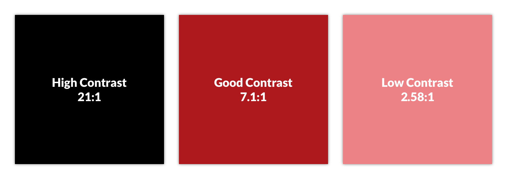
-
High contrast: #FFFFFF on #000000
-
Good contrast: #FFFFFF on #AD191E
-
Low contrast: #FFFFFF on #EC8286
Resources:
WEB-144 - Text can be enlarged to 200% without breaking the page (Required)
This check ensures that users can increase text size up to 200% without triggering layout issues, content loss, or the need for horizontal scrolling (except for elements where it's essential, like data tables). This supports users with low vision or reading disabilities who rely on browser zoom or custom styles. The goal is to maintain readability and usability at larger text sizes.
-
Checklist: Text can be resized up to 200% without loss of content or functionality
-
Standard: WCAG 1.4.4 Resize Text
-
Tier: Required
-
Category: Layout & responsiveness
-
Experience Standard: Comprehension: User can perceive all meaningful elements.
-
Severity: Medium or High
How to Test:
-
Tools Needed: Browser zoom controls, Operating system, Chrome DevTools, Resize text bookmarklet
-
Steps:
-
Browser zoom
-
Zoom the page to 200% -
Ctrl++(Windows) /Cmd++(Mac)
-
-
or Resize text bookmarklet
-
Activate the bookmarklet and verify that text has increased in size
-
-
or increase the font size in your OS to 200%
-
Confirm that:
-
All text remains visible and readable
-
No content is cut off, overlapped, or hidden
-
No horizontal scrolling is required for non-essential content
-
Interactive elements (buttons, links, inputs) remain usable
-
-
Examples:
-
Pass:
-
Text enlarges smoothly, and content reflows within the viewport without overlap or clipping.
-
-
Fail:
-
Enlarged text causes buttons to overlap or forces horizontal scrolling to read paragraphs.
-
WEB-145 - No images of text (Required)
This check ensures that meaningful text is not embedded in images, which can be inaccessible to screen readers and difficult to resize or customize. Instead, text should be implemented using HTML and CSS to ensure it’s selectable, resizable, and readable by assistive technologies. Exceptions are allowed only when the image of text is essential (e.g., logos or stylized branding).
-
Checklist: Images of text are not used when the same presentation can be made with native HTML/CSS
-
Standard: WCAG 1.4.5 Images of Text
-
Tier: Required
-
Category: Images
-
Experience Standard: Comprehension: User can perceive all meaningful elements.
-
Severity: High or Critical
How to Test:
-
Tools Needed: Manual inspection, Chrome DevTools
-
Steps:
-
Look for:
-
Banners, buttons, or headings that appear to contain text but are actually images
-
Infographics or stylized visuals with embedded text
-
-
Hover over the element to see if the text is selectable, if not, it may be an image.
-
Inspect images using DevTools and check for embedded text.
-
Confirm that any text shown in images is decorative or branding only.
-
Validate that meaningful text is rendered using HTML/CSS, not images.
-
-
Examples:
-
Pass
-
Logos are an exception to this test case
-

-
-
Fail
-
Text doesn’t scale and may become pixelated when zoomed in, even with alt text the user may not understand the hierarchy, nor formatting of text
-

-
WEB-1410 - Content fits on small screens without horizontal scrolling (Required)
This check ensures that content can be viewed and interacted with on small screens (e.g., 320px wide or 1280px wide @ 400% zoom) without requiring horizontal scrolling. Users with low vision or those using mobile devices or screen magnifiers must be able to access all content without losing functionality or context. The goal is to support responsive, accessible layouts that adapt to various screen sizes.
-
Checklist: Content reflows to a single-dimension scroll at 320x256 CSS pixels and larger
-
Standard: WCAG 1.4.10 Reflow
-
Tier: Required
-
Category: Layout & responsiveness
-
Experience Standard: Comprehension: User can perceive all meaningful elements.
-
Severity: High or Critical
How to Test:
-
Tools Needed: Chrome DevTools (device emulation)
-
Steps:
-
Chrome DevTools
-
Open DevTools (
Ctrl+Shift+Ior right-click → Inspect). -
Toggle Device Toolbar (
Ctrl+Shift+M) to enter responsive mode. -
Set the viewport width to 320px (common small screen width)
-
OR set the screen width to 1280px and zoom in by 400%
-
-
Examples:
-
Pass:
-
Text, buttons, and images reflow vertically and remain fully visible at 320px width.
-
-
Fail:
-
Content overflows the viewport, requiring horizontal scrolling to read text or access controls.
-
WEB-1411 – Non-text contrast
WEB-1411-001 - Interactive elements are visually distinct from surroundings (Required)
This check ensures that interactive elements, such as buttons, links, toggles, and form controls, are visually distinguishable from their surrounding content. To meet WCAG 1.4.11, these components must have a contrast ratio of at least 3:1 against adjacent colors for their default, hover, and focus states. This helps users with low vision or color perception challenges identify actionable elements.
-
Checklist: Interactive UI components achieve a 3:1 contrast ratio against adjacent colors
-
Standard: WCAG 1.4.11 Non-text Contrast
-
Tier: Required
-
Category: Color, contrast, & sensory
-
Experience Standard: Comprehension: User can perceive all meaningful elements.
-
Severity: High or Critical
How to Test:
-
Tools Needed: TPGi Colour Contrast Analyzer, Chrome DevTools
-
Steps:
-
Scan the page for:
-
Buttons, links, toggles, checkboxes, radio buttons
-
Custom controls (e.g., dropdowns, sliders)
-
-
TPGi Colour Contrast Analyzer
-
Measure contrast between:
-
The interactive element (e.g., button background or border)
-
Its adjacent background or surrounding container
-
-
Confirm that the contrast ratio is ≥ 3:1
-
-
Use Chrome DevTools to inspect styles and test pseudo-classes
-
Open DevTools (
Ctrl+Shift+Ior right-click → Inspect). -
Right-click the interactive element (e.g., button, link, toggle) in the Elements panel and choose "Force state" or "Toggle Element State".
-
Select the pseudo-class you want to simulate:
-
:hover -
:focus -
:active -
:visited(for links)
-
-
With the state toggled on:
-
Use the Styles pane to inspect how the element’s appearance changes.
-
Confirm that the visual indicator (e.g., background, border, outline) maintains at least 3:1 contrast against adjacent colors in each state.
-
Use the TPGi Colour Contrast Analyzer to measure contrast between the element and its surroundings in each state.
-
-
-
Examples:
-
Pass
-
The first radio button shows the default state with a grey (
#949494) circle. The second and third show the radio button selected and filled with a color that contrasts with the color adjacent to the component. The last example shows the state indicator contrasting with the component colors.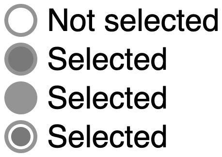
-
-
Fail
-
The borders of the input fields, and the background of the “Send message” buttons, have an insufficient contrast ratio of
1.5:1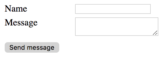
-
Exceptions:
-
Disabled UI components are exempt from meeting contrast minimums
WEB-1411-002 - Important graphics and icons have sufficient contrast (Required)
This check ensures that important visual elements, such as icons, status indicators, and graphical controls, are distinguishable from their background with a contrast ratio of at least 3:1. This helps users with low vision or color perception challenges perceive and understand non-text content. The goal is to make all meaningful graphics visually accessible.
-
Checklist: Essential graphical objects have a 3:1 contrast ratio against adjacent colors
-
Standard: WCAG 1.4.11 Non-text Contrast
-
Tier: Required
-
Category: Color, contrast, & sensory
-
Experience Standard: Comprehension: User can perceive all meaningful elements.
-
Severity: High
How to Test:
-
Tools Needed: TPGi Colour Contrast Analyzer
-
Steps:
-
Identify meaningful graphics and icons
-
Look for:
-
Status icons (e.g., checkmarks, warnings, errors)
-
Action icons (e.g., trash, edit, download)
-
Visual indicators (e.g., progress bars, toggles, sliders)
-
-
Exclude purely decorative images (covered under WEB-111-003)
-
-
TPGi Colour Contrast Analyzer
-
Sample the foreground (icon, graphic) and background colors.
-
Confirm that the contrast ratio is ≥ 3:1 in all interactive states.
-
-
Examples:
-
Pass
-
The phone icon is a simple shape within the orange (
#E3660E) circle. The meaning can be understood from that icon alone, the background behind the circle is irrelevant. The orange background and the white icon have a contrast ratio greater than 3:1, which passes.The graphical object is the white phone icon.

-
-
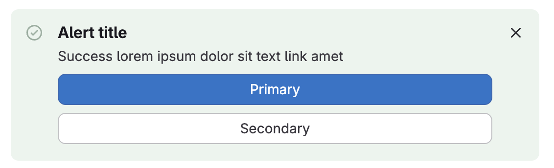
Fail
-
The success icon in this success alert provides context to users, but the color contrast ratio of 2.1:1 is below the required 3:1
-
WEB-1412 - Text remains readable when spacing is adjusted (Recommended)
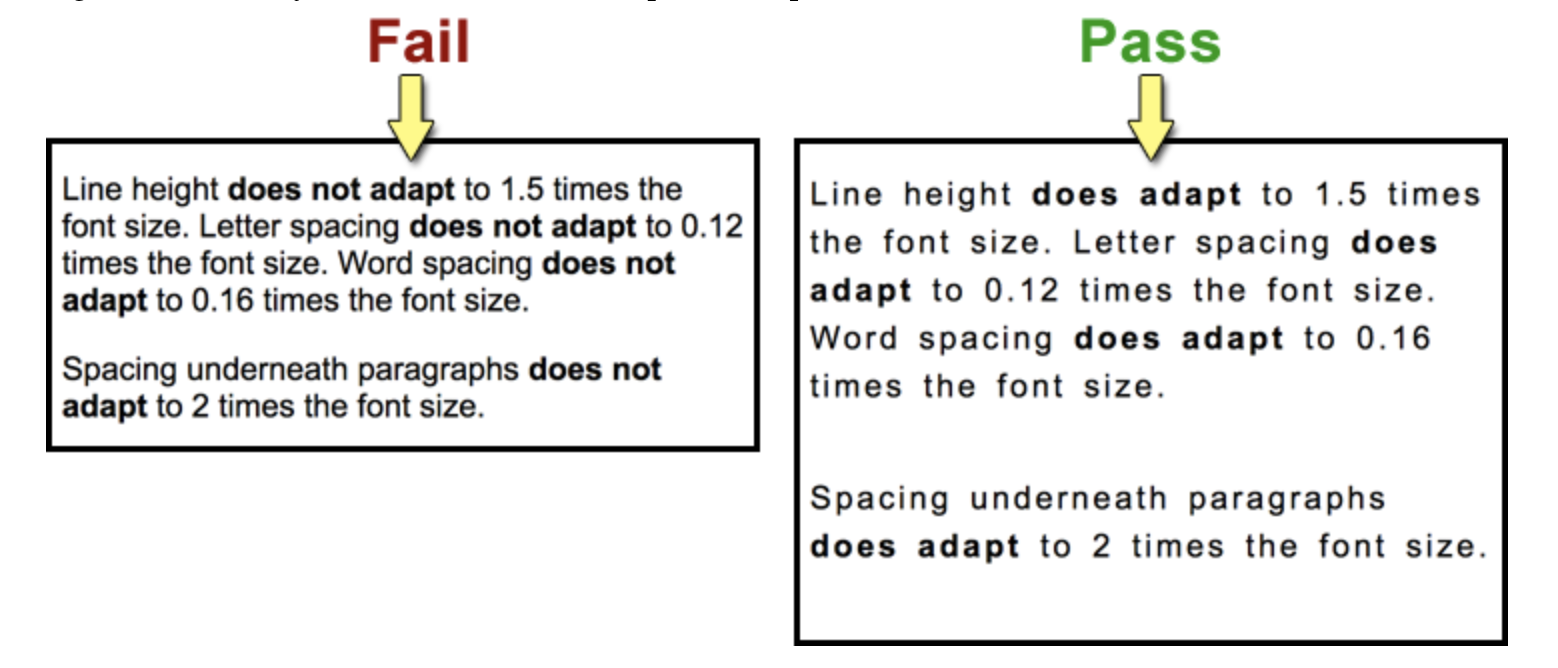
This check ensures that users can override default text spacing, including line height, letter spacing, word spacing, and paragraph spacing, without breaking layout or losing content. This supports users with dyslexia, low vision, or cognitive disabilities who rely on custom styles for readability. The goal is to maintain legibility and functionality when spacing is adjusted.
-
Checklist: No content or functionality is lost when users adjust text spacing: line spacing of 1.5x font size, letter spacing at 0.12x font size, word spacing at 0.16x font size
-
Standard: WCAG 1.4.12 Text Spacing
-
Tier: Recommended
-
Category: Layout & responsiveness
-
Experience Standard: Comprehension: User can perceive all meaningful elements.
-
Severity: Low or Medium
How to Test:
-
Tools Needed: Text spacing bookmarklet
-
Steps:
-
Activate text spacing bookmarklet
-
Confirm that:
-
Text remains readable and does not overlap, truncate, or disappear
-
No content or functionality is lost
-
Interactive elements (e.g., buttons, links) remain usable
-
Layout adapts without requiring horizontal scrolling
-
-
Examples:
-
Pass
-
Paragraphs reflow with increased spacing, and all content remains visible and functional.
-
-
Fail
-
Text overlaps or is clipped due to fixed-height containers or overflow restrictions.
-
WEB‑1413 - Content triggered by hover or focus is dismissible by other means (Advanced)
When additional content (such as tooltips, dropdowns, or popovers) is triggered by hover or focus, users must be able to dismiss it without being forced to move their pointer or focus away. This ensures that users who rely on keyboard navigation or assistive technologies can control their experience without losing their place. The goal is to ensure that supplemental content does not trap users or interfere with task completion.
-
Checklist: Content triggered by hover or focus can be dismissed without requiring the user to move the pointer or focus.
-
Standard: WCAG 1.4.13 - Content on Hover or Focus
-
Tier: Advanced
-
Category: Color, contrast, & sensory
-
Experience Standard: Usability: User can complete necessary flows.
-
Severity: High or Critical
How to Test:
-
Tools Needed: Manual inspection
-
Steps:
-
Keyboard navigation
-
Tab to elements that trigger hover/focus content.
-
Confirm that pressing Escape or another clear mechanism dismisses the content while keeping focus on the triggering element.
-
-
Examples:
-
Pass:
-
A tooltip appears on focus and can be dismissed by pressing Escape, while focus remains on the triggering button.
-
A dropdown menu opens on hover but includes a close button that can be activated without moving the pointer.
-
A popover triggered by focus can be dismissed by pressing Escape or activating a “Close” control.
-
-
Fail:
-
A tooltip appears on hover and can only be dismissed by moving the mouse away.
-
A dropdown menu triggered by focus cannot be dismissed without tabbing away from the triggering element.
-
A popover remains visible until the user clicks elsewhere, with no keyboard‑accessible dismissal method.
-
WEB-211 - All functionality works with keyboard only (Required)
This check ensures that users can operate all interactive components including navigation, forms, modals, menus, and custom widgets, using only a keyboard. This supports users with motor disabilities, screen reader users, and anyone relying on keyboard navigation. The goal is to ensure full functionality without requiring a mouse or touch input.
-
Checklist: All interactive elements and features can be accessed and operated using only a keyboard
-
Standard: WCAG 2.1.1 Keyboard
-
Tier: Required
-
Category: Keyboard & focus
-
Experience Standard: Usability: User can complete necessary flows.
-
Severity: Critical
How to Test:
-
Tools Needed: Manual keyboard testing
-
Steps:
-
Test with keyboard only
-
Use
Tab,Shift+Tab,Enter,Space, and arrow keys to:-
Navigate through all interactive elements
-
Activate buttons, links, toggles, dropdowns, and modals (using
EnterorSpaceor arrow keys) -
Interact with custom components (e.g., accordions, sliders, tabs)
-
-
Confirm that:
-
All functionality is reachable and operable
-
-
-
Examples:
-
Pass:
-
A modal opens with
Enter, traps focus inside, and closes withEscor a keyboard-accessible button.
-
-
Fail:
-
A dropdown menu opens only on hover and cannot be activated with the keyboard.
-
WEB-212 - No keyboard trap (Required)
This check ensures that users can move focus into and out of all interactive components using only a keyboard. A keyboard trap occurs when a user can tab into a component (like a modal, menu, or custom widget) but cannot tab out or escape it. The goal is to ensure that all users, especially those relying on keyboard navigation, can move freely throughout the interface.
-
Checklist: Users can move keyboard focus away from any element using standard keys
-
Standard: WCAG 2.1.2 No Keyboard Trap
-
Tier: Required
-
Category: Keyboard & focus
-
Experience Standard: Usability: User can complete necessary flows.
-
Severity: Critical
How to Test:
-
Tools Needed: Manual keyboard testing
-
Steps:
-
Navigate the page using only the keyboard
-
Use
TabandShift+Tabto move forward and backward through focusable elements. -
Use
Enter,Space, andEscto interact with components like:-
Modals
-
Menus
-
Accordions
-
Custom widgets
-
-
-
Check for keyboard traps
-
Confirm that:
-
You can enter and exit all components using only the keyboard
-
Focus is not stuck inside any element
-
If focus is intentionally trapped (e.g., in a modal), there is a clear, keyboard-accessible way to exit (e.g.,
Esckey or close button)
-
-
-
Examples:
-
Pass:
-
A modal traps focus while open, but pressing
Escor activating a close button returns focus to the triggering element.
-
-
Fail:
-
A custom dropdown traps focus, and
TaborEscdoes not allow the user to exit.
-
WEB‑214 - Single‑key shortcuts can be turned off or customized (Advanced)
Single‑character keyboard shortcuts (such as pressing “S” to save or “D” to delete) can create accessibility barriers, especially for users of assistive technologies like screen readers, voice input, or switch devices. These shortcuts may conflict with commands or be triggered unintentionally. To prevent this, shortcuts must either be:
-
Turned off by default,
-
Remapped to include modifier keys (e.g., Ctrl, Alt), or
-
Active only when the component that uses them has focus.
The goal is to ensure that users can control or customize single‑key shortcuts so they do not interfere with accessibility or usability.
-
Checklist: Any single‑character keyboard shortcuts can be turned off, remapped to include modifiers, or are active only when the component has focus.
-
Standard: WCAG 2.1.4 - Character Key Shortcuts
-
Tier: Advanced
-
Category: Keyboard & focus
-
Experience Standard: Usability: User can complete necessary flows.
-
Severity: High or Critical
How to Test:
-
Tools Needed: Manual inspection, Chrome DevTools
-
Steps:
-
Review functionality
-
Identify any features that use single‑character keyboard shortcuts (e.g., pressing “S” to save, “D” to delete).
-
Confirm whether these shortcuts can be disabled or customized.
-
Verify that shortcuts only activate when the relevant component has focus.
-
-
Chrome DevTools
-
In the right-hand sidebar of the Elements panel (alongside "Styles", "Computed", etc.), click the Event Listeners tab. Inspect event listeners for
keydownorkeypressand the specific character keys. -
Confirm that shortcuts are scoped to the component and not document, body, etc.
-
Verify that there is a mechanism to disable or remap the shortcut.
-
-
Keyboard navigation
-
Test the shortcut with the component unfocused.
-
Confirm that it does not trigger unintended actions.
-
-
Test the shortcut with the component focused.
-
Confirm that it works as expected.
-
-
Check for a settings option or configuration that allows users to turn off or remap the shortcut.
-
-
Examples:
-
Pass:
-
A text editor uses “S” as a shortcut for save, but only when the editor has focus.
-
A web app allows users to disable single‑key shortcuts in the settings menu.
-
A shortcut is remapped to require a modifier key, such as Ctrl+S instead of just “S.”
-
-
Fail:
-
Pressing “D” anywhere on the page deletes a record, even when the user is typing in a form field.
-
A single‑key shortcut is always active and cannot be turned off or customized.
-
A shortcut triggers actions regardless of focus, interfering with screen reader commands.
-
WEB‑221 - Time limits can be turned off or extended (Advanced)
Time limits can create barriers for users who need more time to read, understand, or interact with content. To ensure accessibility, any time limits must be either:
-
Disabled,
-
Extended (with a warning at least 20 seconds before expiration and the ability to extend at least ten times), or
-
Significantly adjusted.
Exceptions apply when timing is essential (such as real‑time events), when the time limit is 20 hours or more, or when the timing is fundamental to the activity. The goal is to ensure that users are not unfairly restricted by time constraints and can complete tasks at their own pace.
-
Checklist: Any time limits can be disabled, extended (with a 20‑second warning and the ability to extend at least ten times), or significantly adjusted; unless the timing is essential, a real‑time event, or the limit is 20 hours or more.
-
Standard: WCAG 2.2.1 - Timing Adjustable
-
Tier: Advanced
-
Category: Timing & interruptions
-
Experience Standard: Usability: User can complete necessary flows.
-
Severity: High
How to Test:
-
Tools Needed: Manual inspection, Chrome DevTools
-
Steps:
-
Review functionality
-
Identify any features that impose time limits (e.g., session timeouts, auto‑logout, timed interactions).
-
Work with engineering and security to understand timing implementations
-
-
Satisfy conditions of timeout (wait 5 minutes, etc.)
-
Confirm whether users are warned at least 20 seconds before the time limit expires.
-
Verify that users can extend the time limit at least ten times.
-
Check whether users can disable or significantly adjust the time limit.
-
-
Keyboard/interaction testing
-
Trigger the time‑limited feature.
-
Observe whether a warning appears before expiration.
-
Attempt to extend or disable the time limit.
-
Confirm that the extension mechanism is accessible via keyboard and does not require pointer movement.
-
-
Chrome DevTools
-
Inspect scripts or timers (
setTimeout,setInterval). -
Confirm that extension or disable mechanisms are coded and available to users.
-
Verify that exceptions (real‑time events, essential timing, or limits ≥ 20 hours) are documented and justified.
-
-
Examples:
-
Pass:
-
A session timeout warning appears 20 seconds before expiration, with a button to extend the session up to ten times.
-
A timed quiz allows users to disable the timer or extend it multiple times.
-
A video stream with a 24‑hour limit is exempt because the time exceeds 20 hours.
-
-
Fail:
-
A login session expires after 5 minutes with no warning and no option to extend.
-
A timed activity ends abruptly without giving users the ability to adjust or disable the limit.
-
A countdown timer is enforced for a non‑essential task, and users cannot extend or disable it.
-
WEB-222 - Automatically moving content can be paused or stopped (Required)
This check ensures that users can pause, stop, or hide any automatically moving content, such as carousels, news tickers, or animated banners, if it lasts longer than 5 seconds. Continuous motion can be distracting or disorienting for users with cognitive or visual impairments. The goal is to give users control over motion to maintain focus and readability.
-
Checklist: All moving, blinking, scrolling, or auto-updating content provides mechanisms to pause, stop, hide, or control its frequency
-
Standard: WCAG 2.2.2 Pause, Stop, Hide
-
Tier: Required
-
Category: Timing & interruptions
-
Experience Standard: Health and Safety: User can safely use http://VA.gov or VA Mobile App products
-
Severity: Critical
How to Test:
-
Tools Needed: Manual inspection
-
Steps:
-
Identify automatically moving content
-
Look for:
-
Auto-advancing carousels or slideshows
-
News tickers or scrolling text
-
Background animations or moving banners
-
Auto-updating content (e.g., live scores, stock tickers)
-
-
-
Observe motion duration and behavior
-
Confirm whether the motion:
-
Starts automatically
-
Lasts longer than 5 seconds
-
Repeats or loops continuously
-
-
-
Check for pause, stop, or hide mechanisms
-
If the motion lasts longer than 5 seconds:
-
Look for visible controls that allow the user to pause, stop, or hide the motion
-
Confirm that these controls are:
-
Clearly labeled
-
Keyboard accessible
-
Exposed to assistive technologies (e.g., screen readers)
-
-
-
-
Examples:
-
Pass:
-
An animated gif auto-plays but stops after n cycles (within 5 seconds)
-
-
Fail:
-
A scrolling banner loops indefinitely with no way to pause or stop it.
-
WEB‑231 - Nothing flashes more than three times per second (Advanced)
Flashing content can cause seizures or other adverse reactions for users with photosensitive epilepsy. To prevent this, no content may flash more than three times in any one‑second period. The goal is to ensure that all users can safely interact with content without risk of physical harm.
-
Checklist: No content may flash more than three times per any one‑second period.
-
Standard: WCAG 2.3.1 -Three Flashes or Below Threshold
-
Tier: Required
-
Category: Color, contrast, & sensory
-
Experience Standard: Health and Safety: User can safely use http://VA.gov or VA Mobile App products
-
Severity: Critical
How to Test
-
Tools Needed: Manual inspection, Chrome DevTools (PEAT optional for advanced testing)
-
Steps:
-
Review visual layout
-
Verify if the page contains any elements that flash, blink, or rapidly change such as sudden light to dark changes
-
Observe the flashing elements and determine if the flash frequency is higher than 3Hz.
-
This can be done with a reasonable degree of confidence without any tools by counting out seconds:
-
“ONE and ah TWO and ah THREE and ah…”
-
This equates to 3 vocalizations per second.
-
If content flashes at or greater than 3 vocalizations per second go to next step
-
-
-
PEAT
-
Verify flash frequency
-
-
Examples:
-
Pass:
-
An animation flashes twice per second and then stops.
-
A banner cycles through colors once per second.
-
A video includes flashing lights but at a rate below three flashes per second.
-
-
Fail:
-
A promotional banner flashes five times per second to attract attention.
-
A warning message blinks continuously at a rapid rate.
-
A video clip includes strobe effects flashing more than three times per second.
-
WEB-241 - Users can skip repeated content like headers and navigation (Required)
This check ensures that users can bypass repeated content, such as headers, navigation menus, or sidebars, and jump directly to the main content of the page. This is especially important for keyboard and screen reader users who would otherwise have to tab through the same elements on every page. The goal is to improve efficiency and reduce cognitive load.
-
Checklist: Pages include a mechanism to bypass repeated blocks of content (e.g., navigation, headers) such as a skip link, HTML5 landmarks, etc.
-
Standard: WCAG 2.4.1 Bypass Blocks
-
Tier: Required
-
Category: Navigation & consistency
-
Experience Standard: Efficiency: User encounters no repetition or redundancy.
-
Severity: High
How to Test:
-
Tools Needed: Manual keyboard testing, VA11y bookmarklet
-
Steps:
-
Use keyboard to test skip link
-
Load the page and press
Tabimmediately. -
Confirm that a “Skip to main content” link appears visually and is announced by a screen reader.
-
Press
Enterto activate the link. -
Confirm that focus moves to the main content container.
-
-
VA11y bookmarklet
-
Activate the VA11y bookmarklet
-
Open VA11y and select the Tools tab
-
Activate the “Page structure” toggle
-
Review the page for:
-
Presence of landmark regions such as:
-
banner(site header) -
navigation(main nav) -
main(primary content area) -
complementary,region,contentinfo, etc.
-
-
-
-
Examples:
-
Pass:
-
A visible skip link appears on first tab press and moves focus to
<main>or content container.
-
-
Fail:
-
No skip link is present, or it does not move focus when activated.
-
WEB-242 - Each page has a unique, descriptive title (Required)
This check ensures that each page includes a <title> element in the <head> that is both unique and descriptive. The title is typically displayed in browser tabs, bookmarks, and screen reader announcements, making it critical for orientation and navigation. Generic titles like “Home” or “Untitled Page” fail this requirement unless scoped appropriately.
-
Checklist: Each web page or screen has a unique and descriptive title reflecting its purpose
-
Standard: WCAG 2.4.2 Page Titled
-
Tier: Required
-
Category: Structure & semantics
-
Experience Standard: Usability: User can identify an element and its state.
-
Severity: Low or Medium
How to Test:
-
Tools Needed: Manual inspection
-
Steps:
-
Check the browser tab
-
Load the page and look at the tab label.
-
Confirm that the title:
-
Accurately reflects the page’s purpose or content
-
Is specific enough to distinguish it from other pages
-
Aligns with the H1 (the two do not need to match, but be aligned)
-
-
-
Examples:
-
Pass:
-
“VA Health Benefits Overview” for a page describing health benefits
-
-
Fail:
-
“VA Form 21P-530A” across multiple pages of the form flow
-
WEB-243 - Tab order follows a logical sequence (Recommended)
This check ensures that when users navigate using the keyboard (Tab, Shift+Tab), focus moves through the page in a logical, intuitive sequence that matches the visual and reading order. A disordered tab sequence can confuse users, especially those using screen readers or keyboard-only navigation. The goal is to preserve usability and comprehension through consistent focus flow.
-
Checklist: Keyboard focus moves through interactive elements in a meaningful order
-
Standard: WCAG 2.4.3 Focus Order
-
Tier: Recommended
-
Category: Keyboard & focus
-
Experience Standard: Usability: User can complete necessary flows.
-
Severity: High or Critical
How to Test:
-
Tools Needed: Manual keyboard testing
-
Steps:
-
Navigate the page using only the keyboard
-
Use
TabandShift+Tabto move forward and backward through focusable elements. -
Confirm that:
-
Focus follows a logical top-to-bottom, left-to-right reading order
-
Interactive elements are not skipped or repeated
-
Modal dialogs, menus, and widgets maintain expected focus behavior
-
-
-
Examples:
-
Pass:
-
Focus moves from the site logo → navigation → search → main content → footer in visual order.
-
-
Fail:
-
Focus jumps from the header to the footer, skipping the main navigation and content.
-
Lack of focus management
-
Focus does not move to a modal dialog when opened
-
Focus does not return to the triggering element when a modal dialog is closed
-
Focus remains on the “Continue/Submit” button when navigating between Single Page Application (SPA) screens
-
-
WEB-244 - Links are descriptive (Recommended)
This check ensures that link text is meaningful on its own or in context, especially for screen reader users who may navigate by links alone. Avoid vague phrases like “Click here” or “Read more” unless accompanied by surrounding context or ARIA attributes that clarify the purpose. The goal is to help users understand where a link will take them or what action it performs.
-
Checklist: Link text or its accessible name describes the link's destination or purpose
-
Standard: WCAG 2.4.4 Link Purpose (In Context)
-
Tier: Recommended
-
Category: Forms & interactive controls
-
Experience Standard: Comprehension: User knows where a button or link leads.
-
Severity: High or Critical
How to Test:
-
Tools Needed: Chrome DevTools, VA11y bookmarklet
-
Steps:
-
Review all links and look for:
-
Vague or generic link text (e.g., “Click here”, “More”, “Details”)
-
Repeated link phrases used in multiple places
-
Links that rely on nearby visual context (e.g., headings or labels)
-
External links
-
Links that download a file
-
-
Manual inspection
-
If a link opens a new tab or window, does the link provide that context either through additional text “opens in a new tab” or programmatically?
-
If a link is a link to a file, does the link include the file type such as “(PDF)”?
-
-
VA11y bookmarklet
-
Activate the VA11y bookmarklet
-
Open VA11y and select the Name tab
-
Focus on potentially vague links
-
Review the VA11y information to determine if additional context is being provided programmatically
-
-
Chrome Devtools
-
Open DevTools (
Ctrl+Shift+Ior right-click → Inspect). -
Inspect each
<a>element:-
Review the link text and any additional details, such as screen reader only text,
aria-label,aria-labelledby,aria-describedby
-
-
-
Examples:
-
Pass
-
“Download the VA Health Benefits Guide (PDF)” clearly describes the action and file type.
-
-
Fail
-
Links that open a new window or tab, but are not indicated “opens in a new tab”
-
Links that are file download links, but don’t indicate filetype (informing the user that the link is going to download a file)
-
WEB-245 - Pages can be found in multiple ways (Recommended)
This check ensures that users can locate pages using more than one method including navigation menus, search functionality, site maps, or contextual links. This supports users with different navigation preferences and helps those using assistive technologies find content efficiently. The goal is to reduce reliance on a single path and improve overall discoverability.
-
Checklist: Two or more mechanisms of finding a webpage are available
-
Standard: WCAG 2.4.5 Multiple Ways
-
Tier: Recommended
-
Category: Navigation & consistency
-
Experience Standard: Findability: User has a path to the content or feature.
-
Severity: Low
How to Test:
-
Tools Needed: Manual inspection
-
Steps:
-
Confirm that pages can be accessed via at least two methods
-
Primary navigation menu
-
Search feature
-
Site map or index
-
Contextual links from related pages or content
-
Breadcrumb trail or hierarchical navigation
-
-
Validate that alternative paths are consistent and functional.
-
Check that users are not restricted to a single navigation method.
-
Exceptions:
-
Single Step in a Process: If the page is part of a sequential process (such as a VA form), providing multiple ways to find that page might not be necessary or appropriate.
-
Very Simple Content: For very simple sites or applications with only a few pages, multiple navigation methods might not add significant value.
Examples:
-
Pass:
-
A benefits overview page is linked from the main menu, appears in search results, and is referenced in related articles.
-
-
Fail:
-
A form page is only accessible via a direct link in an email and not discoverable from the site.
-
WEB-246 – Headings & Labels
WEB-246-001 - Headings are descriptive (Required)
This check ensures that visible headings help users understand the structure and purpose of each section. Descriptive headings support users who skim visually or navigate by headings using assistive technologies. The focus is on clarity of language, not markup or hierarchy.
-
Checklist: Heading text accurately describes the topic or purpose of the content that follows
-
Standard: WCAG 2.4.6 Headings and Labels
-
Tier: Required
-
Category: Structure & semantics
-
Experience Standard: Usability: User can identify an element and its state.
-
Severity: Medium or High
How to Test:
-
Tools Needed: Manual inspection
-
Steps:
-
Note: this test case is only concerned that headings are descriptive, it is not testing heading hierarchy or markup.
-
-
Review all visible headings
-
Confirm that each heading:
-
Clearly describes the content or function of the section it introduces
-
Uses specific, meaningful language
-
Avoids vague or generic phrases
-
-
Examples:
-
Pass:
-
“Eligibility Requirements for VA Benefits” clearly describes the section content.
-
-
Fail:
-
For content about eligibility requirements for VA Benefits, a heading of “Benefits” may be too vague to provide value
-
WEB-246-002 - Form labels clearly describe what to enter (Required)
This check ensures that visible labels on form fields and controls are descriptive enough to help users understand what information is expected. It supports users who rely on visual cues or screen reader navigation by providing clear, task-oriented language. The focus is on clarity of the visible label text, not programmatic association or markup.
-
Checklist: Labels describe the purpose or function of form fields and controls
-
Standard: WCAG 2.4.6 Headings and Labels
-
Tier: Required
-
Category: Forms & interactive controls
-
Experience Standard: Usability: User can identify an element and its state.
-
Severity: High or Critical
How to Test:
-
Tools Needed: Manual inspection
-
Steps:
-
Review all visible form labels
-
Confirm that each label:
-
Clearly describes the expected input or action
-
Uses specific, plain language (e.g., “Email address” instead of “Enter info”)
-
-
-
Examples:
-
Pass:
-
“Phone number (optional)” clearly communicates the expected input and its optionality.
-
-
Fail:
-
“Enter here” or “Info” as a label for a required field is ambiguous
-
WEB-247 - Every focusable element has a visible focus indicator (Required)
This check ensures that users navigating via keyboard can visually identify which element is currently focused. A visible focus indicator, such as an outline, border, or background change, helps users track their position and interact confidently. The goal is to support users who rely on keyboard navigation, including those with motor disabilities or screen reader users.
-
Checklist: All interactive elements show a visible outline or indicator when receiving keyboard focus
-
Standard: WCAG 2.4.7 Focus Visible
-
Tier: Required
-
Category: Keyboard & focus
-
Experience Standard: Comprehension: User can perceive all meaningful elements.
-
Severity: Critical
How to Test:
-
Tools Needed: Manual keyboard testing
-
Steps:
-
Navigate the page using only the keyboard
-
Use
TabandShift+Tabto move through all interactive elements:-
Links, buttons, form fields, toggles, menus, modals, custom widgets
-
-
Confirm that:
-
Each focusable element displays a visible change when focused
-
The indicator is clearly visible against the background
-
-
Note: A focus indicator may take several forms:
-
A user agent supplied “focus ring”
-
A site specific focus indicator
-
a background color change, underline, or another visual change to the element
-
-
-
Examples:
-
Pass:
-
A button shows a 2px blue outline when focused via keyboard.
-
-
Fail:
-
A link receives focus but shows no visual change, making it invisible to keyboard users.
-
WEB-2410 - Content is organized into sections (Required)
This check ensures that content is broken into clearly defined sections, each introduced by a heading that describes its purpose. This helps users understand the page structure and navigate efficiently, especially those using screen readers or keyboard shortcuts. The goal is to support comprehension and orientation through consistent use of headings.
-
Checklist: Content organized in sections includes section headings
-
Standard: WCAG 2.4.10 Section Headings
-
Tier: Recommended
-
Category: Structure & semantics
-
Experience Standard: Consistency: User's experience is consistent with the VA.gov design principles.
-
Severity: Low or Medium
How to Test:
-
Tools Needed: Manual inspection, Chrome Devtools, Show Headings bookmarklet, VA11y bookmarklet
-
Steps:
-
Review visual layout
-
Confirm that content is grouped into meaningful sections:
-
Each section should begin with a heading
-
Avoid long, unbroken blocks of content without headings
-
-
Show Headings bookmarklet
-
Activate bookmarklet
-
Confirm that each content grouping/section begins with a heading
-
-
VA11y bookmarklet
-
Activate the VA11y bookmarklet
-
Open VA11y and select the Headings tab
-
Confirm that each content grouping/section begins with a heading
-
-
Chrome Devtools
-
Inspect grouping/sections
-
Confirm that each section begins with a heading,
<h1>,<h2>, etc.
-
-
Examples:
-
Pass:
-
A benefits page is divided into “Eligibility,” “How to Apply,” and “Contact Us” sections, each with a clear heading.
-
-
Fail:
-
A page presents multiple topics in one continuous block with no headings to separate them.
-
WEB-2411 - The element with focus is always visible (Recommended)
This check ensures that when users navigate via keyboard, the focused element remains at least partially visible on screen. If focus lands on an element that’s hidden behind sticky headers, modals, or scroll containers, users may lose track of their position. The goal is to maintain visibility of the focused element to support orientation and operability.
-
Checklist: The element with focus remains visible and on‑screen and is not obscured by other content.
-
Standard: WCAG 2.4.11 Focus Not Obscured (Minimum)
-
Tier: Recommended
-
Category: Keyboard & focus
-
Experience Standard: Comprehension: User can perceive all meaningful elements.
-
Severity: Critical
How to Test:
-
Tools Needed: Manual keyboard testing
-
Steps:
-
Navigate the page using only the keyboard
-
Use
TabandShift+Tabto move through all focusable elements. -
Confirm that:
-
The focused element is at least partially visible in the viewport
-
It is not hidden behind sticky headers, footers, modals, or scrollable containers
-
-
-
Examples:
-
Pass:
-
Tabbing through a form scrolls the page as needed to keep the focused input visible.
-
-
Fail:
-
Focus lands on a button, but it’s completely hidden behind a fixed header.
-
Additional context:
-
Technically, if the focus is visible at all, then this test case passes (see example screenshot). However, for http://VA.gov , if the element is less than 50% visible, then the element can’t be considered usable, resulting in a failure of the experience standards.
WEB‑251 - All actions work with simple taps or clicks (Advanced)
Functions that require complex gestures (such as multipoint, path‑based, or timed gestures) must also be operable with simple pointer actions like a single tap, click, or double‑click. This ensures that users who cannot perform advanced gestures, including those using assistive technologies, alternative input devices, or with limited dexterity, can still access all functionality. The goal is to ensure that all actions are operable with straightforward, single‑pointer input.
-
Checklist: Functions requiring multipoint or path‑based gestures also work with single pointer actions.
-
Standard: WCAG 2.5.1 - Pointer Gestures
-
Tier: Advanced
-
Category: Pointer & motion
-
Experience Standard: Usability: User can complete necessary flows.
-
Severity: Critical
How to Test:
-
Tools Needed: Manual inspection, Chrome DevTools
-
Steps:
-
Review functionality
-
Identify any features that rely on gestures (e.g., pinch‑to‑zoom, swipe, drag‑and‑drop, drawing paths).
-
Confirm that each gesture‑based function can also be completed with a single pointer action either programmatically, or via other controls such as a button that performs the multipoint gesture action
-
-
Examples:
-
Pass:
-
A photo gallery allows users to swipe through images but also provides “Next” and “Previous” buttons that work with a single click.
-
A map supports pinch‑to‑zoom but also includes double tap to zoom and tap‑and‑hold with drag up/down to zoom in/out.
-
-
Fail:
-
A carousel requires swipe gestures and has no clickable controls for navigation.
-
A zoom function only works with pinch gestures and cannot be activated with a single tap, double tap, or tap‑and‑hold.
-
WEB‑252 - Actions happen on release and can be cancelled (Advanced)
Pointer actions (such as taps, clicks, or presses) must execute on the up‑event (release) rather than the down‑event (initial press). This ensures that users have the opportunity to cancel the action before release - moving the pointer away or lifting a finger outside the target area. The goal is to prevent accidental activation and give users control over whether an action is completed.
-
Checklist: Pointer actions execute on the up‑event and can be cancelled before release.
-
Standard: WCAG 2.5.2 - Pointer Cancellation
-
Tier: Advanced
-
Category: Pointer & motion
-
Experience Standard: Usability: User can complete necessary flows.
-
Severity: Critical
How to Test
-
Tools Needed: Manual inspection, Chrome DevTools
-
Steps:
-
Review functionality
-
Identify interactive elements (buttons, links, controls) that respond to pointer input.
-
Confirm that actions are triggered on release (up‑event), not on initial press (down‑event).
-
Verify that users can cancel the action by moving the pointer/finger away before release.
-
-
Keyboard/pointer testing
-
Press and hold on an interactive element.
-
Move the pointer/finger away before releasing.
-
Confirm that the action does not execute when released outside the target.
-
Release inside the target and confirm that the action executes correctly.
-
-
Chrome DevTools
-
Inspect event listeners for
mousedown,mouseup,touchstart, andtouchend. -
Confirm that activation is bound to
mouseuportouchendrather thanmousedownortouchstart. -
Verify that cancellation logic exists (e.g., ignoring release events outside the target area).
-
-
Examples:
-
Pass:
-
A button executes its action only when the user releases the click (
mouseup) inside the button. -
A mobile app control activates on
touchend, allowing the user to slide their finger away to cancel. -
A custom widget ignores
mousedownand only responds tomouseupwithin its boundaries.
-
-
Fail:
-
A button executes immediately on
mousedown, leaving no way to cancel the action. -
A link activates on
touchstart, even if the user moves their finger away before release. -
A control triggers an irreversible action as soon as the pointer is pressed, without waiting for release.
-
WEB‑253 - Visual labels match what screen readers announce (Advanced)
For user interface components with labels that include text or images of text, the accessible name must contain the text that is presented visually. This ensures that what sighted users see is consistent with what screen reader users hear. The goal is to prevent confusion and guarantee that all users receive the same information about a component’s purpose.
-
Checklist: For user interface components with labels that include text or images of text, the accessible name contains the text that is presented visually.
-
Standard: WCAG 2.5.3 - Label in Name
-
Tier: Advanced
-
Category: Forms & interactive controls
-
Experience Standard: Usability: User can identify an element and its state.
-
Severity: High
How to Test:
-
Tools Needed: Manual inspection, screen reader, VA11y bookmarklet
-
Steps:
-
Review visual layout
-
Identify all user interface components with visible labels (buttons, links, form fields).
-
Confirm that the visible label text is clear and descriptive.
-
-
VA11y bookmarklet
-
Activate the VA11y bookmarklet
-
Open VA11y and select the Name tab
-
Focus on each component.
-
Verify that the accessible name includes the visible label text (e.g., a button labeled “Search” has an accessible name that starts with the text “Search”).
-
Confirm that accessible names do not omit or replace the visible text with unrelated wording.
-
-
Screen reader
-
Navigate to each component using a screen reader.
-
Confirm that the screen reader announces the same text as the visible label.
-
Verify that no mismatches occur (e.g., screen reader announces “Go” while the visible label says “Search”).
-
-
Examples:
-
Pass:
-
A button visually labeled “Submit” has
<button>Submit</button>and the accessible name is “Submit.” -
An icon button with an image of a magnifying glass has
aria-label="Search", matching the visual meaning. -
A form field labeled “Email address” has
<label for="email">Email address</label>and the accessible name includes “Email address.”
-
-
Fail:
-
A button visually labeled “Search” has
aria-label="Go", so screen readers announce “Go” instead of “Search.” -
An icon button shows a trash can but has no accessible name, leaving screen reader users unaware of its purpose.
-
A form field visually labeled “Phone number” has
aria-label="Contact info", which does not match the visible label.
-
WEB-254 - Features don't require shaking or tilting the device (Required)
Some interfaces rely on motion‑based inputs, such as shaking, tilting, rotating, or device movement, to trigger actions. These interactions can be inaccessible to users with motor disabilities, users who cannot physically move their device, users who keep motion features disabled, or users who rely on assistive technologies. To ensure accessibility, any motion‑based action must also be available through standard, device‑independent inputs such as buttons, links, or other on‑screen controls.
-
Checklist: Motion-activated features have alternative input methods and can be disabled.
-
Standard: WCAG 2.5.4 Motion Actuation
-
Tier: Required
-
Category: Pointer & motion
-
Experience Standard: Usability: User can complete necessary flows.
-
Severity: Critical
How to Test:
-
Tools Needed: Manual testing
-
Steps:
-
Review functionality
-
Identify any features that rely on device motion (e.g., shake to undo, tilt to navigate, rotate to reveal content, motion‑triggered menus).
-
Confirm that each motion‑based action can also be completed using a device‑independent method such as a button, link, or other visible control.
-
-
Pointer / touch testing
-
Attempt to perform the action using on‑screen controls (e.g., tap a button instead of shaking the device).
-
Verify that the action completes successfully without requiring motion.
-
-
Keyboard testing
-
If applicable, attempt to perform the action using keyboard commands (e.g., Enter, Space, arrow keys).
-
Confirm that the action is operable without motion input.
-
-
Examples:
-
Pass
-
A “shake to undo” feature also includes an “Undo” button on screen.
-
A game that uses tilt controls also provides on‑screen directional buttons.
-
A feature that rotates content when the device is turned also includes a “Rotate” button.
-
-
Fail
-
A form can only be reset by shaking the device.
-
A navigation feature requires tilting the device with no alternative control.
-
A game requires rotating the device to move an object, with no button‑based alternative.
-
WEB‑257 - Drag‑and‑drop actions have click‑based alternatives (Advanced)
Drag‑and‑drop functionality can be difficult or impossible for some users, including those with limited dexterity, those using screen readers, or those relying on keyboard input. To ensure accessibility, any drag‑and‑drop action must also be available through simple pointer actions (click/tap), keyboard commands, or other non‑dragging methods. The goal is to ensure that all users can complete drag‑and‑drop tasks regardless of their input method.
-
Checklist: Drag functionality is also available through click, keyboard, or other non‑dragging methods.
-
Standard: WCAG 2.5.7 - Dragging Movements
-
Tier: Advanced
-
Category: Pointer & motion
-
Experience Standard: Usability: User can complete necessary flows.
-
Severity: Critical
How to Test
-
Tools Needed: Manual inspection, Chrome DevTools, keyboard
-
Steps:
-
Review functionality
-
Identify any features that require drag‑and‑drop (e.g., reordering lists, moving items between containers, resizing).
-
Confirm that each drag‑and‑drop action can also be completed with a click/tap, keyboard, other non‑dragging method, or other controls such as a button that performs the action.
-
-
Chrome DevTools
-
Inspect event listeners for
dragstart,dragend,drop. -
Confirm that alternative handlers exist for
onclick,onkeydown, or other non‑dragging events. -
Verify that drag‑and‑drop is not the only available method of interaction.
-
-
Examples:
-
Pass:
-
A sortable list allows drag‑and‑drop reordering but also includes “Move up” and “Move down” buttons operable by click or keyboard.
-
A file upload area supports drag‑and‑drop but also provides a “Browse” button to select files.
-
A kanban board allows dragging cards between columns but also includes a menu option to “Move to [column]” via click.
-
-
Fail:
-
A list can only be reordered by dragging items; no alternative controls are provided.
-
A file upload area requires drag‑and‑drop and has no “Browse” button.
-
A game requires dragging objects to targets, with no way to perform the action via click or keyboard.
-
WEB‑258 - Clickable elements are at least 24×24 pixels (Advanced)
Touch and click targets must have a minimum size of 24×24 CSS pixels to ensure they are easy to activate without accidental input. This requirement improves usability for users with limited dexterity, those using touchscreens, and those relying on alternative input devices. The goal is to ensure that all interactive elements are large enough or spaced enough to be reliably activated.
-
Checklist: All touch and click targets must have a clickable target size of at least 24×24 pixels unless the element is inline, controlled by the browser, or the “target offset” to all adjacent clickable elements is at least 24px.
-
Standard: WCAG 2.5.8 - Target Size (Minimum)
-
Tier: Advanced
-
Category: Pointer & motion
-
Experience Standard: Usability: User can complete necessary flows.
-
Severity: High or Critical
How to Test:
-
Tools Needed: Manual inspection, Target size bookmarklet, Chrome DevTools
-
Steps:
-
Review visual layout
-
Identify all clickable/touchable elements (buttons, links, icons, controls).
-
Confirm that each element appears large enough to be easily activated.
-
-
Target Size bookmarklet
-
Run the bookmarklet on the page.
-
Verify that all clickable elements meet the minimum 24×24 pixel requirement or satisfy one of the exceptions.
-
Use the overlay provided by the tool to visually confirm target dimensions and spacing.
-
-
Chrome DevTools
-
Inspect each clickable element.
-
Measure the bounding box dimensions in CSS pixels.
-
Verify that the target size is at least 24×24 pixels.
-
If smaller, check whether exceptions apply:
-
Inline element (e.g., link in text).
-
Native browser control (e.g., checkbox, radio button).
-
Target offset: confirm that spacing between adjacent elements is ≥ 24px.
-
-
-
Examples:
-
Pass:
-
A button is 40×40 pixels, exceeding the minimum requirement.
-
A small icon button is 20×20 pixels but has 30px of spacing around it, meeting the target offset exception.
-
Inline links in a paragraph are exempt because they are controlled by the browser.
-
-
Fail:
-
A 16×16 pixel icon button with no spacing between adjacent buttons.
-
A custom checkbox rendered at 18×18 pixels without sufficient spacing.
-
A navigation menu with tightly packed links, each smaller than 24×24 pixels and with less than 24px offset.
-
Exceptions:
-
The element is inline (e.g., links in a sentence),
-
The target size is controlled by the browser (e.g., native controls), or
-
The “target offset” (spacing between adjacent clickable elements) is at least 24px, ensuring sufficient separation.
WEB-311 - The page language is identified (Recommended)
This check ensures that the primary language of the page is programmatically identified using the lang attribute on the <html> element. This helps screen readers and other assistive technologies pronounce content correctly and apply appropriate language rules. Without it, users may experience mispronunciations or incorrect reading modes.
-
Checklist: The
<html>element includes a validlangattribute specifying the page’s primary language -
Standard: WCAG 3.1.1 Language of Page
-
Tier: Recommended
-
Category: Structure & semantics
-
Experience Standard: Comprehension: User encounters content that meets best practices.
-
Severity: Medium
How to Test:
-
Tools Needed: Chrome DevTools
-
Steps:
-
Chrome DevTools
-
Open DevTools (
Ctrl+Shift+Ior right-click → Inspect). -
Locate the
<html>element at the top of the DOM. -
Confirm that:
-
A
langattribute is present (e.g.,lang="en") -
The value matches the primary language of the visible content
-
-
-
Examples:
-
Pass:
-
<html lang="en">
-
-
Fail:
-
No
langattribute present, or incorrect language code used (e.g.,lang="xx")<html>
-
WEB-312 - Content in another language is identified (Recommended)
This check ensures that when a portion of content is written in a different language than the page’s default, it is marked with the appropriate lang attribute. This allows screen readers and other assistive technologies to switch pronunciation rules and reading modes accordingly. The goal is to support multilingual comprehension and prevent mispronunciation.
-
Checklist: Text in different languages from the page's primary language is marked with
langattributes -
Standard: WCAG 3.1.2 Language of Parts
-
Tier: Recommended
-
Category: Structure & semantics
-
Experience Standard: Comprehension: User encounters content that meets best practices.
-
Severity: Medium
How to Test:
-
Tools Needed: Chrome DevTools
-
Steps:
-
Scan the page for inline language changes
-
Look for:
-
Foreign phrases, quotes, or terms (e.g., “¡Bienvenidos!”, “raison d’être”, “Gesundheit”)
-
Sections of content written in a different language than the page’s default
-
-
-
Chrome DevTools
-
Inspect the element containing the foreign-language text.
-
Confirm that:
-
A
langattribute is present (e.g.,lang="es"for Spanish) -
The value matches the actual language of the content
-
-
-
Examples:
-
Pass:
-
<p lang="fr">Merci beaucoup</p>
-
-
Fail:
-
Spanish phrase is not marked with
lang="es"- screen readers may mispronounce it.<p>Gracias por su visita</p>
-
WEB-321 - Focusing on an element doesn't trigger unexpected changes (Recommended)
This check ensures that when users navigate to an element using the keyboard or assistive technology, it does not automatically trigger a change of context, such as submitting a form, opening a modal, navigating to a new page, or updating content. Focus alone should never cause unexpected behavior; users must be able to explore without fear of accidental activation.
-
Checklist: Focusing an element does not trigger a change of context
-
Standard: WCAG 3.2.1 On Focus
-
Tier: Recommended
-
Category: Keyboard & focus
-
Experience Standard: Usability: User can complete necessary flows.
-
Severity: Critical
How to Test:
-
Tools Needed: Manual keyboard testing
-
Steps:
-
Navigate the page using only the keyboard
-
Use
TabandShift+Tabto move through all focusable elements. -
Confirm that:
-
No element triggers a change of context just by receiving focus
-
Changes only occur when the user activates the element (e.g., presses
Enter, clicks)
-
-
-
Examples:
-
Pass:
-
Tabbing to a dropdown does not auto-submit the form or reload the page.
-
-
Fail:
-
Tabbing to a link or field causes a modal to open or redirects to another page.
-
WEB-322 - Interacting with form fields doesn't trigger unexpected changes (Recommended)
This check ensures that interacting with a form field, such as typing into a text box, selecting a dropdown option, or checking a box, does not automatically trigger a change of context. That includes submitting a form, navigating to a new page, opening a modal, or updating unrelated content. Users must be able to enter information without fear of unintended consequences.
-
Checklist: Changing form values does not automatically cause navigation or context changes without warning
-
Standard: WCAG 3.2.2 On Input
-
Tier: Recommended
-
Category: Keyboard & focus
-
Experience Standard: Usability: User can complete necessary flows.
-
Severity: High or Critical
How to Test:
-
Tools Needed: Manual form interaction
-
Steps:
-
Navigate the page using only the keyboard
-
Use
Tabto move through all form fields. -
Interact with each field:
-
Type into text inputs
-
Select options from dropdowns/selects
-
Check/uncheck boxes
-
-
Confirm that:
-
No change of context occurs automatically
-
Changes only occur after explicit user action (e.g., pressing
Enter, clicking a submit button)
-
-
-
Examples:
-
Pass:
-
Selecting a dropdown option updates the field value but does not reload the page or submit the form.
-
-
Fail:
-
Selecting a dropdown option immediately redirects to a new page or submits the form.
-
WEB-323 - Navigation structure is the same across pages (Recommended)
This check ensures that repeated navigation components, such as menus, headers, footers, and sidebars, appear in the same relative order across pages. Consistent navigation helps users build familiarity, reduces cognitive load, and supports predictable keyboard and screen reader navigation. The goal is to maintain structural consistency, not identical content.
-
Checklist: Navigation menus maintain consistent order and structure across multiple pages
-
Standard: WCAG 3.2.3 Consistent Navigation
-
Tier: Recommended
-
Category: Navigation & consistency
-
Experience Standard: Consistency: User's experience is consistent with the http://VA.gov design principles.
-
Severity: High
How to Test:
-
Tools Needed: Manual inspection
-
Steps:
-
Identify repeated navigation components
-
Includes:
-
Global navigation menus
-
Header and footer links
-
Sidebars or utility menus
-
Breadcrumbs or skip links
-
-
-
Compare across multiple pages
-
Confirm that:
-
The order of repeated navigation elements is the same
-
The placement (e.g., top, left, bottom) is consistent
-
The structure (e.g., nested lists, landmark regions) is preserved
-
-
-
Examples:
-
Pass:
-
The main menu appears first, followed by a search bar and utility links - it’s the same on every page.
-
-
Fail:
-
On one page, the search bar appears before the menu; on another, it’s after - this difference can be disrupting
-
Exceptions:
-
This test case applies to pages that are related or similar, but may not apply to landing pages or unique digital experiences.
WEB‑324 - Similar features have the same labels across pages (Advanced)
Consistency in labeling and functionality across pages is critical for usability and accessibility. When components with similar functionality (such as a header “Search” field, navigation links, or action buttons) are used across multiple pages, they must be labeled identically and function identically. This ensures that users can rely on predictable interactions and do not encounter confusion when navigating between pages.
-
Checklist: Any components with similar functionality used on multiple pages must be labeled identically and function identically.
-
Standard: WCAG 3.2.4 - Consistent Identification
-
Tier: Advanced
-
Category: Structure & semantics
-
Experience Standard: Consistency: User's experience is consistent with the http://VA.gov design principles.
-
Severity: Medium or High
How to Test:
-
Tools Needed: Manual inspection, Chrome DevTools, screen reader, VA11y bookmarklet
-
Steps:
-
Review visual layout
-
Identify components that appear across multiple pages (e.g., header search fields, navigation links, “Submit” buttons).
-
Confirm that the visible labels are identical across pages.
-
-
VA11y bookmarklet
-
Activate the VA11y bookmarklet
-
Open VA11y and select the Name tab
-
Run the bookmarklet on repeated components across different pages.
-
Verify that the accessible name includes the same text as the visible label, and that it is consistent across pages.
-
-
Screen reader
-
Navigate to the repeated components across different pages.
-
Confirm that the screen reader announces the same accessible name for each instance of the component.
-
Verify that functionality is consistent (e.g., the “Search” field behaves the same way on all pages).
-
-
Chrome DevTools
-
Inspect the DOM for each repeated component.
-
Confirm that accessible names (
aria-label,aria-labelledby, visible text) are consistent across pages. -
Verify that event handlers and functionality are identical (e.g., the same search form submission behavior).
-
-
Examples:
-
Pass:
-
A header “Search” field is labeled “Search” on all pages, and screen readers announce “Search” consistently.
-
A “Submit” button in forms across different pages always uses the label “Submit” and performs the same action.
-
Navigation links labeled “Contact Us” consistently point to the same destination and are announced identically.
-
-
Fail:
-
A header search field is labeled “Search” on one page and “Find” on another, causing inconsistency.
-
A “Submit” button is labeled “Submit” on one form and “Send” on another, even though both perform the same action.
-
A navigation link labeled “Help” points to different destinations depending on the page, confusing users.
-
WEB-326 - Help options appear in the same location on all pages (Recommended)
This check ensures that if a page provides help, such as contact info, live chat, FAQs, or inline guidance, those options appear consistently across pages in the same relative location. Predictable placement helps users quickly find support when needed, especially those with cognitive or memory-related disabilities. The goal is consistency, not uniformity of content.
-
Checklist: Help mechanisms (e.g., contact info, chat, self-help) appear in the same relative order on all pages
-
Standard: WCAG 3.2.6 Consistent Help
-
Tier: Recommended
-
Category: Navigation & consistency
-
Experience Standard: Consistency: User's experience is consistent with the http://VA.gov design principles.
-
Severity: Medium
How to Test:
-
Tools Needed: Manual inspection
-
Steps:
-
Identify help mechanisms
-
Includes:
-
Contact links (e.g., “Need help?”, “Contact support”)
-
Live chat widgets
-
Help center or FAQ links
-
Inline help icons or tooltips
-
Guided walkthroughs or contextual help
-
-
-
Compare across multiple pages
-
Confirm that:
-
Help options appear in the same relative location (e.g., top-right corner, footer, sidebar)
-
The order of help mechanisms is consistent
-
The type of help offered is consistent where applicable
-
-
-
Examples:
-
Pass:
-
A “Need help?” link appears in the top-right corner of every page, and a live chat widget is always docked bottom-right.
-
-
Fail:
-
On one page, help appears in the footer; on another, it’s in the header, or is missing entirely.
-
Exceptions:
-
This test case applies to pages that are related or similar, but may not apply to landing pages or unique digital experiences.
WEB-331 - Error messages are provided and are clear (Recommended)
This check ensures that when a user makes a mistake in a form, such as leaving a required field blank or entering invalid data, the error is clearly identified and described in text. The message must describe what went wrong, such as “This field is required” or “Invalid date format.” It does not need to explain how to fix the error, that’s covered under WEB-333
-
Checklist: Whenever an input error is detected, the user is informed of the error and how to correct it
-
Standard: WCAG 3.3.1 Error Identification
-
Tier: Recommended
-
Category: Forms & interactive controls
-
Experience Standard: Comprehension: User has enough information to complete a task.
-
Severity: Critical
How to Test:
-
Tools Needed: Manual form testing
-
Steps:
-
Trigger input errors
-
Leave required fields blank
-
Enter invalid formats (e.g., letters in a number field)
-
Submit the form
-
-
Confirm that an error message is provided
-
Must be:
-
Visible
-
Near the field or in a summary
-
Descriptive of the issue, not just a generic “Error”
-
-
-
Examples:
Note the distinction between WEB-331 and WEB 333.
-
WCAG 3.3.1 - Error Identification (WEB-331): Focuses on detecting and announcing that an error occurred.
-
Pass
-
“Phone number is invalid.”
-
-
Fail:
-
No error message
-
-
-
WCAG 3.3.3 - Error Suggestion (WEB-333): Focuses on helping the user fix the error.
-
Pass:
-
“Phone number must be 10 digits.”
-
-
Fail:
-
“Phone number is invalid.”
-
-
WEB-332 – Labels & Instructions
WEB-332-001 - Form fields have visible labels (Required)
This check ensures that all form fields, including text inputs, dropdowns, checkboxes, and radio buttons, have a visible label that clearly communicates what the field is for. Labels must be persistently visible (not just on hover or focus) and placed close to the field. This supports all users, especially those with cognitive or visual disabilities, by reducing ambiguity and improving form usability.
-
Checklist: Visible labels or instructions are available for all inputs and input groupings
-
Standard: WCAG 3.3.2 Labels or Instructions
-
Tier: Required
-
Category: Forms & interactive controls
-
Experience Standard: Usability: User can identify an element and its state.
-
Severity: Critical
How to Test:
-
Tools Needed: Manual inspection
-
Steps:
-
Identify all form fields
-
Includes:
-
Text inputs, textareas
-
Dropdowns, checkboxes, radio buttons
-
Date pickers, sliders, toggles
-
-
-
Confirm that each field has a visible label
-
Label must:
-
Be persistently visible (not hidden or only shown on hover/focus)
-
Be located near the field (above, beside, or within)
-
Clearly describe the field’s purpose
-
-
Note:
-
Placeholder text does not satisfy this test case, as placeholder text is not persistent
-
Well understood iconography, such as a eyeglass icon in a search field, meets the requirement of visible label
-
-
-
Examples:
-
Pass:
-
A text input for “Email address” has a visible label above it reading “Email address”.
-
-
Fail:
-
A dropdown has no visible label, and its purpose is unclear until options are navigated/selected
-
A text field has placeholder text, but that text disappears on focus and there is no other visible label
-
WEB-332-002 - Fields with specific formats include instructions (Required)
This check ensures that users are informed about required input formats, such as date, phone number, or password rules, before they submit a form. Instructions must be visible near the field or conveyed programmatically, so users don’t have to guess or rely on trial and error. This supports users with cognitive, visual, and language-related disabilities by reducing frustration and improving accuracy.
-
Checklist: Form fields that require specific formats provide instructions or examples
-
Standard: WCAG 3.3.2 Labels or Instructions
-
Tier: Required
-
Category: Forms & interactive controls
-
Experience Standard: Usability: User can identify an element and its state.
-
Severity: Critical
How to Test:
-
Tools Needed: Manual inspection, VA11y bookmarklet
-
Steps:
-
Identify fields that require a specific format
-
Common examples:
-
Date (e.g., MM/DD/YYYY)
-
Phone number (e.g., 123-456-7890)
-
Password (e.g., minimum length, character types)
-
Social Security Number, ZIP code, credit card
-
-
-
Confirm that format instructions are provided
-
Instructions must be:
-
Visible near the field (label, hint text, tooltip, or inline help)
-
Clear and specific - not vague or generic
-
-
-
VA11y bookmarklet
-
Activate the VA11y bookmarklet
-
Open VA11y and select the Name tab
-
Focus on fields that include instructions or supplementary text
-
Verify that the instructions are conveyed programmatically, which may be provided via the label,
aria-label, oraria-description
-
-
Examples:
-
Pass:
-
“Enter date as MM/DD/YYYY” appears below the date field.
-
-
Fail:
-
A phone number field accepts only 10 digits but provides no format guidance.
-
WEB-332-003 - Required or optional fields are clearly marked (Required)
This check ensures that users can easily identify which form fields are required and which are optional before submitting. This helps prevent errors, reduces guesswork, and supports users with cognitive or language-related disabilities. The goal is to provide this information clearly and consistently without relying only on color or placeholder text.
-
Checklist: All required fields are identified with visible labels or instructions OR all optional fields are identified with visible labels or instructions
-
Standard: WCAG 3.3.2 Labels or Instructions
-
Tier: Required
-
Category: Forms & interactive controls
-
Experience Standard: Usability: User can identify an element and its state.
-
Severity: Critical
How to Test:
-
Tools Needed: Manual inspection
-
Steps:
-
Identify all form fields
-
Includes:
-
Text inputs, dropdowns, checkboxes, radio buttons, date pickers, etc.
-
-
-
Confirm that required fields are clearly marked
-
Acceptable indicators:
-
A visible asterisk (
*) with a legend (e.g., “* = required”) -
Inline text like “(required)” or “(optional)”
-
Text at the beginning of the form indicating that all fields are required/optional
-
Programmatic indicators (
requiredattribute oraria-required="true") plus visible text
-
-
-
Examples:
-
Pass:
-
A label reads “Email address (required)” and the input has
requiredin the markup.
-
-
Fail:
-
A required field has no visible indicator and only uses
aria-required="true", which not enough for sighted users.
-
WEB-333 - Error messages explain how to fix the problem (Required)
This check ensures that when a user makes a mistake in a form and the system can suggest how to fix it, the error message includes that guidance. This helps users recover from errors independently, especially those with cognitive or language-related disabilities. The message must go beyond stating that an error occurred, it must explain how to correct it.
-
Checklist: Users are provided with clear suggestions for correcting input errors, unless doing so would compromise security or the content's purpose
-
Standard: WCAG 3.3.3 Error Suggestion
-
Tier: Required
-
Category: Forms & interactive controls
-
Experience Standard: Comprehension: User has enough information to complete a task.
-
Severity: Medium, High, or Critical
How to Test:
-
Tools Needed: Manual form testing
-
Steps:
-
Trigger input errors
-
Leave required fields blank
-
Enter invalid formats (e.g., letters in a number field)
-
Submit the form
-
-
Confirm that the error messages include a suggestion
-
The message must:
-
Clearly explain how to fix the error
-
Be visible and located near the field or in a summary
-
Be specific - not just “Invalid input” or “Try again”
-
-
-
Examples:
Note the distinction between WEB-331 and WEB 333.
-
WCAG 3.3.1 - Error Identification (WEB-331): Focuses on detecting and announcing that an error occurred.
-
Pass
-
“Phone number is invalid.”
-
-
Fail:
-
No error message
-
-
-
WCAG 3.3.3 - Error Suggestion (WEB-333): Focuses on helping the user fix the error.
-
Pass:
-
“Phone number must be 10 digits.”
-
-
Fail:
-
“Phone number is invalid.”
-
-
WEB‑334 - Important submissions can be reviewed or undone (Advanced)
Legal, financial, or otherwise critical transactions must provide users with the ability to review their submission before finalizing or to reverse/undo the action afterward. This ensures that users are not locked into irreversible actions without confirmation, reducing the risk of costly mistakes or unintended commitments. The goal is to protect users by giving them control and confidence when completing high‑stakes interactions.
-
Checklist: Legal or financial transactions allow review before submission or can be reversed.
-
Standard: WCAG 3.3.4 - Error Prevention (Legal, Financial, Data)
-
Tier: Advanced
-
Category: Forms & interactive controls
-
Experience Standard: Credibility: User can review, edit or confirm their information before form submission.
-
Severity: Critical
How to Test:
-
Tools Needed: Manual inspection
-
Steps:
-
Review functionality
-
Identify any legal, financial, or critical submission forms (e.g., checkout, contract acceptance, account deletion). Note: Most VA Forms on http://VA.gov meet this threshold.
-
Confirm that users are given a chance to review their input before submission (e.g., “Summary” or “Review” pages, confirmation dialogs, etc.).
-
Verify that users can cancel or undo the submission after completing it, if applicable.
-
-
Examples:
-
Pass:
-
An e‑commerce checkout flow includes a “Review Order” page before final purchase, with clear options to edit or cancel.
-
A financial transfer form provides a confirmation dialog before submission and allows cancellation afterward.
-
An account deletion process includes a confirmation step and a grace period where the account can be restored.
-
-
Fail:
-
A “Cancel” button immediately backs the user out of the form entry flow without a confirmation step.
-
An account deletion process permanently removes data instantly, with no confirmation or recovery option.
-
WEB‑336 - Users can review and correct incorrect information (Advanced)
Users must be able to review and correct their submitted data before finalizing a transaction, or be able to reverse or correct it afterward. This applies to all user‑submitted information, including forms, applications, and transactions. The goal is to prevent errors from becoming permanent and to ensure users can trust that their input is accurate and recoverable.
-
Checklist: All user‑submitted data allows for review before submission or can be reversed or corrected.
-
Standard: WCAG 3.3.4 - Error Prevention (Legal, Financial, Data)
-
Tier: Advanced
-
Category: Forms & interactive controls
-
Experience Standard: Credibility: User can review, edit or confirm their information before form submission.
-
Severity: High
How to Test:
-
Tools Needed: Manual inspection
-
Steps:
-
Review functionality
-
Identify forms or transactions where users submit important information (e.g., checkout, applications, account updates).
-
Confirm that users are given a chance to review their input before final submission (e.g., “Review your details” page).
-
Verify that users can correct errors before submission or reverse/correct them afterward.
-
-
Examples:
-
Pass:
-
A checkout form includes a “Review Order” page where users can edit shipping and payment details before finalizing.
-
An application form provides a summary screen with “Edit” links for each section before submission.
-
A banking transaction allows reversal within a set time window if incorrect information was submitted.
-
-
Fail:
-
A form submits immediately without giving users a chance to review or correct their input.
-
A contract acceptance form locks in data with no way to edit or reverse after submission.
-
An account update process saves changes instantly without confirmation or correction options.
-
WEB‑337 - Users don’t have to re‑enter the same information (Advanced)
Users must not be required to re‑enter the same information multiple times within the same process. Exceptions apply when re‑entry is essential to the task, necessary for security validation, or when the original information is no longer valid. The goal is to reduce frustration, prevent errors, and ensure efficiency by allowing information to persist across steps in a process.
-
Checklist: Users are not required to refill the same information in the same process unless doing so is essential, is ensuring security, or the original information is no longer valid.
-
Standard: WCAG 3.3.7 - Redundant Entry
-
Tier: Advanced
-
Category: Forms & interactive controls
-
Experience Standard: Usability: User encounters no repetition or redundancy.
-
Severity: Medium or High
How to Test:
-
Tools Needed: Manual inspection
-
Steps:
-
Review functionality
-
Identify multi‑step forms, applications, or transaction flows.
-
Confirm that information entered in earlier steps is carried forward automatically (e.g., name, address, account details).
-
Verify that users are not asked to re‑enter the same information unless required for security or validity.
-
-
Examples:
-
Pass:
-
A checkout process carries forward the shipping address entered in Step 1 to Step 2 automatically.
-
An application form pre‑fills previously entered personal details when moving between sections.
-
A banking transaction requires re‑entry of a password for security validation, which is an allowed exception.
-
-
Fail:
-
A multi‑step form requires users to re‑enter their name and email address on every page.
-
A checkout process asks for the shipping address again after payment details are entered, without justification.
-
An account update flow requires re‑entering unchanged information multiple times, even though it remains valid.
-
WEB‑338 - Login doesn’t rely solely on remembering information (Advanced)
Login processes must not rely exclusively on cognitive tests such as recalling passwords, PINs, or answers to security questions. All steps in a login process must support at least one method that does not depend on memory or knowledge alone. This ensures that users with cognitive disabilities, memory challenges, or those using assistive technologies can still authenticate successfully. The goal is to provide equitable access to secure login without creating barriers based on recall ability.
-
Checklist: Login processes must not solely rely on cognitive tests. All steps in a login process must support some method that does not rely on memory or knowledge.
-
Standard: WCAG 2.2.0 - Accessible Authentication (No Exception)
-
Tier: Advanced
-
Category: Forms & interactive controls
-
Experience Standard: Usability: User can complete necessary flows.
-
Severity: High
How to Test:
-
Tools Needed: Manual inspection
-
Steps:
-
Review login process
-
Identify all steps required to log in (e.g., username/password, PIN, security questions).
-
Confirm that at least one alternative method is available that does not rely on memory or knowledge alone (e.g., biometric login, email/SMS link, authenticator app).
-
-
Examples:
-
Pass:
-
A site offers password login but also supports “Login with email link” (magic link).
-
A banking app allows biometric login (fingerprint or facial recognition) in addition to password entry.
-
A system provides device‑based authentication where users approve login via a trusted device.
-
A website sends a one‑time SMS code to the user’s phone, which can be entered without recalling any information.
-
-
Fail:
-
A site requires only username and password with no alternative method.
-
A login process relies solely on answering security questions.
-
A system forces users to recall a PIN without offering biometric, link‑based, or device‑based alternatives.
-
WEB-412 – Name, Role, Value
WEB‑412‑001 - Every interactive element has a clear name, role, and value (Advanced)
All interactive elements (buttons, links, form fields, icons, custom widgets) must expose three critical pieces of information to assistive technologies:
-
Name - what the element is called (e.g., “Search,” “Email address”).
-
Role - what type of element it is (e.g., button, link, checkbox, slider, text field).
-
Value - the current input or status (e.g., text entered in a field, the selected option in a select, slider position).
This ensures that users can identify the element, understand its purpose, and know its current value. Without this information, interactive elements may be ambiguous or unusable for assistive technology users.
-
Checklist: Interactive elements expose a clear accessible name, role, and value/state that identify what they are, what they do, and their current status.
-
Standard: WCAG 4.1.2 - Name, Role, Value
-
Tier: Advanced
-
Category: Structure & semantics
-
Experience Standard: Comprehension: User can perceive all meaningful elements.
-
Severity: Critical
How to Test:
-
Tools Needed: Manual inspection, Chrome DevTools, VA11y bookmarklet, screen reader (NVDA, JAWS, VoiceOver)
-
Steps:
-
Review visual layout
-
Identify all interactive elements (buttons, links, form fields, sliders, checkboxes, custom widgets).
-
Confirm that each has a visible label or icon that conveys its purpose.
-
-
VA11y bookmarklet
-
Activate the VA11y bookmarklet
-
Open VA11y and select the Name tab
-
Verify that each interactive element has an accessible name.
-
Confirm that the accessible name matches the visible label or icon meaning.
-
Note: Accessible name calculation is approximate and may not be 100% accurate. If you are unsure, follow the Chrome DevTools testing steps.
-
-
Screen reader testing
-
Navigate through interactive elements using a screen reader.
-
Confirm that each element is announced with:
-
Name (e.g., “Email address”),
-
Role (e.g., “combobox”),
-
Value (e.g., “john@example.com,” “Slider at 75”).
-
-
Verify that custom widgets expose their current value or state correctly.
-
-
Chrome DevTools
-
Inspect the DOM for each interactive element.
-
Confirm that accessible names are programmatically determinable (
aria-label,aria-labelledby, inner text, oralt). -
Verify that roles are correctly exposed (
role="button",role="slider",role="link", etc.). -
Check for value attributes that expose current input or selection, such as:
-
value(for text inputs, form fields) -
aria-valuenow(for sliders, progress bars) -
aria-selected(for selected items in lists, tabs, menus)
-
-
Alternatively, in the Elements panel, select the Accessibility sub-panel, and inspect the element to see the accessibility attributes from which the accessible name is derived.
-
-
Examples:
-
Pass:
-
A text input labeled “Email address” has
<label for="email">Email address</label>and is announced as “Email address, edit field, john@example.com.” -
A slider control exposes
role="slider"andaria-valuenow="50", announced as “Slider at 50.” -
A button labeled “Submit” has
<button>Submit</button>and is announced as “Submit button.”
-
-
Fail:
-
A text input has no label, announced only as “Edit field” with no name.
-
A slider is operable but does not expose its current value (
aria-valuenowmissing). -
A button with only an icon has no accessible name, leaving screen readers to announce “Button” without context.
-
A custom combobox does not user
role=”option”oraria-selected=”true”, so screen readers can’t parse the current value
-
WEB-412-002 - Element states are announced to screen readers (Advanced)
Interactive elements must communicate their dynamic states (such as expanded/collapsed, checked/unchecked, selected/unselected, enabled/disabled) to assistive technologies. This ensures that users relying on screen readers or other AT can understand not only the element’s purpose but also its current condition. Without state information, users may be unaware of changes in the interface or unable to determine whether their actions succeeded.
-
Checklist: Interactive states like expanded, checked, selected, or disabled are programmatically exposed and announced to assistive technologies.
-
Standard: WCAG 4.1.2 - Name, Role, Value
-
Tier: Advanced
-
Category: Structure & semantics
-
Experience Standard: Comprehension: User can perceive all meaningful elements.
-
Severity: Critical
How to Test:
-
Tools Needed: Manual inspection, Chrome DevTools, VA11y bookmarklet, screen reader (NVDA, JAWS, VoiceOver)
-
Steps:
-
Review visual layout
-
Identify interactive elements that change state dynamically (e.g., accordions, checkboxes, radio buttons, tabs, dropdown menus, disabled buttons).
-
Confirm that state changes are visually clear.
-
-
VA11y bookmarklet
-
Activate the VA11y bookmarklet
-
Open VA11y and select the Name tab
-
Focus interactive elements
-
Verify that the accessible name includes state information when appropriate (e.g., “expanded,” “checked”).
-
-
Screen reader testing
-
Navigate through interactive elements with a screen reader.
-
Confirm that state changes are announced when they occur (e.g., “Menu collapsed” → “Menu expanded,” “Checkbox checked”).
-
Verify that disabled elements are announced as unavailable.
-
-
Chrome DevTools
-
Inspect the DOM for attributes that expose state.
-
Look for:
-
aria-expanded(accordions, dropdowns, menus) -
aria-checkedorchecked(checkboxes, radio buttons, toggles) -
aria-selected(tabs, list items, options) -
aria-disabledordisabled(buttons, inputs) -
aria-current(navigation links, steps in a process) -
aria-requiredorrequired(form fields) -
and others
-
-
Confirm that these attributes update correctly when the element’s state changes.
-
-
Examples:
-
Pass:
-
A dropdown menu button uses
aria-expanded="false"initially, then updates toaria-expanded="true"when opened, announced as “Menu expanded.” -
A checkbox has
role="checkbox"andaria-checked="true", announced as “Subscribe checkbox checked.” -
A disabled button includes the
disabledattribute, announced as “Submit button unavailable.”
-
-
Fail:
-
An accordion visually expands but does not update
aria-expanded, leaving screen readers unaware of the change. -
A checkbox changes visually but does not update
aria-checked, so AT users cannot tell if it’s checked.
-
WEB-412-003 - Links navigate to pages; buttons perform actions (Required)
This check ensures that interactive elements use the correct HTML semantics for their intended purpose. Links (<a>) must be used to navigate to new pages or locations. Buttons (<button>) must be used to perform actions like submitting forms, opening modals, or toggling UI elements. Misusing these roles can confuse users and impair keyboard or screen reader navigation.
-
Checklist: User interface elements defined as links are used for navigation and elements defined as buttons perform in-page actions or submit forms
-
Standard: WCAG 4.1.2 Name, Role, Value
-
Tier: Required
-
Category: Forms & interactive controls
-
Experience Standard: Comprehension: User knows where a button or link leads.
-
Severity: High or Critical
How to test:
-
Tools Needed: VA11y bookmarklet
-
Steps:
-
Confirm semantic role matches behavior
-
Links must:
-
Use
<a>with a validhref -
Navigate to a new page, anchor, or location
-
-
Buttons must:
-
Use
<button>or appropriate input types -
Trigger actions (e.g., submit, toggle, open modal)
-
-
-
VA11y bookmarklet
-
Activate the VA11y bookmarklet
-
Open VA11y and select the Name tab
-
Focus on links and buttons
-
Review:
-
Whether each element is exposed with the correct role
-
Whether the behavior matches the role
-
Whether any elements are flagged for role mismatch
-
-
-
Examples:
-
Pass:
-
<a href="/about">Learn more</a>
<button onclick="openModal()">Contact us</button>
-
-
Fail:
-
<a onclick="submitForm()">Submit</a> <!-- Should be a button -->
<button onclick="window.location='/about'">Learn more</button> <!-- Should be a link -->
-
WEB‑413 - Important updates are announced to screen readers automatically (Advanced)
Status messages that are added or updated without a page reload must be communicated automatically to assistive technologies. Users should not be required to manually move focus to the message in order to perceive it. This ensures that important updates - such as form validation errors, success confirmations, or system alerts - are accessible to screen reader users in real time.
-
Checklist: Status messages that are added or updated without a page reload notify users of assistive technologies automatically, without requiring focus changes.
-
Standard: WCAG 4.1.3 - Status Messages
-
Tier: Advanced
-
Category: Navigation & consistency
-
Experience Standard: Comprehension: User has enough information to complete a task.
-
Severity: High
How to Test:
-
Tools Needed: Manual inspection, Chrome DevTools, screen reader (NVDA, JAWS, VoiceOver)
-
Steps:
-
Review functionality
-
Identify areas where status messages appear dynamically (e.g., form errors, success confirmations, loading indicators).
-
Confirm that messages are visually presented and also programmatically exposed.
-
-
Screen reader testing
-
Trigger actions that generate status messages (alerts, etc).
-
Confirm that the message is announced automatically without requiring focus to move.
-
Verify that the announcement is clear and identifies the nature of the update (error, success, progress).
-
-
Chrome DevTools
-
Inspect the DOM for status message elements.
-
Confirm that appropriate attributes are used to expose updates, such as:
-
role="status"(general updates) -
role="alert"(urgent messages) -
aria-live="polite"oraria-live="assertive"(live regions for dynamic updates) -
aria-relevant="additions"oraria-relevant="text"(to specify what changes are announced)
-
-
Verify that these attributes update correctly when the message changes.
-
-
Examples:
-
Pass:
-
A form error message appears with
role="alert", automatically announced as “Email field is required.” -
A success message uses
aria-live="polite", announced as “Your changes have been saved.” -
A loading indicator uses
role="status", announced as “Loading results.”
-
-
Fail:
-
A form error message appears visually but has no
roleoraria-live, requiring the user to manually navigate to it. -
A success message is added to the DOM but not exposed programmatically, leaving screen reader users unaware.
-
A loading indicator appears on screen but lacks
role="status", so assistive technologies do not announce progress.
-
Resources:
Help and feedback
-
Get help from the Platform Support Team in Slack.
-
Submit a feature idea to the Platform.