How-To: Sampling in GA4
Last Updated: September 6, 2024
The goal of this training is to provide the audience with proper knowledge and understanding of how sampling works in Google Analytics 4 (GA4).
Intro to Sampling
Data sampling is the practice of analyzing a smaller portion of a dataset in order to uncover meaningful information from the larger source dataset. This practice makes data more readily available to users while having minimal impact on the quality of available data.
In GA4, data sampling occurs when the volume of events in a report, exploration, or request exceeds the systems processing abilities. Data sampling is common in advanced reports, where various metrics, dimensions, filters, and segments are utilized causing a strenuous load. When the volume of data reaches a specific size GA4 will utilize data sampling, lessening the server load and report generation time.
How to Identify Data Sampling in GA4
Data sampling is identifiable in almost all charts in GA4. When viewing a chart in the homepage, reports page, or events page, there will be an icon in the top right corner of the chart. This icon represents the percent of data being used in the report, and can take the form of a green check mark, an yellow hazard triangle with ‘!' inside, or a red circle with a '!’ inside. Referece the images below for how to identify these.
 Green Check - No Sampling |  Yellow Hazard - Some Sampling |  Red Hazard - Heavily Sampled Report |
|---|
Data Sampling Key
Clicking on the symbols provides more information on the percent of data being used. The green check indicates that the report is using 100% of the available data to create the visualization you are seeing.
No data is being sampled
The yellow triangle indicates that the report is using sampled data. If you click on the triangle, it will tell you the exact percent of data that is being used in the sample. Sometimes the triangle will also indicate that a report has condensed data. If the report has more rows than can be displayed in the chart it will group all of the non visible events into the (other) row.
Note: To avoid condensed reports, adjust the Show Row count (in the settings column) form the default of 10, to the max of 500.
Some of the data is sampled.
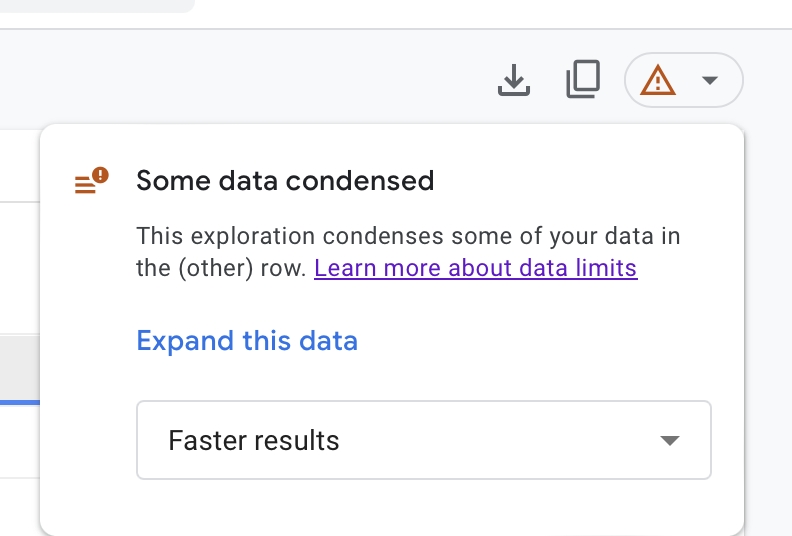
Clicking expand this data will increase thew row count and remove the (other) row
Sampled Exploration Options
The red circle indicates that a report is heavily sampled, indicating that the report will only be representative of a small percentage of the actual data. Similarly to the yellow hazard, symbol clicking into this icon will provide you with the percentage of data being used.
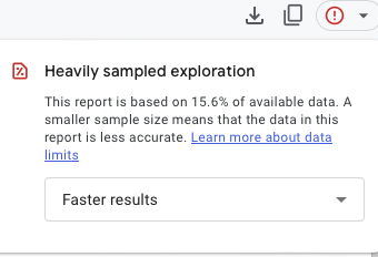
A majority of the data is sampled
Clicking into sampling icons will prompt users with a drop down menu ,[Faster Results ⌄]. Clicking into this menu allows the user to chose between keeping the sampled results, which will generate faster results, or opting for more detailed results based on a larger subset of data.
Sample Exploration drop down selection
There is nothing wrong with using the Faster results option. Sampled reports still provide valuable insights about the dataset. It is important that while analyzing reports that utilize sampling, the data present is not used for numerical accuracy, but for directionality and general analysis. When needing a more accurate report, the More detailed results option is recommended. For the most accurate data, users may need to export the report.
If You Want to Avoid Sampled Reports
Tips for avoiding sampled reports.
If reports are too large you can export reports by selecting the download icon
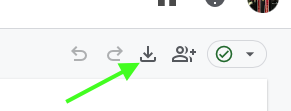
Down load button: top right
Default reports without additional filters/comparisons will not be sampled.
Where possible, make sure you are selecting smallest date ranges you need for your analysis. The larger the range, the more data the report will leverage, which will likely lead to sampling.
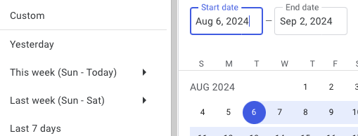
Change date range in reports
Don't overcrowd a single report with too many dimensions and metrics. Use the plus sign to add a new tabs to your report where you can look at additional dimensions and metrics.
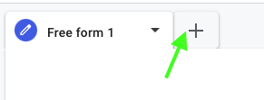
Add report
 : middle left
Help and feedback
Get help from the Platform Support Team in Slack.
Submit a feature idea to the Platform.
