

Last Updated:
Getting started
Find your product
Each dashboard is standardized to serve multiple VFS teams, and the default view includes data for all these teams together. The first thing you will need to do is configure the dashboard for your product alone.
-
Dashboard filters should automatically appear in a thin, horizontal bar at the top of the page. If you do not see this when the dashboard loads, you can access the filters manually by clicking the funnel icon at the top-right corner of the page.
-
Next, use the first filter in the bar to select your product (name of this filter will differ, depending on the dashboard you are using). Once selected, the dashboard title and intro text will automatically update.
Select dates
The dashboard will default to display all dates available, grouped by week. However, VFS teams may find it more useful to look at a specific time period or to compare data by months. Both can be customized by opening the “Choose date” menu at the righthand side of the menu bar.
Date range
Opening the “Date range” menu will allow you to choose from several preset period options by clicking the arrows the right of “Current” or “Previous.” You can also select a custom time range by choosing the “Between.” Return to the default view by selecting “Default” or “All time.”
Graph by
Many charts show metrics for the most recent period selected. Changing the “Graph by” settings from week to month will impact which unit of time is being shown, as well as the groupings for any line chart on the dashboard. While the “Graph by” menu includes many options, the Analytics team recommends ONLY using the week or month settings. User behavior tends to be closely tied to the day of the week, and viewing by day makes it easier for patterns to get lost in the noise of cyclical data.
Data sources
These dashboards are powered by data pulled from Google Analytics using BigQuery. Some of the queries pull in raw, event-level data while others transform data to group by session, user, etc. Additional user feedback data comes from Medallia. Non-Google Analytics data does not include device or browser fields and will not respond to these dashboard filters. Data is updated once a week.
For more information on how metrics are calculated, grouped, or filtered, please see the data dictionary for your dashboard. If you have additional questions, you can reach the Analytics team on the #vfs-platform-support channel on Slack.
Navigating the dashboard
Using filters
The filter bar is sticky and can be accessed anywhere on the dashboard without scrolling back to the top. You can adjust dates or apply additional filters for device or browser for cards using Google Analytics data. However, the product filter shouldn’t be changed once you’ve configured the dashboard for your product.
Hover text
You can learn more about a particular datapoint or how a KPI is calculated by hovering over it. Hover text appears works when you’re viewing the card in the dashboard and when you’ve clicked the card’s title to see it in a detailed card view in a new tab. Definitions of KPIs can also be found in the data dictionary.
Percent change comparisons
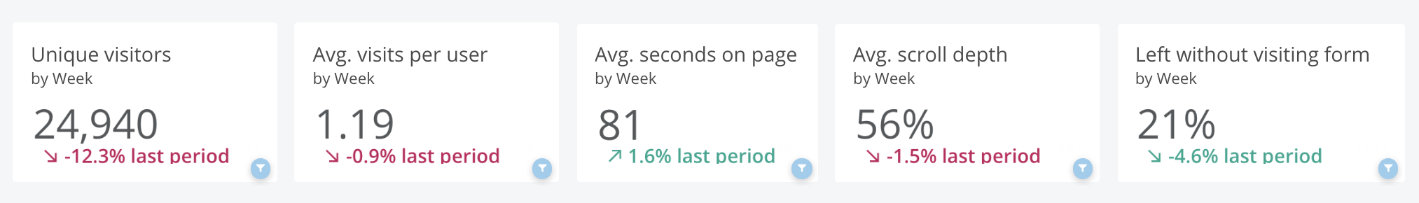
Many cards on the dashboard show a large value with a percent change below. The larger number will always show the KPI for the most recent period selected, while the number below provides a comparison to the previous period’s data. These cards will update to reflect any changes made in the date filters.
For example, the card at right shows the total forms started by users in the most recent week, with a comparison to the previous week to put that number in context. If the date range were customized, it would update to display the most recent week within that selected range. Meanwhile, if the “Graph by” setting was changed to month, the large number would show the last month’s total while the comparison value would reflect the percent change between the most recent two months of data.
For a more detailed view of how a KPI has changed over time, click through to its drill path chart.
VA.gov comparisons
Throughout the dashboard, you will see comparisons for your KPIs against all similar products on VA.gov. These metrics are dynamic and will respond to all dashboard filters, including the “Date range” and “Graph by” settings. These cards do not respond to the product filter, since they provide metrics across all products.
Drilling down into your data
Drill path charts
Most cards on the dashboard can be expanded and the data can be drilled into to reveal additional graphs. To access:
-
Click the chart’s title, which will automatically open that card in a new tab. Do NOT use right-click to open chart in new tab, as this will not preserve dashboard filters.
-
All cards on the dashboard have at least one additional chart. To access, clicking anywhere on the chart in the new tab. You can also view the underlying data in the detailed chart by clicking on a particular point.
-
To return to the dashboard or a previous view of a chart, use the navigation path above the chart’s title.
For additional instructions, see Domo’s documentation on Drilling into Data.
Card-level filters
When you open a card in a new tab by clicking on the title, all filters you have set on the dashboard will be carried over. As you drill into the data, some additional filters may be added or removed, depending on the chart type. For example, clicking through to a line chart does not add any additional filters. However, bar charts, pie charts, and tree charts will filter by the category you click on.
For example, when you click on a bar in the “Forms by status” chart from its card detail view, the new chart that appears will filter to only show monthly totals for that category. But what if you wanted to see the full distribution across all three categories over time? Remove the form status filter by clicking the “X” to the right of the blue filter pill, and the drill path chart will update to include all categories.
To focus only on the most recent months of data in the new chart, drag a pane over the columns you would like to see. This does not add a filter to the bar above, but a blue arrow will appear that will return you to the full date view.
View underlying data
Once in the detailed card tab, you can see a data table by clicking the table icon at the top right of the screen. This will only include the variables shown in the chart and will be summarized at the same level of detail (i.e. grouped by week/month, rather than individual data points).
You can also view the underlying dataset behind each data point by clicking through to the final step of the drill path. For example, in the “Forms by status” chart, clicking a bar will show that submission category by month, while clicking one of the month bars will show the underlying rows of data. You can also view the data source in Domo by clicking the link below the chart.
Shares & exports
Dashboard
There are several ways to share the dashboard. If the person who you’d like to share the dashboard with has Collaborator permissions within Domo, you can use the “Share” icon in the top right corner to find their account.
To share static images of the dashboard, the Analytics team recommends taking screenshots. While Domo does offer export options under the “Share” icon, these automatically reformat the dashboard layout in ways we cannot customize, making it more difficult to read.
Specific cards
Once a card is opened in the detailed view, click on the “Share” icon in the top-right icon to see options. The first “Share” option in the menu allows you to share the card directly to another Domo user.
Alternatively, the “Send / Export” option under the “Share” menu allows you to save the chart as an image in PowerPoint or print to PDF. You can also save as an Excel or CSV, though this will not export the underlying data, but the aggregated data as it appears in the data table (see “Viewing data” section above).
Changing chart types
Once you’ve opened card details in a new tab, you also have the option to change the type of visualization. At the top-right corner of your screen, click the Chart Picker tool (shown as a gray pie chart icon) to see your options. These are automatically generated, and so not all chart types offered will make sense for your data.
Changes made using Chart Picker are not permanent. They will not be seen by other users and can be cleared by refreshing the page. However, they can be exported and may be a good way to explore and better understand your data.
Other resources
Data dictionaries
Help and feedback
-
Get help from the Platform Support Team in Slack.
-
Submit a feature idea to the Platform.