

Last Updated: October 2, 2024
Figma is a valuable tool for designers and VFS teams to enable collaboration, design, and prototyping. This page walks through how to create designs in Figma that are aligned with the VA Design System and ensure a smooth handoff from design to code.
Benefits of using the Figma VA Design Library
Leveraging the VA Design System in your designs as much as possible benefits you and your team in many ways. Some benefits of using the VA design library include the following:
For Veterans
Using the VA Design System ensures a consistent usability experience for Veterans.
For Designers
Fewer spacing issues
Dynamic resizing with auto layout (spacing and text wrapping are built in).
Easy access to component guidance
Links to appropriate guidance in the design system.
Easy configuration of components
Rebuilt components that use Figma’s properties allow you to configure your components more easily without detaching the instance.
Aligned with Storybook
Designers can configure component properties in Figma in the same ways that Engineers configure them in Storybook. This means that when Designers hand off a file, Engineers can implement it as the Designers intended it to be.
Automatic updates
If there are any changes to components, color, etc., you’ll be alerted to update to the latest version.
For VFS teams
Analytics is built in
Out-of-the-box components come with analytics baked in so you don’t waste time building custom code.
Accessibility is built in
Make sure you’re starting with components tested to be accessible. Check the Component checklist at the bottom of a component page in the Design System to ensure they’re accessible.
How to enable the VA Design Library
It’s easy to enable the VA design library so that it’s readily accessible in your Assets tab in the left panel of Figma.
To enable the VA design library:
-
Navigate to your project and open a file (it doesn’t matter which file).
-
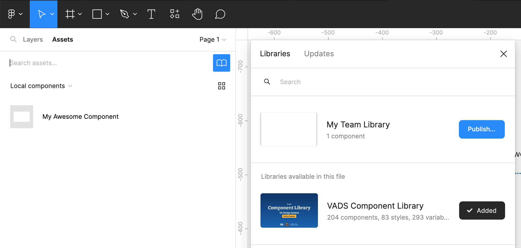
In the left panel, select the Assets tab.
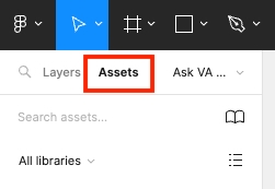
The Assets panel in the left sidebar
-
Then, select the library icon.
The Library icon within the Assets panel in the left sidebar -
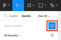
In the Libraries window that pops up, scroll to find the VADS Component Library and click Add to file.
Once you add the library, it'll be available in the Assets tab in all your files.
The VA Design System component library available to add to your file
Best practices for using the VA Design Library
Once you enable the VA design library, you can access styles and components. Below is a quick overview of how to access them in your design file.
Styles
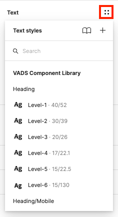
Text styles
You can apply the VA Design Library text styles by clicking the style picker button in the right sidebar. This menu allows you to use text styles from the library (e.g., heading, link, body). You can learn more about text styles in the VA Design System typography section.
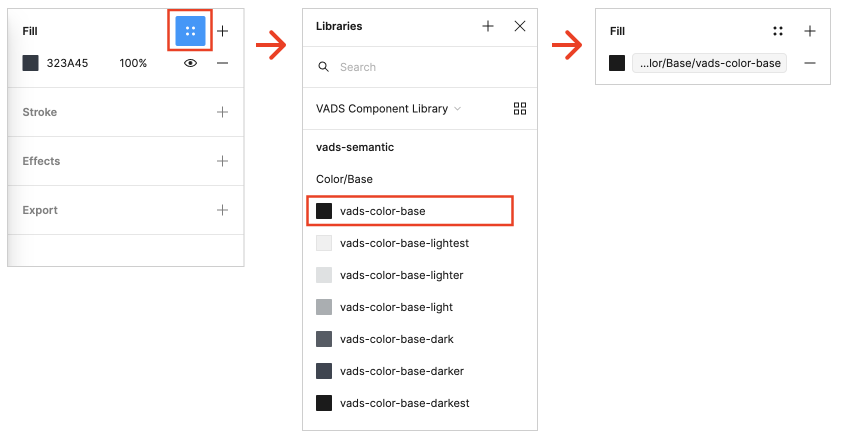
Fill styles
You can apply fill styles from the VA Design Library by clicking the style picker button in the right sidebar. You can learn more about VA color styles in the VA Design System color palette.
Components
Using components straight from the library ensures that your engineers can implement exactly what you see.
Insert a component instance
-
In the left panel, select the Assets tab.
-
Find and click on the component you want to use (you can also drag and drop from here and configure later - see below for how to configure components).
-
A details window will be displayed where you can configure the properties of your component.
-
Click the Insert instance button when you have it the way you want. You can always change these properties later.
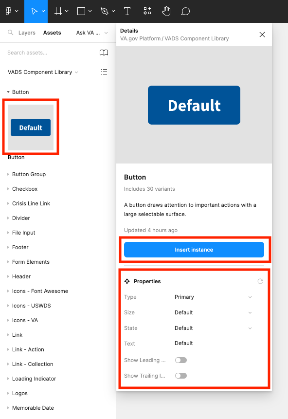
How to configure and insert a component from the library to a Figma file
Configure a component instance
Once you have an instance of a component on an artboard, you can still configure from there.
-
In the left panel, select the Layers tab.
-
Select a component instance on your artboard.
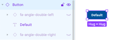
Component in the Layer tab in the left sidebar -
In the right panel, you’ll see an Instance section in the Design tab. Here you can configure the component properties with things like text, state, and icons.
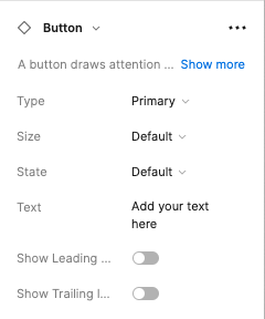
Configure component properties in the Instance section of the design tab -
From the Instance section, you can hover over the description of the instance and click the Show more text to display links to documentation like guidance on use of the component.
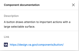
Link to documentation within the component properties panel
Team component libraries
The VA Design System Component Library offers components as defined on design.va.gov. If you have a need to create a component that’s specific only to your team, then it's likely not going to be in the Component Library. Your team might want to consider having a team-specific component library if you find yourselves with repeatable design patterns. However, if you think the component is useful for multiple teams and it’s not in the VA Design System, consider contributing it to the Design System.
Figma makes creating a team component library pretty easy. Any file within your team project can be published as a library so that its assets can be used by other files in the team (which includes all VFS teams).
For example, if your Figma file is called "My Team Library," you can publish it via the assets panel, which should look something like this:
Once you’ve published it, it’s available for others on our team (anyone in our VA.gov Platform account can add it to their file as well).
Figma plugins
One of the great things about Figma are all the great plugins that are easily available. You're welcome to use a plugin if it's a free and it doesn't create a dependency for other teams (i.e., would another team need to also have the plugin for them to be able to open a file that utilized that plugin) then you may use it. We’ll update this page with commonly used and recommended plugins soon. In the meantime, feel free to explore plugins in the Figma Community.
Getting help
If you have questions or need help with anything Figma related, feel free to drop in to our Figma office hours. Designers and Engineers from the Platform Design system team will be available to answer your questions, and it’s a great opportunity to learn from each other.
Help and feedback
-
Get help from the Platform Support Team in Slack.
-
Submit a feature idea to the Platform.