

Widgets are React components that return specific form elements. There are two types:
-
Widgets directly from React JSON Schema Form (RJSF). These are bundled directly in the
react-jsonschema-formrepo at Form.js. -
Widgets created specifically for VA Forms Library. Some of these widgets get bundled into the SchemaForm component and passed to RJSF at Forms System Widgets.
Before using form widgets or fields, be sure to understand how schema and uiSchema work. Both are needed to successfully implement a widget or a field.
Using RJSF widgets
To use RJSF widgets, modify the uiSchema ui:widget property to reflect the imported widget name. This tells the form which UI widget should be used to render a field. You will also need to modify the schema to reflect the type. See further examples for each widget below.
uiSchema: {
  //...other uiSchema code omitted here
  'ui:widget': CurrencyWidget,
}
Note: Ellipses are used in code samples throughout this document to indicate when some code has been omitted for brevity (for example, “//...code omitted here”). When available, links to full code examples in GitHub are included.
Using Forms Library widgets
Widgets created specifically for the Forms Library do not have import mappings to the files, so the component for the widget must be passed directly to the config by importing.
To use any Forms Library widget, make the following modifications in the config file. There are three steps:
-
Import the widget at the top of the file:
JavaScriptimport CheckboxWidget from 'platform/forms-system/src/js/widgets/';Note: To not trigger the linter, the import path needs to import directly from Platform as shown above, not relative to the source, and be above any manifest imports.
-
Modify the
uiSchemaui:widgetproperty to reflect the imported widget name (e.g., CheckboxWidget). This tells the form which UI widget should be used to render a field.JavaScriptuiSchema: { //...other uiSchema code omitted here 'ui:widget': CheckboxWidget, }
-
You also need to modify the
schemato reflect the type of the widget. For example,type: 'string'. Other patterns or formatting are sometimes required. See further examples for each widget below.
Available widgets and fields
This section includes all available widgets and fields, along with some important features, how to use them, and simple examples or example directly from the VA codebase. The widgets and fields that require file imports are shown in each description.
Array count widget
This widget can collect multiple items with the same form question. For example, if you need to collect multiple addresses, jobs, or employment in a time period.
Renders an <input type="number"> HTML element and is used when determining how many times a group of questions should be rendered. The following screen capture is an example of what the ArrayCountWidget looks like in the user interface to select the number of times the question is rendered.
How to use
-
Include an import to the widget at the top of the file:
import ArrayCountWidget from 'platform/forms-system/src/js/widgets/'; -
In the
uiSchema, specify'ui:widget': ArrayCountWidgetfor for the given field. -
Original Forms Library file for reference: ArrayCountWidget.jsx
Example
A shortened example is included here, but you can view a full example on Pensions Form 21P-527EZ.
import ArrayCountWidget from 'platform/forms-system/src/js/widgets/';

const marriages = {
  type: 'array',
  items: {
    type: 'object',
    properties: {
      locationOfMarriage: {
        type: 'string',
      },
      marriageType: {
        type: 'string',
      },
    },
  },
};
//...other formConfig code omitted here
page1: {
          path: 'additional-information',
          title: 'Additional Information - Page 1',
          uiSchema: {
            marriages: {
              'ui:title': 'How many times have you been married?',
              'ui:widget': ArrayCountWidget,
              'ui:field': 'StringField',
              'ui:options': {
                showFieldLabel: 'label',
                keepInPageOnReview: true,
              },
            },
          },
          schema: {
            type: 'object',
            properties: {
              marriages,
            },
          },
        },
To display multiple groups of the same form questions, define the data in the schemaas type: 'array', with each group of questions as an itemin that array. The schemaand uiSchemafor the group of questions within the itemsobject is structured the same as other fields.
Your config file might look like this:
{
  schema: {
    type: 'object',
    properties: {
      dogs: {
        type: 'array',
        items: {
          type: 'object',
          properties: {
            nameOfDog: { type: 'string' },
            age: { type: 'string' },
            breed: { type: 'string' }
          }
        }
      }
    }
  },
  uiSchema: {
    'ui:title': 'How many dogs do you have?',
    items: {
      nameOfDog: { 'ui:title': 'What is your dog‘s name?' },
      age: { 'ui:title': 'How old is your dog?' },
      breed: { 'ui:title': 'What is your dog‘s breed?' }
    }
  }
}
Array field
Use this to render a growable table (array) field for the user to select data. This field is suitable for the regular form, not the review page. The ArrayFieldcode will add an "Add another" button with a suffix from itemName.
How to Use
-
At the top of the file, include:
import ArrayField from 'platform/forms-system/src/js/fields/ArrayField'; -
In the
uiSchema, specify'ui:field': ArrayFieldfor the given field. -
Original Forms Library file for reference: ArrayField.jsx
An option for ArrayField is addAnotherLabel, which only applies when setting a schema type to array.
-
The
ArrayFieldcode will add an "Add another" button with a suffix fromitemName. -
Including an
addAnotherLabelreplaces the add another button text:names: { 'ui:title': 'Bunch of names', 'ui:options': { itemName: 'Name', // title case addAnotherLabel: 'Add another name' // sentence case } }This code results in a title of "New Name" & a button containing "Add another name."
Example
A shortened version of the Forms Library military history disability benefits example with an array field is included here, and the full example can be found at VA Form 21-526EZ, Military History.
export const uiSchema = {
  serviceInformation: {
    servicePeriods: {
      'ui:title': 'Military service history',
      'ui:description':
        'Please add or update your military service history details below.',
      'ui:field': ArrayField,
      'ui:options': {
        itemName: 'Service Period',
        itemAriaLabel,
        viewField: ValidatedServicePeriodView,
        reviewMode: true,
        showSave: true,
        setEditState: formData =>
          formData.map(data => !isValidServicePeriod(data)),
      },
      items: {
        serviceBranch: {
          'ui:title': 'Branch of service',
        },
        dateRange: dateRangeUISchema,
        'ui:options': {
          itemAriaLabel,
          itemName: 'Military service history',
        },
      },
    },
  },
};

export const schema = {
  type: 'object',
  properties: {
    serviceInformation: {
      required: ['servicePeriods'], // required in fullSchema
      type: 'object',
      properties: {
        servicePeriods:
          fullSchema.properties.serviceInformation.properties.servicePeriods,
        'view:militaryHistoryNote': {
          type: 'object',
          properties: {},
        },
      },
    },
  },
};
Auto suggest field
Use this to provide a list of suggestions when the user is typing. This automatically begins offering a truncated list of suggestions based upon what the user types and renders a field with a list of options that expands under that field when selected.
The following screen capture is an example of what the AutoSuggestField looks like in the user interface.
How to use
-
In the
uiSchema, specifyautosuggest.uiSchema('Name of question', listOfOptionsFunction),for for the given field. -
In the schema, inside
'ui:options', addinputProps, which contains attributes you'd like to add to the<input>element inside the Autosuggest component. -
Original Forms Library file for reference: AutosuggestField.jsx
Example
A full example is provided here with two autosuggest fields included. The fetch for getCemeteries, from a different file, is also provided below.
The full example can be found at Form 40-10007 Apply for pre-need eligibility determination.
uiSchema: {
            application: {
              claimant: {
                desiredCemetery: autosuggest.uiSchema(
                  'Which VA national cemetery would you prefer to be buried in?',
                  getCemeteries,
                ),
                'view:desiredCemeteryNote': {
                  'ui:description': desiredCemeteryNoteDescription,
                },
              },
              // ...
              // hasCurrentlyBuried radio option removed for length
              currentlyBuriedPersons: {
                'ui:options': {
                  viewField: EligibleBuriedView,
                  expandUnder: 'hasCurrentlyBuried',
                  expandUnderCondition: '1',
                },
                items: {
                  name: merge({}, fullNameUI, {
                    'ui:title': 'Name of deceased',
                  }),
                  cemeteryNumber: autosuggest.uiSchema(
                    'VA national cemetery where they’re buried',
                    getCemeteries,
                    {
                      'ui:options': {
                        inputProps: {
                          'aria-describedby': 'burial-cemetary-note',
                          },
                      },
                    },
                  ),
                },
              },
            },
          },
          schema: {
            type: 'object',
            properties: {
              application: {
                type: 'object',
                properties: {
                  claimant: {
                    type: 'object',
                    properties: {
                      desiredCemetery: autosuggest.schema,
                      'view:desiredCemeteryNote': {
                        type: 'object',
                        properties: {},
                      },
                    },
                  },
                  currentlyBuriedPersons: currentlyBuriedPersonsMinItem(),
                },
              },
            },
          },
Here is the fetch function referred to in the previous code snippet, which can be found at Form 40-10007 Helpers.js:
export function getCemeteries() {
  return fetch(`${environment.API_URL}/v0/preneeds/cemeteries`, {
    credentials: 'include',
    headers: {
      'X-Key-Inflection': 'camel',
      'Source-App-Name': window.appName,
    },
  })
    .then(res => {
      if (!res.ok) {
        return Promise.reject(res);
      }

      return res.json();
    })
    .then(res =>
      res.data.map(item => ({
        label: item.attributes.name,
        id: item.id,
      })),
    )
    .catch(res => {
      if (res instanceof Error) {
        Sentry.captureException(res);
        Sentry.captureMessage('vets_preneed_cemeteries_error');
      }

      // May change this to a reject later, depending on how we want
      // to surface errors in autosuggest field
      return Promise.resolve([]);
    });
Basic array field
Use this to provide an array selection field for the user. If the component has form data, it uses that, otherwise it uses an array with a single default object.
How to use
-
In the
uiSchema, specify'ui:field': BasicArrayFieldfor the given field. -
Original Forms Library file for reference: BasicArrayField.jsx
Example
A simplified version of the linked example is included here. The full example can be found at 10-10EZ Healthcare Benefits Application.
dependents: {
      'ui:field': 'BasicArrayField',
      items: dependentIncomeUiSchema,
      'ui:options': {
        hideIf: formData => !get('view:reportDependents', formData),
      },
    },
schema: {
    type: 'object',
    properties: {
      dependents: merge({}, dependents, {
        minItems: 1,
      }),
    },
Checkbox widget
Use of this widget is not recommended because there is a default boolean option that does the same thing. Please follow the instructions below to use the default solution.
The CheckboxWidget is uncommonly used in the uiSchema, because it renders by default in a schema that specifies:
type: 'boolean'
This renders an <input type="checkbox"> HTML element. On the review page, a selected checkbox appears as “Selected.”
Each individual checkbox is used to store booleandata. To include a group of checkboxes, include separate fields for each checkbox, with type: 'boolean' passed to the schema.
The following example shows a group of checkboxes that allows more than one item to be selected.

Your config for the group of checkboxes looks like this:
schema: {
  type: 'object',
  properties: {
    'view:booksRead': {
      type: 'object',
      properties: {
        hasReadPrideAndPrejudice: { type: 'boolean' },
        hasReadJaneEyre: { type: 'boolean' },
        hasReadGreatGatsby: { type: 'boolean' },
        hasReadBuddenbrooks: { type: 'boolean' },
      },
    },
  },
},
uiSchema: {
  'view:booksRead': {
    'ui:title': 'Which books have you read?',
    'ui:description': 'You may check more than one.',
    hasReadPrideAndPrejudice: {
      'ui:title': 'Pride and Prejudice by Jane Austen',
    },
    hasReadJaneEyre: {
      'ui:title': 'Jane Eyre by Charlotte Brontë',
    },
    hasReadGreatGatsby: {
      'ui:title': 'The Great Gatsby by F. Scott Fitzgerald',
    },
    hasReadBuddenbrooks: {
      'ui:title': 'Buddenbrooks by Thomas Mann',
    },
  },
},
Date widget
Use this to allow the user to select a date. This renders two dropdown fields, a month and a date, followed by a text entry field for the year.
How to use
-
In the
uiSchema, specify'ui:widget': 'date'for the given field. -
In the
schema, specify both apatternand atype, as included in the example schema below. -
Original Forms Library file for reference: DateWidget.jsx
Other options are available in the forms library that implement the date widget and may be useful to you in your :
-
currentOrPastDate: This allows users to only choose the current date or past date, not a date in the future. Many dates input by the user are current or past dates, such as dates of service, injury, or life events.
-
dateUI: This adds additional error messaging and optional validation.
Example
This example uses the date widget prompting the user to select a date, in order of Month, Day, and Year.
uiSchema: {
        date: {
          'ui:widget': 'date',
        },
      },
schema: {
  type: 'object',
  properties: {
    date: {
      "pattern": "^(\\d{4}|XXXX)-(0[1-9]|1[0-2]|XX)-(0[1-9]|[1-2][0-9]|3[0-1]|XX)$",
      type: 'string',
    },
  },
},
Email widget
Use this to provide an email field for the user to type their email address. It renders a TextWidget with the type: "email" passed to the <input> element. The purpose of this widget is to validate the string as it’s typed in. It requires the user to type in an email format, including an @ symbol and a dot extension: x@x.com.
How to use
-
In the
uiSchema, specify'ui:widget': EmailWidgetfor the given field. -
In the
schema, specifytype: 'string', format: 'email'. -
Original Forms Library file for reference: EmailWidget.jsx
Example
import EmailWidget from 'platform/forms-system/src/js/widgets/';

//...other formConfig code omitted here
    uiSchema: {
      email: {
        'ui:title': 'Email address',
        'ui:widget': 'email',
      },
    },
    schema: {
      required: [formFields.firstName],
      type: 'object',
      properties: {
        email: {
          type: 'string',
          format: 'email',
        },
      },
    },
File field
Use this to allow a user to upload a file in one of the following formats: 'pdf', 'jpg', 'jpeg', 'png'.
There is a minimum (minSize: 1024) and maximum (maxSize: 20971520) file size that the user may upload.
How to use
-
In the
uiSchema, specify'ui:field': FileFieldfor the given field. Atype: 'array',schema is required, and an example schema is shown below. -
Original Forms Library file for reference: FileField.jsx
Example
An example schema:
export const fileSchema = {
  type: 'array',
  minItems: 1,
  items: {
    type: 'object',
    properties: {
      fileName: {
        type: 'string',
      },
      fileSize: {
        type: 'integer',
      },
      confirmationNumber: {
        type: 'string',
      },
      errorMessage: {
        type: 'string',
      },
      uploading: {
        type: 'boolean',
      },
    },
  },
};
Full name field
Use this to render a field for the user to type their full name. This renders four fields: First name, Middle name, Last name, and a dropdown selection box for Suffix.
How to use
-
At the top of the file, include:
import fullNameUI from 'platform/forms/definitions/fullName';
-
In the
uiSchema, specify'ui:field': fullNameUIfor the given field. -
Other options are available if you want to specify a spouse or child’s name instead of using the generic field titles. A case of this is shown in the example section below.
-
Original Forms Library file for reference: FullNameField.jsx
Example
A simplified version of the linked example is included here. The full example can be found at Burials Form 21P-527EZ.
previousNames: {
          title: 'Previous names',
          path: 'military-history/previous-names',
          uiSchema: {
            previousNames: {
              'ui:options': {
                itemName: 'Name',
                expandUnder: 'view:serveUnderOtherNames',
                viewField: FullNameField,
              },
              items: fullNameUI,
            },
              //...code omitted here
          },
          schema: {
            type: 'object',
            properties: {
              //...code omitted here
              previousNames: {
                ...previousNames,
                minItems: 1,
              },
            },
          },
        },
Another case in the same form where the fullNameUI is used for the spouse is shown here:
uiSchema: {
        marriages: {
          items: {
            'ui:options': {
              updateSchema: (form, schema, uiSchema, index) => ({
                title: getMarriageTitleWithCurrent(form, index),
              }),
            },
            spouseFullName: merge({}, fullNameUI, {
              first: {
                'ui:title': 'Spouse first name',
              },
              last: {
                'ui:title': 'Spouse last name',
              },
              middle: {
                'ui:title': 'Spouse middle name',
              },
              suffix: {
                'ui:title': 'Spouse suffix',
              },
            }),
            //...code omitted here
Object field
This is largely copied from the react-jsonschema-form library, but with a modification in the way descriptions are used, along with additional performance optimizations. This runs a series of steps that order properties and then group them into expandable groups. If there are no expandable groups, then the end result will be an array of single item arrays
How to use
-
In the
uiSchema, specify'ui:field': ObjectFieldfor the given field. -
Original Forms Library file for reference: ObjectField.jsx
Example
A full example of ObjectField can be found at Burials Form 21P-527EZ.
import React from 'react';

export default function RaceEthnicityReviewField(props) {
  const { formContext, uiSchema, schema, formData } = props;
  const ObjectField = props.registry.fields.ObjectField;

  if (!formContext.reviewMode) {
    return <ObjectField {...props} />;
  }

  const categories = Object.keys(schema.properties).filter(
    prop => formData[prop],
  );
  return (
    <>
      <div className="review-row">
        <dt>{uiSchema['ui:title']}</dt>
      </div>
      {categories.slice(1).map(prop => (
        <div key={prop} className="review-row">
          <dt />
          <dd>{uiSchema[prop]['ui:title']}</dd>
        </div>
      ))}
    </>
  );
}
Phone number widget
Use this to render a field that allows the user to type in their phone number. When submitted, the field handles removing dashes, parentheses, and the letter `x` from phone numbers by keeping the user input in local state and saving the transformed version instead.
How to use
-
Include an import to the widget at the top of the file:
import PhoneNumberWidget from 'platform/forms-system/src/js/widgets/'; -
In the
uiSchema, specify'ui:widget': PhoneNumberWidgetfor the given field. -
In the
schema, specify:
phone: {
            type: 'string',
            pattern: '[0-9]+',
       },
-
Original Forms Library file for reference: PhoneNumberWidget.jsx
Example
uiSchema: {
      phone: {
        'ui:title': RepresentativePhoneTitle,
        'ui:widget': PhoneNumberWidget,
      },
  },
  schema: {
      phone: {
        type: 'string',
        pattern: '[0-9]+',
      },
  },
Radio widget
Use this to provide a list of two or more mutually exclusive options for the user. The user can select one of a list of options, and selecting a non-selected option will deselect any other selected option.
How to use
-
In the
uiSchema, specify'ui:widget': 'radio'for the given field. -
In the
schema, specify:
schema: {
  type: 'string',
enum: [
  'Option 1',
  'Option 2',
  'Option 3',
]
-
You may notice the schema is identical to the
SelectWidgetschema. -
Original Forms Library file for reference: RadioWidget.jsx
Example
This example shows radio buttons with separate ui:options labels. This is a simplified version of an example in Form 10-10CG, Application for Comprehensive Assistance for Family Caregivers Program.
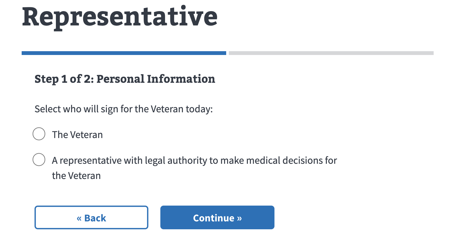
uiSchema: {
            signAsRepresentativeYesNo: {
              'ui:title': 'Select who will sign for the Veteran today:',
              'ui:widget': 'radio',
              'ui:options': {
                labels: {
                  no: 'The Veteran',
                  yes:
                    'A representative with legal authority to make medical decisions for the Veteran',
                },
              },
            },
          },
schema: {
        type: 'object',
        properties: {
          signAsRepresentativeYesNo: {
            type: 'string',
            enum: ['no', 'yes'],
          },
        },
      },
Select widget
Use the SelectWidget for a select, or dropdown, menu of options for the user. The SelectWidget is not imported or specified directly in the uiSchema because it renders a <select>HTML element by default for data of type: 'string'with an enum property.
How to use
-
In the
uiSchema, specify'ui:widget': 'select'for the given field. -
In the
schema, specify:
type: 'string',
enum: [
  'Option 1',
  'Option 2',
  'Option 3',
]
-
You may notice the schema is identical to the
RadioWidgetschema. -
Original Forms Library file for reference: SelectWidget.jsx
Example
This example shows how to use a select widget with three options.
uiSchema: {
  animal: {
    'ui:title': 'Selection options',
    'ui:widget': 'select',
  },
},
schema: {
  type: 'object',
  properties: {
    animal: {
      type: 'string',
      enum: ['aardvark', 'capybaras', 'kangaroos'],
    },
  },
},
SSN widget
Use this to allow the user to type in their Social Security Number. This uses a TextWidget with additional logic to strip the dashes before saving the input.
How to use
-
Import the ssnUI from the forms system:
import ssnUI from 'platform/forms-system/src/js/definitions/ssn';
-
In the
uiSchema, specify'ui:widget': ssnUIfor the given field. -
In the
schema, specifytype: 'string'. -
Original Forms Library file for reference: SSNWidget.jsx
Example
This is a basic example of the ssnUI implementation. As mentioned, it looks the same as a text field but strips any entry of dashes on submission.

uiSchema: {
            ssn: {
              'ui:widget': ssnUI,
            },
          },
schema: {
          type: 'object',
          properties: {
            ssn: {
              type: 'string',
            },
          },
        },
Text widget
The TextWidget is uncommonly used in the uiSchema, because it renders an <input>HTML element by default in a schema that specifies:
type: 'string'
Text widget is the default widget for data of type: ‘string.’ This is recommended unless you would like to use it to create a custom component.
How to use
-
At the top of the file, include:
import TextWidget from 'platform/forms-system/src/js/widgets/'; -
In the
uiSchema, specify'ui:widget': TextWidgetfor the given field. -
In the
schema, specifytype: string. -
Original Forms Library file for reference: TextWidget.jsx
Example
export const personalInformationUiSchemas = {
  preferredName: {
    preferredName: {
      'ui:widget': TextWidget,
      'ui:title': `Provide your preferred name (25 characters maximum)`,
      'ui:errorMessages': {
        pattern: 'Preferred name required',
      },
    },
  },
Text area widget
Use this to create a multi-row text area for the user to type in. This may be used for a user to provide more description; e.g., why they're making an appointment or additional symptoms.
How to use
-
At the top of the file, include:
import TextareaWidget from '../../vaos/components/TextareaWidget'. -
In the
uiSchema, specify'ui:widget': TextareaWidgetfor the given field. -
In the
schema, specifytype: 'string'. -
Original Forms Library file for reference: TextareaWidget.jsx
Example
This is an example of a simple TextAreaWidget implemented in code.

import TextareaWidget from '../../vaos/components/TextareaWidget';

//...formConfig code omitted here

    uiSchema: {
      reasonAdditionalInfo: {
        'ui:widget': TextareaWidget,
      },
    },
    schema: {
      type: 'object',
      properties: {
        reasonAdditionalInfo: {
          type: 'string',
        },
      },
    },
Title field
TitleField.jsx is used to render a title for other fields. It currently returns a title for ArrayField, BasicArrayField, and ObjectField. TitleField should be used in instances where custom field creation is needed, outside the normal schema. The TitleField (legend) needs to be the first child of the fieldset.
How to use
-
See how to use custom field creation.
Example
An example of the TitleField in use outside of the Forms Library can be found in the Financial Status Report Item Loop.
const { TitleField, SchemaField } = registry.fields;
//...formConfig code omitted here
return (
      <div className={containerClassNames}>
        {hasTitleOrDescription && (
          <div className="schemaform-block-header">
            {title && !hideTitle ? (
              <TitleField
                id={`${idSchema.$id}__title`}
                title={title}
                formContext={formContext}
              />
            ) : null}
            {textDescription && <p>{textDescription}</p>}
            {DescriptionField && (
              <DescriptionField options={uiSchema['ui:options']} />
            )}
            {!textDescription && !DescriptionField && description}
          </div>
        )}
        <div>
          {items.map((item, index) => {
            //...other code omitted here
            return (
              <SchemaField
                key={index}
                schema={itemSchema}
                uiSchema={uiSchema.items}
                errorSchema={errorSchema ? errorSchema[index] : undefined}
                //...other code omitted here
              />
            );
          })}
        </div>
Yes-no widget
Use this to provide two options, ‘Yes’ or ‘No’, to the user in radio button selection style.
How to use
-
In the
uiSchema, specify'ui:widget': 'yesNo'for the given field. -
In the
schema, specifytype: 'boolean'. -
Original Forms Library file for reference: YesNoWidget.jsx
Example
This is an example of a basic Yes-no widget:

This code shows an example of a Yes-no widget similar to the one shown. The full example can be found at vets-website/form.js at main · department-of-veterans-affairs/vets-website.
    uiSchema: {
      previousNames: {
        //...code omitted here
      'view:serveUnderOtherNames': {
        'ui:title': 'Did the Veteran serve under another name?',
        'ui:widget': 'yesNo',
      },
    },
    schema: {
      type: 'object',
      properties: {
        'view:serveUnderOtherNames': {
          type: 'boolean',
        },
      //...code omitted here
      },
    },s
Help and feedback
-
Get help from the Platform Support Team in Slack.
-
Submit a feature idea to the Platform.