

Last Updated: March 27, 2025
The VA.gov Forms Library lets you build web-based forms using the JSON Schema standard for form data and React for the form UI. The form data and UI are represented by schemaand ui:schema, respectively, which are included in the form configuration file.
To create pages within the form or application using the Forms Library, we need to include both a schema and uiSchema. The schema defines the structure of the form data. The uiSchema much match the naming convention of the schema and it defines the user interface using properties. These properties describe the content and include which form elements to render on the page.
Here is a list of available page options:
Schema object
|
Properties |
Value Type |
Definition |
Example |
|---|---|---|---|
|
type |
string |
Type of schema object. Currently, the type on the top level of schema object is ‘object’. |
|
|
required |
array |
The list of required fields of the current page. It takes an array of property names passed as strings. |
|
|
properties |
object |
See the schema object properties section. |
|
|
definition |
object |
Definition of the fields that are commonly used. The field property can use this definition by setting the reference to the definition name.
|
|
|
title |
string |
Title of field data. It can be used when there is no title defined on the uiSchema. |
|
Schema object example
From the Evidence Upload 10182 Form:
  schema: {
    type: 'object',
    required: ['evidence'],
    properties: { ... },
  }
Schema object properties
This is an example of the object that contains the fields on each page. Each property is the field name of each field.
   properties: {
      myField1: {
        type: myFieldType1,
      },
      myField2: {
        type: myFieldType2,
      },
    }
"myField1" and "myField2" are the names of the fields.
"myFieldType1" and "myFieldType2" are the types of the field. They can be set as "number", "string", "object", "boolean" or "array".
Property type
The property type of the field of a schema object can be one of the following:
Boolean
For the property type ‘boolean’, you can customize it through the following properties: enum , enumNames and default.
|
Properties |
Value Type |
Definition |
Example |
|---|---|---|---|
|
type |
string |
The value is set to ‘boolean.’ |
|
|
enum |
array |
This property is normally used with enumName. The value can be ‘true’ or ‘false’ (optional). |
|
|
enumNames |
array |
The name that represents the property “enum” (optional). |
|
|
default |
boolean |
The default value of the field (optional). |
|
Example of field with type ‘boolean’
From the Disability Benefits 20-0996 Form Opt-in page:
    properties: {
      socOptIn: {
        type: 'boolean',
        enum: [true, false],
        enumNames: Object.values(OptInSelections),
      },
    },
String
For the property type ‘string’, you can customize it through the following properties: maxLength , minLength, enum, enumNames, format, patternand default.
|
Properties |
Value Type |
Definition |
Example |
|---|---|---|---|
|
type |
string |
The value is set to ‘string.’ |
|
|
maxLength |
number |
The maximum length of the field. |
|
|
minLength |
number |
The minimum length of the field. |
|
|
enum |
array |
This property is normally used with enumName. The value can be "true" or "false" (optional). |
|
|
enumNames |
array |
The name that represents the property "enum" (optional). |
|
|
default |
string |
The default value of the field (optional). |
|
|
format |
format |
Specify the function that will be used to format the field. |
|
|
pattern |
string |
The regular expression that is used to format the field. |
|
Examples of field with type ‘string’
From the Disability Benefits MDOT Form:
properties: {
    isMilitaryBase: {
      type: 'boolean',
      default: false,
    },
    country: {
      type: 'string',
    },
    'view:livesOnMilitaryBaseInfo': {
      type: 'string',
    },
    street: {
      type: 'string',
      minLength: 1,
      maxLength: 50,
      pattern: '^.*\\S.*',
    },
    street2: {
      type: 'string',
      minLength: 1,
      maxLength: 50,
      pattern: '^.*\\S.*',
    },
    city: {
      type: 'string',
      minLength: 1,
      maxLength: 51,
    },
    state: {
      type: 'string',
    },
    province: {
      type: 'string',
    },
    postalCode: {
      type: 'string',
      pattern: '(^\\d{5}$)|(^\\d{5}-\\d{4}$)',
    },
    internationalPostalCode: {
      type: 'string',
    },
  },
From the Disability Benefits 20-0996 form Informal-conference page:
      informalConferenceTime: {
        type: 'string',
        enum: Object.keys(CONFERENCE_TIMES_V2),
        enumNames: Object.values(CONFERENCE_TIMES_V2).map(name => name.label),
      },
    },
Number
|
Properties |
Value Type |
Definition |
Example |
|---|---|---|---|
|
type |
string |
The value is set to ‘number’ |
|
Example of field with type ‘number’
From the Disability Benefits 21-526EZ Form:
      properties: {
        mostEarningsInAYear: {
          type: 'number',
        },
        yearOfMostEarnings,
        occupationDuringMostEarnings,
      },
Array
For the property type ‘array’, you can customize it through the following properties: maxItems , minItems and items.
|
Properties |
Value Type |
Definition |
Example |
|---|---|---|---|
|
type |
string |
The value is set to ‘array.’ |
|
|
maxItems |
number |
The maximum items of array. |
|
|
minItems |
number |
The minimum items of array. |
|
|
items |
object |
Item object in array. |
|
Example of field with type ‘array’
From the Appeals 10182 Form:
   properties: {
      additionalIssues: {
        type: 'array',
        maxItems: 100,
        minItems: 1,
        items: {
          type: 'object',
          required: ['issue', 'decisionDate'],
          properties: {
            issue: {
              type: 'string',
            },
            decisionDate: {
              type: 'string',
            },
          },
          [SELECTED]: 'boolean',
        },
      },
    },
Object
For the property type ‘object’, you can have nested object to the property properties.
|
Properties |
Value Type |
Definition |
Example |
|---|---|---|---|
|
type |
string |
The value will be set to ‘object.’ |
|
|
required |
array |
The list of required fields of the current page. It takes an array of property names passed as strings. |
|
|
properties |
object |
The list of fields in this object. |
|
Example of field with type ‘object’
From the 10-10 EZR Form:
schema: {
  type: 'object',
  properties: {
    'view:grossIncome': {
      type: 'object',
      required: ['grossIncome'],
      properties: { grossIncome },
    },
    'view:netIncome': {
      type: 'object',
      required: ['netIncome'],
      properties: { netIncome },
    },
    'view:otherIncome': {
      type: 'object',
      required: ['otherIncome'],
      properties: { otherIncome },
    },
  },
}
Using the required property, from the Federal Orders page of the 21-526EZ Form to file for disability compensation:
export const schema = {
  type: 'object',
  properties: {
    serviceInformation: {
      type: 'object',
      properties: {
        reservesNationalGuardService: {
          type: 'object',
          required: ['view:isTitle10Activated'],
          properties: {
            'view:isTitle10Activated': {
              type: 'boolean',
            },
            title10Activation,
          },
        },
      },
    },
  },
};
uiSchema object
The uiSchemaobject was introduced by react-jsonschema-form, or RJSF, as a means of describing how a form page should be rendered from a schema. To generate a form, react-jsonschema-form steps through the schema depth and renders different React components based on the type of data each property in the schema represents. In the Forms Library, uiSchemafollows the format described in the react-jsonschema-form documentation, with some custom Forms Library additions. The schemaand uiSchemaobjects should have a similar structure, with the same fields organized in the same way, with these exceptions:
-
uiSchemadoesn't need to contain all the fields found in theschemaobject. -
uiSchemadoesn't need apropertiesobject for sub-fields.
For example, given this schema:
{
  type: 'object',
  properties: {
    field1: {
      type: 'string'
    }
  }
}
The matching uiSchemawould be:
{
  'ui:title': 'My form',
  field1: {
    'ui:title': 'My field'
  }
}
For array fields, you must specify an itemsobject that contains the fields for each row in the array in the uiSchemaobject:
{
  'ui:title': 'My form',
  toursOfDuty: {
    items: {
      branchName: {
        'ui:title': 'Branch'
      }
    }
  }
}
Configuring uiSchema using RJSF options
If you're not already familiar with the RJSF uiSchema options, see the RJSF library documentation. Here are some commonly used options:
|
Properties |
Value Type |
Definition |
Example |
|---|---|---|---|
|
ui:order |
array |
An array of field names in the order in which they should appear. |
|
|
ui:field |
string |
The name of a custom field. |
|
|
ui:widget |
string |
Deprecated. We recommend using web component patterns and fields. The name of an alternative widget to use for the field, for example, a custom widget called |
|
Configuring uiSchema using Forms Library options
The Forms Library code includes additional uiSchemafunctionality not found in the RJSF library.
|
Properties |
Value Type |
Definition |
Example |
|---|---|---|---|
|
ui:title |
string or component |
Used instead of the `title` property in the JSON Schema. It can also be a component, which passes the current form data as a property. |
or
|
|
ui:autocomplete |
string |
Set the "autocomplete" property on input - check out this MDN Web Docs page. |
|
|
ui:description |
string or component |
Used instead of the `description` property in the JSON Schema. This can be a string or a React component, and is normally used on object fields in the schema to provide description text or HTML before a block of fields. |
or
|
|
ui:field |
component |
The component of a custom field. |
|
|
ui:webComponentField |
component |
Renders a design system web component for the field. |
|
|
ui:objectViewField |
component |
Renders a custom object field on the review page. This function creates the wrapper around the `ui:reviewField` content. This component is passed in parameters including all the `props` (e.g. `formContext`, `schema`, `uiSchema`, etc), `title`, `renderedProperties` (the rendered `reviewField`) and `editButton` which is used to render the review entry. Note: this entry will must be defined in the uiSchema page, outside of the defined item (one level up). |
|
|
ui:required |
function |
Provides a function to make a field conditionally required. The data in the whole form, with no page breaks, is the only parameter. Don't make a field required in the JSON schema in addition to using `ui:required` on that field. The index argument is provided if you use `ui:required` on data inside an array. |
|
|
ui:validations |
array |
An array of validation functions or objects that you can use to add validation that's not possible through JSON Schema.
|
|
|
ui:errorMessages |
object |
An object with field-specific error messages. Structured by error name (from JSON Schema error types). This is passed to custom validations in `ui:validations` in order to allow configurable error messages in a validator. |
|
|
object |
An object that contain the configuration for each field. |
|
|
|
ui:widget |
component |
Deprecated. We recommend using web component patterns and fields. The component of an alternative widget to use for the field. |
|
|
ui:reviewWidget |
component or function |
Deprecated. We recommend using web component patterns and fields. Renders string fields on the review page. Always used when you specify a custom widget component. Can also be used with regular widgets. |
or
|
Examples of uiSchema
From the contactInfo page of 10182 Form (Request a Board Appeal):
  uiSchema: {
    'ui:title': ' ',
    'ui:description': ContactInfoDescription,
    'ui:required': () => true,
    'ui:validations': [contactInfoValidation],
    'ui:options': {
      hideOnReview: true,
      forceDivWrapper: true,
    },
  },
From under the field object from the areaOfDisagreement page of 10182 Form (Request a Board Appeal):
  uiSchema: {
    areaOfDisagreement: {
      items: {
        'ui:title': issueName,
        'ui:description': issusDescription,
        'ui:required': () => true,
        'ui:validations': [areaOfDisagreementRequired],
        'ui:errorMessages': {
          required: missingAreaOfDisagreementErrorMessage,
        },
        'ui:options': {...
        },
        disagreementOptions: {
          serviceConnection: {
            'ui:title': serviceConnection,
            'ui:reviewField': AreaOfDisagreementReviewField,
          },
          effectiveDate: {
            'ui:title': effectiveDate,
            'ui:reviewField': AreaOfDisagreementReviewField,
          },
          evaluation: {
            'ui:title': evaluation,
            'ui:reviewField': AreaOfDisagreementReviewField,
          },
          other: {
            'ui:title': other,
            'ui:reviewField': AreaOfDisagreementReviewField,
          },
        },
        otherEntry: {
          'ui:title': otherLabel,
          'ui:description': otherDescription,
          'ui:required': otherTypeSelected,
          'ui:options': {...
          },
          'ui:errorMessages': {
            required: missingAreaOfDisagreementOtherErrorMessage,
          },
        },
      },
    },
  },
ui:options
ui:options contains the configuration for each field. The configuration can be set through the following properties:
|
Properties |
Value Type |
Definition |
Example |
|---|---|---|---|
|
confirmRemove |
boolean |
|
|
|
confirmRemoveDescription |
string |
|
|
|
doNotScroll |
boolean |
For array fields, this toggles the auto-scroll that happens when an item is added to the list. This setting toggles the scroll for both the original page and the review page. |
|
|
expandUnder |
string |
To show a field only when another field is true, set this option to the property name. It wraps the fields with an ExpandingGroup component using the `expandUnder` field as the first question. |
|
|
expandUnderCondition |
string |
To match to a specific value, use the `expandUnderCondition` option to specify the value that the `expandUnder` field's data should equal: expandUnderCondition: 'someValue', `expandUnderCondition` can also be a function that receives the data from the `expandUnder` field as an argument. |
|
|
expandUnderClassNames |
string |
When using the expandUnder option, you can set `expandUnderClassNames` on the field specified by `expandUnder` and it will add classes to the `div` that wraps all of the fields when they're expanded. |
|
|
forceDivWrapper |
boolean |
Use |
|
|
hideDuplicateDescription |
boolean |
Use when the ui description is duplicated on the page |
|
|
hideIf |
function |
A function that conditionally hides fields in the form. `hideIf` provides the `index` argument when you use `ui:required` on data inside an array. |
|
|
hideOnReview |
boolean or function |
Hides the specified field on the review page. |
|
|
hideOnReviewIfFalse |
boolean |
Hides the specified field on the review page when the field value is `false.` |
|
|
hideEmptyValueInReview |
boolean |
Hide review row entry if the form value is an empty string, null or undefined. This option is ignored if there is a custom `'ui:reviewField'` defined. |
|
|
hideLabelText |
boolean |
Hides label added before the field. |
|
|
itemAriaLabel |
function |
Returns a string and appends it to the |
|
|
keepInPageOnReview |
boolean |
By default, array fields that are displayed on a single page in a form, such as information for multiple dependents, are displayed in a separate section on the review page. To keep the information in a single section on a review page, set this property to `true.` |
|
|
labels |
object |
A map of enum values to labels that are shown by the select and radio patterns. |
|
|
nestedContent |
object |
A map of values to a component, text, or JSX. If your field is a radio pattern, the content here is shown underneath the radio button for that value when it's selected. |
|
|
reviewItemHeaderLevel |
string or number |
Header level on review and submit page, pass in a value between 1 and 6; defaults to 5. |
|
|
showFieldLabel |
boolean or string |
Use label, legend (inside fieldset), or no wrapper. |
|
|
updateSchema |
function |
A function that conditionally replaces the current field's schema. `updateSchema` provides the `index` argument when you use `ui:required` on data inside an array. |
|
|
useDlWrap |
boolean |
Wrap the review page content in a |
|
|
viewField |
component |
For array fields, this component is shown when the item in the array is rendered as read-only on a page that is not a review page. |
|
|
widgetClassNames |
string |
Deprecated. We recommend using web component patterns and fields. A string of class names that are added to the widget for the current field. widgetClassNames` is similar to the default `classNames` property, but it puts the class names on the input/select/etc element itself, rather than a surrounding `div.` |
|
Examples of 'ui:options'
Using expandUnder and expandUnderCondition from [formFields.isDependent] field on Contact Us Form 0873:
   'ui:options': {
      expandUnder: 'veteranStatus',
      expandUnderCondition: 'dependent',
    },
Using labels and nestedContent from applicantInformation field on Apply for pre-need eligibility determination Form 40-10007:
  'ui:options': {
    labels: {
      1: 'I am the service member/Veteran',
      2: 'Spouse or surviving spouse',
      3: 'Unmarried adult child',
      4: 'Other',
    },
    nestedContent: {
      1: veteranRelationshipDescription,
      2: spouseRelationshipDescription,
      3: childRelationshipDescription,
      4: otherRelationshipDescription,
    },
  }
Using doNotScroll and keepInPageOnReview from the assets field on Request help with VA debt Form 5655:
  'ui:options': {
    viewField: CardDetailsView,
    doNotScroll: true,
    itemName: 'vehicle',
    keepInPageOnReview: true,
  },
Using hideOnReview from the permanentAddressUI field on the MDOT Form to order hearing aid batteries and accessories:
  'ui:options': {
    viewComponent: AddressViewField,
    hideOnReview: formData =>
      formData['view:currentAddress'] !== 'permanentAddress',
  },
Using hideIf and hideOnReviewIfFalse from the isMilitaryBase field on the MDOT Form to order hearing aid batteries and accessories:
  'ui:options': {
    hideIf: () => !isMilitaryBaseAddress,
    hideOnReviewIfFalse: true,
    useDlWrap: true,
  },
Using hideIf and hideOnEmptyValueInReview from the personChildLivesWith field on the 686C-674 Form to add or remove a dependent on your VA disability benefits:
  'ui:options': {
    hideIf: () => !isMilitaryBaseAddress,
    hideEmptyValueInReview: true,
  },
Using expandUnder, expandUnderCondition, showFieldLabel and keepInPageOnReview from the DIAGNOSED_DETAILS field on the 686c-674 Form:
expandUnder: 'type',
expandUnderCondition: 'OTHER',
showFieldLabel: true,
keepInPageOnReview: true,
Using updateSchema from the otherEntry field on the Request a Board Appeal 10812 Form:
  'ui:options': {
    hideIf: (formData, index) => !otherTypeSelected(formData, index),
    updateSchema: (formData, _schema, uiSchema, index) => ({
      type: 'string',
      maxLength: calculateOtherMaxLength(
        formData.areaOfDisagreement[index],
      ),
    }),
Putting it together
Example 1
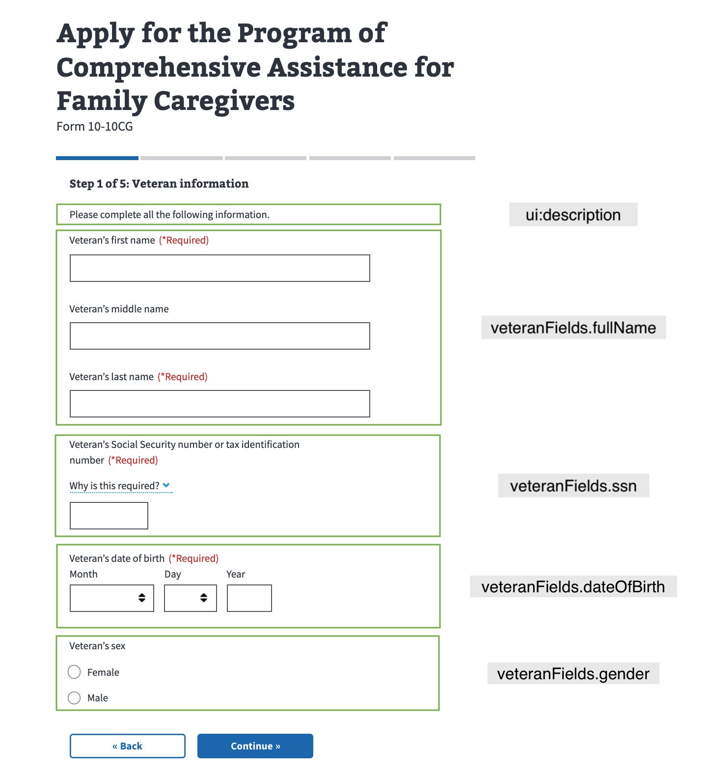
This is an example from the Veteran information page on the 10-10CG Form, which is used to apply for comprehensive assistance for family caregivers.
The uiSchema has the following properties: ui:description , veteranFields.fullName, veteranFields.ssn, veteranFields.dateOfBirth and veteranFields.gender.
The schema has veteranFields.fullName, veteranFields.ssn and veteranFields.dateOfBirth as required fields.
From the formConfig for the 10-10CG Form:
import vetPersonalInfoPage from './chapters/veteran/personalInformation';
...
const formConfig = {
  ...,
  chapters: {
    veteranInformation: {
      title: 'Veteran information',
      pages: {
        veteranInfoOne: {
          path: 'vet-1',
          title: 'Veteran information',
          uiSchema: vetPersonalInfoPage.uiSchema,
          schema: vetPersonalInfoPage.schema,
        },
        ...
      },
    },
    ...
  },
};
export default formConfig;
From the Veteran Information page on the 10-10CG Form:
import { titleUI } from 'platform/forms-system/src/js/web-component-patterns';
import { fullNameSchema } from '../../../definitions/sharedSchema';
import { dobUI, genderUI, fullNameUI } from '../../../definitions/sharedUI';
import { FULL_SCHEMA } from '../../../utils/imports';
import content from '../../../locales/en/content.json';

const { fullName, date, gender } = FULL_SCHEMA.definitions;
const inputLabel = content['vet-input-label'];

const veteranPersonalInformation = {
  uiSchema: {
    ...titleUI(content['vet-info-title--personal']),
    veteranFullName: fullNameUI({ label: inputLabel }),
    veteranDateOfBirth: dobUI(inputLabel),
    veteranGender: genderUI(inputLabel),
  },
  schema: {
    type: 'object',
    required: ['veteranDateOfBirth'],
    properties: {
      veteranFullName: fullNameSchema(fullName),
      veteranDateOfBirth: date,
      veteranGender: gender,
    },
  },
};

export default veteranPersonalInformation;
Using a common front-end definition
This example is deprecated. We recommend using web component patterns.
There are a few things happening here on the veteranFields.fullNamefield.
-
First, we've pulled the
fullNamedefinition fromfullSchema. JSON Schema's method of code reuse has you put definitions in adefinitionsobject in the schema. -
Second, we've imported
fullNameUIfrom our common front-end definitions. For this field, we just have someuiSchemaconfiguration that sets labels and widget types. Other fields are more complex, and may require you to call a function to generate the right configuration, and possibly import something for the regularschemaobject as well. -
Third, in the code you can see that we're using
fullNameUIin theuiSchemaobject.
The veteranFields.ssn, veteranFields.dateOfBirth and veteranFields.gender fields use common frontend definitions as well by importing ssnUI, dateOfBirthUI and genderUI respectively.
Example 2
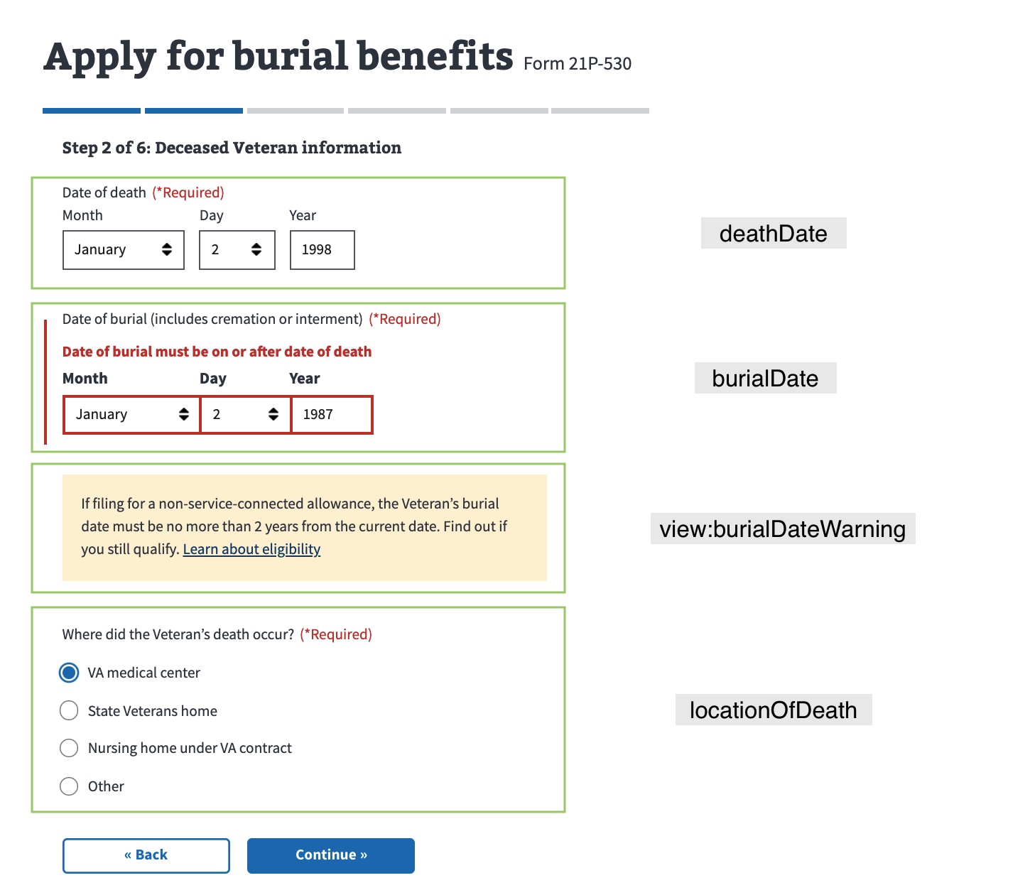
This is an example from the Deceased Veteran Information page on the 21P-530EZ Form, used to apply for burial benefits.
The uiSchema has the following properties: deathDate, burialDate, view:burialDateWarning, locationOfDeath and ui:validations.
The schema has deathDate, burialDate and locationOfDeath as required fields.
From the Burial Benefits 21P-530EZ Form:
  burialInformation: {
    title: 'Burial information',
    path: 'veteran-information/burial',
    uiSchema: {
      deathDate: currentOrPastDateUI('Date of death'),
      burialDate: currentOrPastDateUI(
        'Date of burial (includes cremation or interment)',
      ),
      'view:burialDateWarning': {
        'ui:description': burialDateWarning,
        'ui:options': {
          hideIf: formData => {
            // If they haven’t entered a complete year, don’t jump the gun and show the warning
            if (formData.burialDate && !isFullDate(formData.burialDate)) {
              return true;
            }

            // Show the warning if the burial date was more than 2 years ago
            return isEligibleNonService(formData.burialDate);
          },
        },
      },
      locationOfDeath: {
        location: {
          'ui:title': 'Where did the Veteran’s death occur?',
          'ui:widget': 'radio',
          'ui:options': {
            labels: locationOfDeathLabels,
          },
        },
        other: {
          'ui:title': 'Please specify',
          'ui:required': form =>
            get('locationOfDeath.location', form) === 'other',
          'ui:options': {
            expandUnder: 'location',
            expandUnderCondition: 'other',
          },
        },
      },
      'ui:validations': [validateBurialAndDeathDates],
    },
    schema: {
      type: 'object',
      required: ['burialDate', 'deathDate', 'locationOfDeath'],
      properties: {
        deathDate,
        burialDate,
        'view:burialDateWarning': { type: 'object', properties: {} },
        locationOfDeath,
      },
    },
  },
The object locationOfDeath contains location and otherfields.
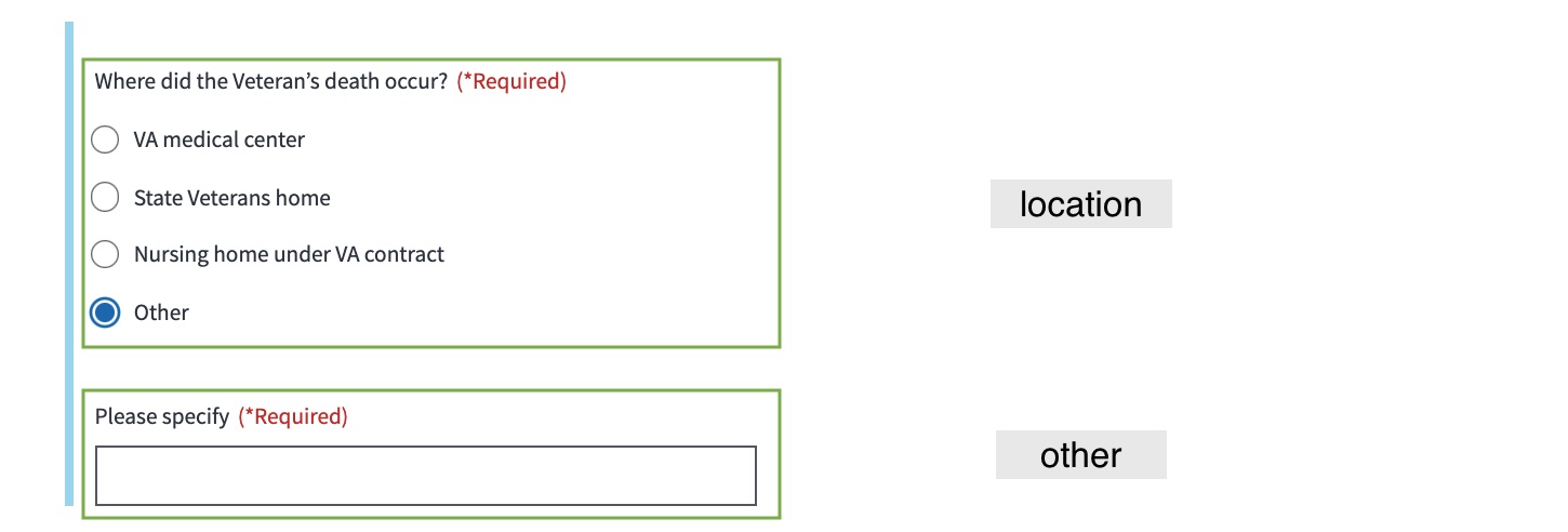
locationofDeath
The other field has properties ui:title, ui:required and ui:options.
The ui:options of other has properties expandUnder and expandUnderCondition. The field other is shown under field location when the ‘Other’ options is selected.
From the Burial Benefits 21P-530EZ Form:
      locationOfDeath: {
        location: {
          'ui:title': 'Where did the Veteran’s death occur?',
          'ui:widget': 'radio',
          'ui:options': {
            labels: locationOfDeathLabels,
          },
        },
        other: {
          'ui:title': 'Please specify',
          'ui:required': form =>
            get('locationOfDeath.location', form) === 'other',
          'ui:options': {
            expandUnder: 'location',
            expandUnderCondition: 'other',
          },
        },
      },
Conditionally displayed fields
Often when building forms you'll need to hide and show fields based on form data or other information. In this example, we use conditionally displayed fields in two places : other (location) and view:burialDateWarning, and we use it with two different methods:
-
Expand under fields: A common pattern is to expand some fields "underneath" others, when a user enters or selects information in a field that requires more information to be collected. In this example, we want to hide and show the
otherfield based onlocation(this pattern is no longer encouraged due to accessibility concerns).
-
Conditionally hidden fields: If you just need to hide or show a field, without the expand under treatment, you can use
hideIf. In this example, we usehideIfon theview:burialDateWarningfield.
Help and feedback
-
Get help from the Platform Support Team in Slack.
-
Submit a feature idea to the Platform.