

Last Updated: February 6, 2025
This guide contains a considerable amount of out of date information. Several sections are marked as “deprecated” or have text advising against using, but not everything is labeled. The Forms team is aware and is actively updating all forms documentation to be more in line with the current form digitization guidance. While this guide still has useful information, it may be more fruitful to reference and practice development with the already existing Simple Forms Patterns mock form (view in staging) or the Patterns Demonstrations mock form (view in staging).
In this document, we'll walk through creating a new form and making some simple changes.
Prerequisites:
Create a new form application with Yeoman generator
The Yeoman generator is the automated script that allows engineers and designers to easily create forms and all of the corresponding files that you'll need to edit and build out your form. Use the link below to get started and create your new form application!
VA.gov Create New Form Using Yeoman Generator
To begin, run the generator from the root of your local vets-website repository:
yarn new:app
This tutorial uses the following answers to the questions asked by the generator:
|
Question |
Answer |
|---|---|
|
What's the name of your application? |
tutorial-test |
|
What folder in |
tutorial-test |
|
What should be the name of your app's entry bundle? |
tutorial-test |
|
What's the root url for this app? |
/tutorial-test |
|
Is this a form app? |
Y |
|
Where can I find the vagov-content repo? |
/Users/<your-user>/<path-to-vagov-content
|
|
What's your form number? |
XX-230 |
|
What's the Google Analytics event prefix you want to use? |
tutorial-test- |
|
What's the respondent burden of this form in minutes? |
30 |
|
What's the OMB control number for this form? |
XX3344 |
|
What's the OMB expiration date (in M/D/YYYY format) for this form? |
12/31/2023 |
|
What's the benefit description for this form? |
tutorial test benefits |
|
Which form template would you like to start with? |
WITH_1_PAGE: A form with 1 page - name and date of birth |
After answering the questions, the generator will create several source files for a new form application in /src/applications/tutorial-test.
NOTE: If you've already created another form locally there will be a question at the end to Overwrite the existing registry.json file in your content-build repo. We suggest that you use the a option, which will add the new json block at the bottom of the file and not alter your existing form.
Open the new form application
Next you'll need to start the site up locally (restart this task if it's already running):
yarn watch --env entry=tutorial-test
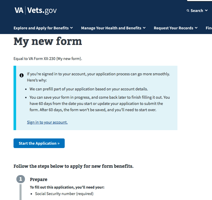
Then navigate to http://localhost:3001/tutorial-test.
You should see something like this:
Update your form
Now that you're up and running, we can add a new page and a new field to our form. If you open up src/applications/tutorial-test/config.js, you should see a formConfigvariable:
const formConfig = {
  urlPrefix: '/',
  submitUrl: '/v0/api',
  trackingPrefix: 'tutorial-test-',
  introduction: IntroductionPage,
  confirmation: ConfirmationPage,
  formId: 'XX-230',
  version: 0,
  prefillEnabled: true,
  savedFormMessages: {
    notFound: 'Please start over to apply for new form benefits.',
    noAuth: 'Please sign in again to continue your application for new form benefits.'
  },
  title: 'My new form',
  defaultDefinitions: {
  },
  chapters: {
    chapter1: {
      title: 'Chapter 1',
      pages: {
        page1: {
          path: 'first-page',
          title: 'First Page',
          uiSchema: {
          },
          schema: {
            type: 'object',
            properties: {
            }
          }
        }
      }
    }
  }
};
There's a lot of information already there, and you can check out the Form Config Options to see what each property means. For now, we're going to look at the content of the form, which lives in chapters.
At the most basic level, our forms consist of widgets, fields, web component based fields, pages, and chapters:
-
Widgets are the basic form controls, things like
<input/>and<select/>elements. These are deprecated. We recommend using web component patterns and fields. -
Fields are the next level up and contain a widget and a
<label/>, plus some extra optional description information. Using fields with widgets is deprecated. We recommend using web component patterns and fields. -
Web component based fields are similar to regular fields, but they don’t rely on widgets, and the rendering of the
<label/>and other optional information is handled by a VA.gov Design System web component. More information can be found in web component patterns and fields. -
Pages are are collections of fields.
-
Chapters are collections of pages.
We can see in the config that there's already one chapter, with one page inside it, called page1. In the page1object there are a few pieces of information, which we can mostly ignore for now. The important properties for us right now are uiSchemaand schema. schemais the initial structure of our page, in the form of a JSON Schema. This describes the type of data that will result from a user filling in our form. It's also used by the Forms Library to determine what fields and widgets to display in the application, except when overridden by uiSchema. uiSchemais an object with extra, user interface-focused information to help render the form. We recommend using the uiSchema to override the default, deprecated widget behavior and instead utilize web component patterns and fields.
Let's add a property to schema:
page1: {
  path: 'first-page',
  title: 'First Page',
  uiSchema: {
  },
  schema: {
    type: 'object',
    properties: {
      myField: {
        type: 'string'
      }
    }
  }
}
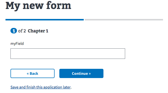
Now if you go to http://localhost:3001/new-form/first-page, you should see this:
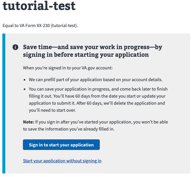
NOTE: Another way to get to this page above is to navigate to http://localhost:3001/tutorial-test and then click the Start your application without signing in button as shown below.
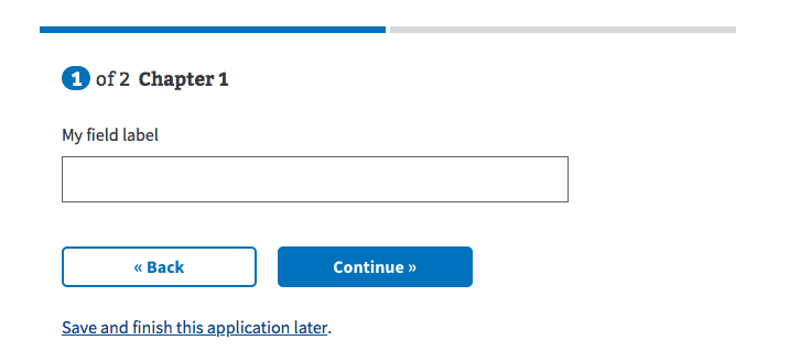
That's not the most exciting field, but it's a field! We can add a title to it by adding to uiSchema:
page1: {
  path: 'first-page',
  title: 'First Page',
  uiSchema: {
    myField: {
      'ui:title': 'My field label'
    }
  },
  schema: {
    type: 'object',
    properties: {
      myField: {
        type: 'string'
      }
    }
  }
}
That makes it look a little more presentable:
Note that uiSchemadoesn't follow exactly the same structure as schema: you don't need the propertiesobject. This is because uiSchematreats everything without a ui:prefix as a field name, with one exception for array fields.
Changing the the typeproperty in your field will change the data accepted and also the way it displays on the form. You can change it to be booleanand get a checkbox or numberto get a number input. If you want a selectbox, you use JSON Schema's enumproperty:
page1: {
  path: 'first-page',
  title: 'First Page',
  uiSchema: {
    myField: {
      'ui:title': 'My field label'
    }
  },
  schema: {
    type: 'object',
    properties: {
      myField: {
        type: 'string',
        'enum': [
          'First option',
          'Second option'
        ]
      }
    }
  }
}
That will get you a select box with options:
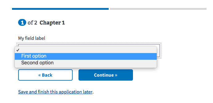
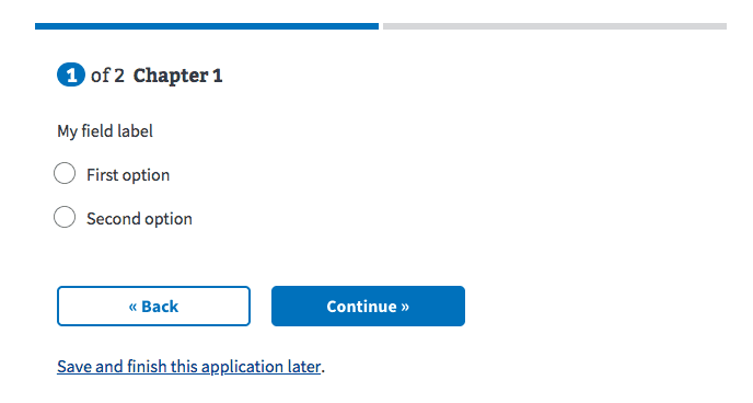
Some types of data might have different valid ways of asking the user for input. For example, a field that uses enumcould also use radio buttons. You can change that with ui:widget (using ui:widget is deprecated and we recommend using web component patterns and fields):
page1: {
  path: 'first-page',
  title: 'First Page',
  uiSchema: {
    myField: {
      'ui:title': 'My field label',
      'ui:widget': 'radio',
      'ui:options': {
        widgetProps: {
          'First option': { 'data-info': 'first_1' },
          'Second option': { 'data-info': 'second_2' }
        },
        // Only added to the radio when it is selected
        // a11y requirement: aria-describedby ID's *must* exist on the page;
        // and we conditionally add content based on the selection
        selectedProps:  {
          'First option': { 'aria-describedby': 'some_id_1' },
          'Second option': { 'aria-describedby': 'some_id_2' }
        }
      }
    }
  },
  schema: {
    type: 'object',
    properties: {
      myField: {
        type: 'string',
        'enum': [
          'First option',
          'Second option'
        ]
      }
    }
  }
}
Now the form offers two radio buttons to choose from:
You can also mark fields as required, which will prevent you from moving to the next page without filling them out:
page1: {
  path: 'first-page',
  title: 'First Page',
  uiSchema: {
    myField: {
      'ui:title': 'My field label',
      'ui:widget': 'radio'
    }
  },
  schema: {
    type: 'object',
    required: ['myField'],
    properties: {
      myField: {
        type: 'string',
        'enum': [
          'First option',
          'Second option'
        ]
      }
    }
  }
}
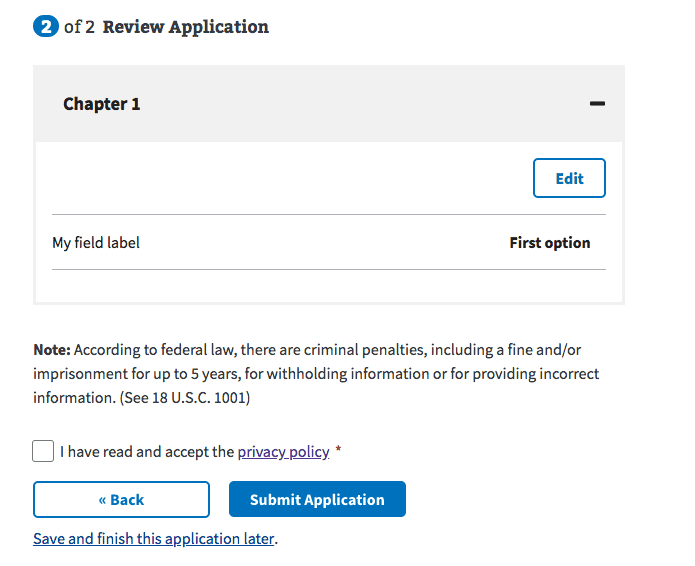
If you do fill in the required information and click Continue, you'll end up on the review page. The review page is generated based on the defined chapters and pages and provides a quick way to review the data that you've entered:
Note that if you refresh in the middle of the form, your data will be lost and the review page won't have any content to edit.
Once you've reviewed your form, you need to click the checkbox to agree to the privacy policy and then you can submit! For now, though, that Submit button will fail because there's no api to submit the data to.
That's it! Continue on with the following sections to learn about building more complex forms and the complete process for building and submitting a new form.
Form validation
Because our forms are based on JSON Schema, you can rely on the built in types and pattern property to do a lot of your validation. However, sometimes you need validation rules that go beyond what JSON Schema offers. To write custom validation, we use a ui:validationhelper:
page1: {
  path: 'first-page',
  title: 'First Page',
  uiSchema: {
    myField: {
      'ui:title': 'My field label',
      'ui:validations': [
        (errors, field) => {
          if (field && field.startsWith('bad')) {
            errors.addError("Sorry, you can't start this field with 'bad'");
          }
        }
      ]
    }
  },
  schema: {
    type: 'object',
    properties: {
      myField: {
        type: 'string'
      }
    }
  }
}
ui:validationtakes an array of functions, each of which is passed in an errors object, and the field data (plus some other parameters). In the above example, if a user puts 'badString' in myField, then the form will display a validation error with the message passed in addError().
Learn more about validating a field based on values from another field.
Custom validation error messages
In addition to the above custom validation, you can also customize the messages for the built in JSON Schema validation. For example, if you have some pattern validation, you can set an understandable message:
page1: {
  path: 'first-page',
  title: 'First Page',
  uiSchema: {
    myField: {
      'ui:title': 'My field',
      'ui:errorMessages': {
        pattern: 'Sorry, word MUST start with "good"'
      }
    },
  },
  schema: {
    type: 'object',
    properties: {
      myField: {
        type: 'string',
        pattern: '^good'
      }
    }
  }
}
Conditional required fields
In some cases you may want to have fields be required only under certain conditions. To handle that, you can use the ui:requiredhelper:
page1: {
  path: 'first-page',
  title: 'First Page',
  uiSchema: {
    myField: {
      'ui:title': 'My field',
    },
    // To force this field to be required the 'myField' must equal 'test'
    myOtherField: {
      'ui:title': 'My field',
      'ui:required': (formData) => formData.myField === 'test'
    },
  },
  schema: {
    type: 'object',
    properties: {
      myField: {
        type: 'string',
      },
      myOtherField: {
        type: 'string',
      }
    }
  }
}
In the above config, myOtherFieldwill be required if myFieldequals "test". The formDataparameter contains all of the form data, across all pages, so your conditional logic can be based on any other data in the form.
Conditionally displayed fields
Often when building forms you'll need to hide and show fields based on form data or other information. The VAFS has three ways to do this.
Expand under fields - DISCLAIMER - TRY NOT TO USE THIS ANYMORE
A common pattern is to expand some fields "underneath" others, when a user enters information in a field that requires more information to be collected:
To do that, you can use the expandUnderoption:
page1: {
  path: 'first-page',
  title: 'First Page',
  uiSchema: {
    myField: {
      'ui:title': 'My field',
      'ui:widget': 'yesNo',
      'ui:options': {
        labels: {
          Y: 'Yes, this is what I want',
          N: 'No, I do not want this',
        },
        widgetProps: {
          Y: { 'data-info': 'yes' },
          N: { 'data-info': 'no' }
        },
        // Only added to the radio when it is selected
        // a11y requirement: aria-describedby ID's *must* exist on the page;
        // and we conditionally add content based on the selection
        selectedProps: {
          Y: { 'aria-describedby': 'some_id' },
          N: { 'aria-describedby': 'different_id' }
        }
      }
    },
    myConditionalField: {
      'ui:title': 'My conditional field',
      'ui:options': {
        expandUnder: 'myField'
      }
    },
  },
  schema: {
    type: 'object',
    properties: {
      myField: {
        type: 'boolean',
      },
      myConditionalField: {
        type: 'string',
      }
    }
  }
}
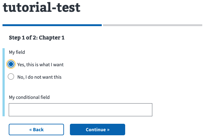
In the above example, myConditionalFieldwill display whenever myFieldhas a truthy value. You can add this to multiple fields and all of them will be grouped under the expandUnderfield. Note, however, that if any of these hidden fields are required when visible, you'll have to use ui:requiredto make sure they're not required when they're not displayed.
NOTE: The blue bar to the left side of the fields indicates that the conditional field has been expanded under the first field.
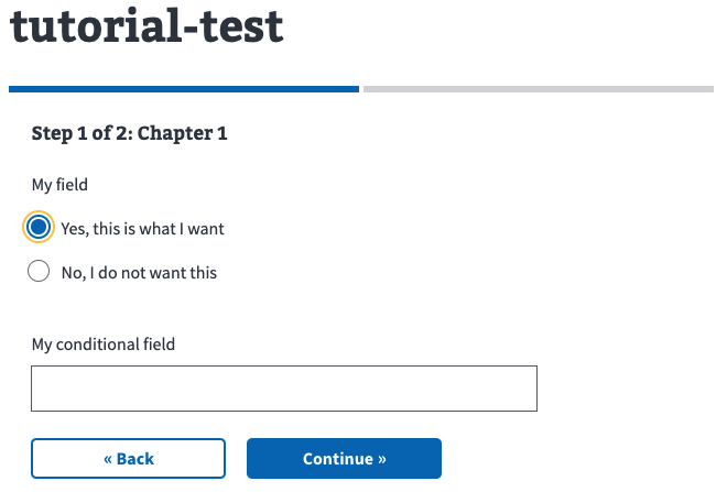
Conditionally hidden fields DISCLAIMER - TRY NOT TO USE THIS ANYMORE
If you just need to hide or show a field, without the expand under treatment, you can use hideIf:
page1: {
  path: 'first-page',
  title: 'First Page',
  uiSchema: {
    myField: {
      'ui:title': 'My field',
      'ui:widget': 'yesNo',
      'ui:options': {
        labels: {
          Y: 'Yes, this is what I want',
          N: 'No, I do not want this',
        },
        widgetProps: {
          Y: { 'data-info': 'yes' },
          N: { 'data-info': 'no' }
        },
        // Only added to the radio when it is selected
        // a11y requirement: aria-describedby ID's *must* exist on the page;
        // and we conditionally add content based on the selection
        selectedProps: {
          Y: { 'aria-describedby': 'some_id' },
          N: { 'aria-describedby': 'different_id' }
        }
      }
    },
    myConditionalField: {
      'ui:title': 'My conditional field',
      'ui:options': {
        hideIf: (formData) => formData.myField !== true
      }
    },
  },
  schema: {
    type: 'object',
    properties: {
      myField: {
        type: 'boolean'
      },j
      myConditionalField: {
        type: 'string'
      }
    }
  }
}
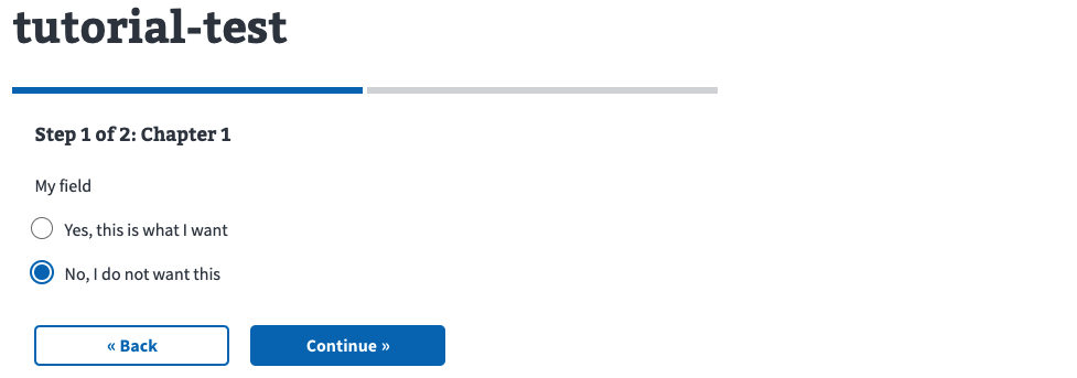
In the above example, myConditionalFieldis hidden when myFieldis not true (meaning it's false or undefined).
NOTE: Also in this example you'll see when myField is selected the conditional field now appears but does not have the blue bar on the left side which indicates it’s NOT expanded under the first field.
Conditional pages
Another situation you may encounter is needing to make an entire page of the form conditional. You can do that with the dependsproperty:
page1: {
  path: 'first-page',
  title: 'First Page',
  uiSchema: {
    fieldOnAnotherPage: {
      'ui:title': 'Field on Another Page',
    }
  },
  schema: {
    type: 'object',
    properties: {
      fieldOnAnotherPage: {
        type: 'string'
      }
    }
  }
},
page2: {
  path: 'second-page',
  title: 'Second Page',
  depends: (form) => form.fieldOnAnotherPage !== 'test',
  uiSchema: {
    myField: {
      'ui:title': 'My field',
      'ui:widget': 'yesNo',
      'ui:options': {
        labels: {
          Y: 'Yes, this is what I want',
          N: 'No, I do not want this',
        },
        widgetProps: {
          Y: { 'data-info': 'yes' },
          N: { 'data-info': 'no' }
        },
        // Only added to the radio when it is selected
        // a11y requirement: aria-describedby ID's *must* exist on the page;
        // and we conditionally add content based on the selection
        selectedProps: {
          Y: { 'aria-describedby': 'some_id' },
          N: { 'aria-describedby': 'different_id' }
        }
      }
    }
  },
  schema: {
    type: 'object',
    properties: {
      myField: {
        type: 'boolean'
      }
    }
  }
}
The depends function is passed the current form data (form), so you can check different conditions and return false if want to skip a page. Note that you want to make sure your checking data a user would enter before potentially reaching this page, otherwise they won't ever see it.
NOTE: When fieldOnAnotherPage is set to test you'll see that the second page never appears.
View-only data
In some cases, you may have fields that you don't need to submit along with the form data. for example, a confirmation email field. In other cases, you may also want to group fields into objects but not have that grouping reflected in the submitted data. This can be useful if you need to conditionally hide a group of fields and don't want to write hideIf functions for every individual field.
To keep a field from being submitted, you can prefix it with view::
page1: {
  path: 'first-page',
  title: 'First Page',
  uiSchema: {
    email: {
      'ui:title': 'Email',
    },
    'view:confirmEmail': {
      'ui:title': 'Confirm email'
    }
  },
  schema: {
    type: 'object',
    properties: {
      email: {
        type: 'string'
      },
      'view:confirmEmail': {
        type: 'string'
      }
    }
  }
}
Since we've prefixed confirmEmailwith view:, that field will be removed before submitting the completed form.
In the above example this is the data that gets submitted to the backend API:
{
  email: "test@test.com"
}
If you prefix an object with view:, something slightly different will happen. In the below example we'll prefix the entire emails object and see how the data changes. Be sure to add the keys type and properties in the new view:emails object:
page1: {
  path: 'first-page',
  title: 'First Page',
  uiSchema: {
    'view:emails': {
      email: {
        'ui:title': 'Email',
      },
      confirmEmail: {
        'ui:title': 'Confirm email'
      }
    }
  },
  schema: {
    type: 'object',
    properties: {
      'view:emails': {
        type: 'object',
        properties: {
          email: {
            type: 'string'
          },
          confirmEmail: {
            type: 'string'
          }
        }
      }
    }
  }
}
In this case, the form data that's submitted when a user completes a form would be:
{
  email: 'test@test.com',
  confirmEmail: 'test@test.com'
}
If we’d left off the view:prefix it would be:
page1: {
  path: 'first-page',
  title: 'First Page',
  uiSchema: {
    emails: {
      email: {
        'ui:title': 'Email',
      },
      confirmEmail: {
        'ui:title': 'Confirm email'
      }
    }
  },
  schema: {
    type: 'object',
    properties: {
      emails: {
        type: 'object',
        properties: {
          email: {
            type: 'string'
          },
          confirmEmail: {
            type: 'string'
          }
        }
      }
    }
  }
}
The resulting JSON to be submitted will look like this:
{
  emails: {
    email: 'test@test.com',
    confirmEmail: 'test@test.com'
  }
}
That should get you started with some of the common validation and conditional field scenarios. Many of the options above have extra parameters or options that may help with some less common scenarios, so be sure to check the Form Config Options for a full picture of all the options offered.
Using Common Definitions
All of our forms share schemas with the backend through vets-json-schema, the repository where we store JSON Schemas for validating data submitted to a vets-apiAPI endpoint. Assuming you've created one of those schemas, the next step is to incorporate that into your form, along with other common definitions we've built.
Here is a helpful link with some tips on how to commit and push a new version of vets-json-schema: VA Forms Library - Using Forms in Production
Adding your schema
Assuming you've created your form using our form scaffolding generator, you should have some commented out lines in your config/form.jsfile:
import fullSchema from 'vets-json-schema/dist/definitions.json';

// ...code omitted...

// const { } = fullSchema;
If you uncomment those lines and update the import path to match your schema's file name, you can start pulling in individual definitions and properties to use in your form. We try to use the properties from the shared schema as much as possible, since it helps keep the frontend and backend in sync and avoid validation errors in production. For example, if you want to import an emailfield from your schema, you can do something like this:
import fullSchema from 'vets-json-schema/dist/definitions.json';

// ...code omitted...

const {
  email
} = fullSchema;

// const { } = fullSchema;

const formConfig = {
   // ...code omitted...
   page1: {
     path: 'first-page',
     title: 'First Page',
     uiSchema: {
       email: {
         'ui:title': 'My field label'
       }
     },
     schema: {
       type: 'object',
       properties: {
         email
       }
     }
   }
   // ...code omitted...
};
Here we're using Javascript's object shorthand syntax to set the emailproperty to the object from the shared schema properties. That way we know we're using the same field name and using the same definition type as what will be used by the backend. Note that we still need to be careful that we include all the fields we need from fullSchema.
Using a common frontend definition
There is a collection of common definitions and fields on the frontend for you to use in your form. Let's try using our common full name field:
import fullSchema from 'vets-json-schema/dist/definitions.json';
import fullNameUI from 'platform/forms-system/src/js/definitions/fullName';
// ...code omitted...

const {
  fullName
} = fullSchema;

const formConfig = {
  // ...code omitted...
  definitions: {
    fullName
  },
  // ...code omitted...
    page1: {
      path: 'first-page',
      title: 'First Page',
      uiSchema: {
        veteranFullName: fullNameUI
      },
      schema: {
        type: 'object',
        properties: {
          veteranFullName: fullName
        }
      }
    }
   // ...code omitted...
};
There are a few things going on here. One, we've pulled the fullNamedefinition from fullSchema. JSON Schema's method of code reuse has you put definitions in a definitionsobject in the schema, then reference them with a $refproperty, so we need to account for that on the frontend. We can do that by importing it from fullSchema.definitionsand adding it to the definitionsobject in our form config object.
Second, we've imported fullNameUIfrom our common frontend definitions. For this field, we just have some uiSchemaconfiguration that sets labels and widget types. Other fields are more complex, and may require you to call a function to generate the right configuration, and possibly import something for the regular schemaobject as well.
Finally, in the code you can see that we're using fullNameUIin the uiSchemaobject, and we're using veteranFullNamelike we used emailpreviously.
Modifying common definitions
You'll often need to slightly modify common definitions on the frontend to change a label or some conditional logic. We typically do that by using our data utilities to set values on the schema. For example, say we needed to make our veteranFullNamefield expand underneath another field:
import set from 'platform/utilities/data/set';
import fullSchema from 'vets-json-schema/dist/definitions.json';
import fullNameUI from 'platform/forms-system/src/js/definitions/fullName';// ...code omitted...

const {
  veteranFullName
} = fullSchema.properties;

const {
  fullName
} = fullSchema.definitions;

const formConfig = {
   // ...code omitted...
  definitions: {
    fullName
  },
  // ...code omitted...
    page1: {
      path: 'first-page',
      title: 'First Page',
      uiSchema: {
        myField: {
          'ui:title': 'My field',
          'ui:widget': 'yesNo',
          'ui:options': {
            labels: {
              Y: 'Yes, this is what I want',
              N: 'No, I do not want this',
            },
            widgetProps: {
              Y: { 'data-info': 'yes' },
              N: { 'data-info': 'no' },
            },
            // Only added to the radio when it is selected
            // a11y requirement: aria-describedby ID's *must* exist on the page;
            // and we conditionally add content based on the selection
            selectedProps: {
              Y: { 'aria-describedby': 'some_id' },
              N: { 'aria-describedby': 'different_id' },
            }
          }
        },
        // inputs for full name include the appropriate autocomplete properties:
        // first (given-name), middle (additional-name) and last (family-name)
        veteranFullName: set('ui:options.expandUnder', 'myField', fullNameUI)
      },
      schema: {
        type: 'object',
        properties: {
          myField: { type: 'boolean' },
          veteranFullName
        }
      }
    }
   // ...code omitted...
};
We're using one of the available data utilities to set the expandUnder value for fullNameUI in a way that doesn't modify the existing fullNameUI object. All of the data functions in platform/utilities/datatreat objects as immutable, not modifying anything you pass in to them, so you can reuse fullNameUIin another spot in your form without worrying about having to remove the ui:optionsconfiguration we added.
Things to watch out for
The point of having these common definitions and sharing a schema between the frontend and backend is to encourage consistency in our forms and to reduce errors when submitting a form to a vets-apiendpoint, but following the guide above won't completely prevent those issues. Here are some things to keep in mind:
-
Since we're importing individual fields from
fullSchema, it can be easy to miss required field rules, since we often import those directly. Make sure you're marking all the necessary fields as required in your form config. -
Importing individual fields makes it easy to group them in ways specific to the frontend, so make sure if you're grouping things, you're using property names prefixed with
view:to remove that grouping before submitting.
Help and feedback
-
Get help from the Platform Support Team in Slack.
-
Submit a feature idea to the Platform.