

The reviewCardField is used as a wrapper around user data that's displayed in a review card if data is pre-filled, otherwise it will show form components. It is currently being used to group user data such as:
-
Phone & email
-
Contact information (home or mailing address)
-
Bank account information
ReviewCardField options
|
Options |
Description |
|---|---|
|
viewComponent |
Component shown in review (non-edit) mode. It gets the same |
|
startInEdit |
Set as either a function or a (boolean) value that will be evaluated as truthy or not. If a function is used, it's passed the formData and expects a boolean return value. |
|
volatileData |
If this is truthy, the component pattern changes slightly so that only completely new data can be entered, but not edited. This is useful for bank account information. |
|
reviewTitle |
The title shown on the review card. Defaults to |
|
editTitle |
The title shown on the edit card. Defaults to |
|
itemName |
The name of the set of data in the card. This shows up as a "New {itemName}" button when |
|
itemNameAction |
Replaces the "New" in "New X" when |
Usage
-
Include an import to the component at the top of the file:
// The review card field
import ReviewCardField from 'platform/forms-system/src/js/components/ReviewCardField';
// review mode renderer
import myViewComponent from './myViewComponent';
// predefined uiSchemas
import phoneUI from 'platform/forms-system/src/js/definitions/phone';
import emailUI from 'platform/forms-system/src/js/definitions/email';
-
In the
uiSchema, specify'ui:field': ReviewCardFieldfor the given field and set'ui:options':{viewComponent:<<CustomComponent>>}. -
Include the desired uiSchema for the form elements.
Example
An example of basic contact information is shown here:
// ContactInformationViewComponent.jsx
import React from 'react';

const formatPhoneNumber = number => {
  // formatting magic done here
  return number;
}

export default function ContactInformationViewComponent({ formData }) {
  const { phone, emailAddress } = formData;
  return (
    <>
      <p>
        <strong>Phone number</strong>
        {formatPhoneNumber(phone) || 'Not available'}
      </p>
      <p>
        <strong>Email address</strong>
        {emailAddress || 'Not available'}
      </p>
    </>
  );
};
We create a component ContactInformationViewComponent. This component renders the form data when the ReviewCardField is in review (not edit) mode.
Your uiSchema might look like this:
contactInfo: {
  'ui:title': 'Contact Information',
  phoneEmailCard: {
    'ui:title': 'Phone & email',
    'ui:field': ReviewCardField,
    'ui:options': {
      // showing ALL options
      // ** required **
      viewComponent: ContactInformationViewComponent,
      // ** optional **
      reviewTitle: 'New Title',
      editTitle: 'Editing...',
      startInEdit: false,
      volatileData: false,
      itemName: 'Name',
    },
    phone: phoneUI('Home phone'),
    emailAddress: emailUI(),
  },
},
Set up the schema in a typical manner; there is no mention of the ReviewCardFieldhere:
schema: {
  type: 'object',
  properties: {
    contactInfo: {
      type: 'object',
      properties: {
        phoneEmailCard: {
          type: 'object',
          required: ['phone', 'emailAddress'],
          properties: {
            phone: {
              type: 'string',
            },
            emailAddress: {
              type: 'string',
            },
          },
        },
      },
    },
  },
},
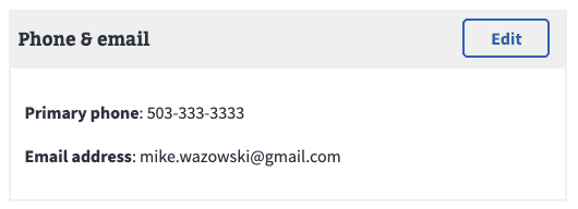
If the data is preloaded, it will appear on the page in a collapsed form with an Edit button. This allows the user to review and make changes as needed.
With missing pre-fill data, or when the user presses the "Edit" button, the card will enter edit mode showing the form components:
.png?cb=0d90866ab0c372c389fb9b2eba43da45)
Help and feedback
-
Get help from the Platform Support Team in Slack.
-
Submit a feature idea to the Platform.